
Return To Course Overview

Pigments are like words. You mix them together to make a million different colors to make your stories on canvas.
A language takes time to learn, but it isn’t mysterious. You learn words and you learn grammar. You put words together to make stories. You use grammar to organize everything in a way that makes sense.
In this lesson, you’ll learn that there are two completely different aspects to using color that are similar to words and grammar: color mixing with pigments, and color schemes. You’ll also find out why and how we use the 10 specific pigments on our palette.
A color scheme is a set of several colors used for composition, or the design of a work of art.
A color pigment is a tube of paint containing a chemical compound with a brilliant hue.
Pigments are like words. You mix them together to make a million different colors to make your stories on canvas.
Color schemes are like the grammar. We organize our color language into schemes to make sure our art isn’t overwhelming or incomprehensible.
Pigments
I have painted with the same pigments my entire adult life, so I know what happens when you combine them. I can tell you with certainty that the same combination mixed together will always make the same color. Every single time. It’s predictable.
However, when you start doing the math, you realize that 10 pigments can create a billion different combinations. That is overwhelming, but there’s more.
- Different brands of the same pigment look different.
- A pigment compound can be used to create several variations of colors.
- The amount of acyrlic or oil (the goop that makes it paint, called the medium or binder) in the tube changes the effect of the pigment.
- We don’t measure precisely (volume or weight), when we mix colors on our palettes, we use a brush or knife.
- There are hundreds of pigments (most are not commonly available).
- Many paints come with more than one pigment in them, vastly multiplying the different colors you can begin with.
- Some pigments are incompatible with others.
These are the reasons why color mixing seems so amazingly unpredictable.
I’ve done all the color work for you.
You don’t need to waste time and money, or be overwhelmed trying to figure out the immensely complex world of color. You just need to make sure your young artist is happy – and not frustrated by color.
You don’t have to worry about that scary list above because if you follow my recommendations, you are making the same decisions that an artist with 50 years of experience is making. You’re going to be doing it like a pro.
So please trust me on this. You cannot substitute and use other pigments in our lesson plans. As for brands, if you can follow our recommendations it will be cheaper as well as less frustrating. Many brands of paint that appear the same as more expensive ones, will have runny paint in them. They’re full of the cheap clear acrylic medium, and have half, or even a third of the pigment that quality student-grade brands will have. So you’re not saving money buying these, you are making it much harder to paint well. So you’re really buying something you should immediately throw away.
A frustrating tool is worse than no tool at all when it comes to art. A frustrating tool will make the artist feel like it’s their own fault, and that they’re not a good artist. You don’t want that!
TIP: every brand of student-grade white is too weak to work. It’s important to always buy a professional grade of white paint.
Experimental mixing
But what about a billion colors? How do you tame that monster?
Color is so complex, it will likely overwhelm anyone who begins without a framework, so I’m about to give you a fantastic framework to overcome that complexity – so your young artist can find colors reliably, and not be frustrated. The framework is mostly using my systems that are built into the lessons, but it’s also understanding several important basic facts, which I’ve outlined below.
I’ll start by explaining that we can distinguish only a fraction of a billion combinations, and you’ll only be able to make a few thousand visibly different colors as a practical matter when painting. Still, several thousand combinations using 10 pigments is a lot to memorize.
So every painter experiments. That’s why we like large palettes. Every painter makes a bunch of learner colors before they get to the exact color they’re looking for. The more experienced you are, the less time it takes, but we all experiment.
A practical scenario
Tell your artist to practice mix first, using small amounts of pigments and a small brush. Once an artist figures out a color, then they can make more of it, and make some variations too. You’ll need to encourage practice mixing more than once, though. Be on the lookout for the inevitable time when your student is frustrated, and has a huge mass of greenish-brownish-bluish gray in the middle of their palette. Don’t be negative, because all this paint is about to become a great teacher.
Tell your artist, that this is what artists do, and ask (genuinely, not like, “I told you so”) if they can see how practice mixing using a smaller brush could make things easier next time.
You can then turn a learner into even more of a positive experience by using the big glob of paint in one of two ways:
- Draw with it – get out another canvas or piece of heavy paper, and let them “draw” with all that gray paint, as if it were ink. It will be helpful to get a medium or small brush and clean it off with a paper towel often.
- Underpainting – cover a new canvas with the paint, to create a cool underpainting. Working on a gray background is often better than work on a white canvas.
If now isn’t a good time to use it, scrape up all the paint with a palette knife and put it in a baggie for later. If you use two baggies, with a bit of water in-between the first one and the second one, will keep acrylic paint good for a couple of weeks. When you’re ready to use it, pull out the inside baggine, snip a small corner off the bottom, and squeeze it out.
Color mixing with our pigments
All of our 10 pigments are as low in toxicity as possible, while being as vibrant as possible. Still, you should remember that these are chemical compounds, and they should be handled with a certain amount of care. Don’t worry about getting it on your hands, but do not purposely paint yourself with them, especially on the face. Do not hold brushes with your mouth. This is a habit that a lot of artists rely on for a third hand. You can find inexpensive brush holders that help.
Pigments are what is actually in our tubes. They are very strong and sometimes quite dark, so they can make a huge range of colors. Our set is called a mixing palette. Pigments from the tubes are used to mix colors, but not to paint with. There are exceptions. Every now and then, out of the thousands of colors you need, you will want these 3 colors: the brightest red, yellow, or the purest white. These 3 can come from our pigment tubes, but none of the other colors should be painted with unless they have been mixed with other colors and/or white. Many more reds and yellows can be created in combinations with other pigments.
It’s very important to understand that the tubes of pigments are not the colors you paint with. They’re the ingredients to make the colors you paint with. Just like sentences convey ideas when words are put together, colors look good when pigments are mixed together.
That’s why we place colors into models that help us think of them more easily, such as a color wheel. If you have a wheel, you can look across to the other side and find the opposite, also called it’s complement. That helps to find color schemes, and it can be very helpful when mixing as well. We’re going to learn more about wheels in a minute.
Complement, not compliment
A compliment is when I say to my wife, “you look great today”. A complement – with an e – is when two items complete each other. The concepts are similar, since a complementary couple sounds rather romantic.
It gets even more confusing when you realize that the term complementary colors is used to refer to both uses of color – color schemes and color mixing. In the lessons, I use a new term, perfect opposites, to talk about mixing complementary matched colors. That leaves the term, complementary colors, exclusively for color scheme references.
When we talk about complementary colors for mixing, we are looking at how two pigments react when mixed together. With mixing, a perfect complementary pair will darken and dull each other better than any other colors will. They are perfectly matched for mixing – a complete set.
The impressionist painters in Paris in the 1800s used complementary colors to darken and dull each other, instead of mixing black into colors. This is why their work is so vibrant. People react so well to the vibrant shadow colors in their work, because shadows in the real world are also vibrant and full of color.
You can learn this same method
In our curriculum, we use the complementary mixing method, which follows a logical pattern. It isn’t mysterious, it is understandable. Anyone can learn this method.
All of our pigments have either a perfect opposite match, or a best match. These are practiced by the students in all of our color journals. Using opposites to find colors makes the process of mixing colors more rewarding – once you get over the mistaken idea that shadows are full of gray.
Color Journals
To help artists understand how pigments affect each other, we have 10 color journals that students create during the 2 years of Foundations. In the grades 3-5 version, each journal has 16 color mixes. In the higher grade level they have 25. If a student has only done the smaller version, they should review with the larger version when they’re older.
If I could, I would have every student do all the color journals every 2 years. I learn so much every time I revisit them.
That’s why practice mixing is so essential. It takes some work to find your way to the color you want. Encourage your artist by reminding them it takes practice and patience to find each color, and that’s why we use a palette to wander our way through until we find it. Our color journals have students mix sets of colors in the same way that artists mix and modify colors when painting.
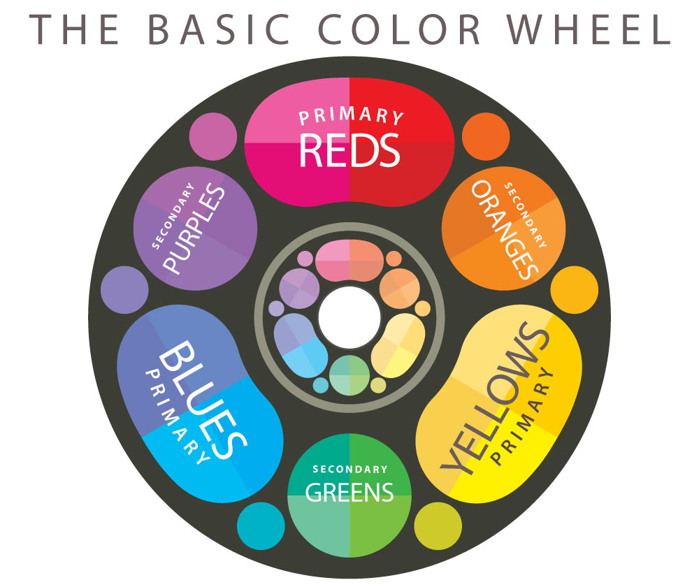
COLORS wheel
Any blue and any orange can work together – to make a complementary color scheme. However, when mixing colors, each pigment has a best match, or perfect opposite, that darken and dull each other wonderfully. When you know these matches, and mix using the opposites mixing method, you can make better colors and better paintings.
Any blue and any orange will not work well together – to make colors when mixed on a palette. Only one blue pigment, and it’s perfectly matched orange pigment opposite, will work together. Most basic colors do not make a good match. Artists try this, and when it doesn’t work, they doubt the opposites mixing method, which almost every art teacher mentions at some point, because of the impressionists.
It makes the impressionists’ methods even more mysterious.
So color wheels are great, but most color wheels lead to mixing confusion because they seem to match any color with any opposite, like in color schemes.
We need to change two things for artists.
- Artists need a tried-and-true set of pigments that are matched with their best pigment opposites, and stay with that set across all mediums so they can learn it well.
- A better color wheel. One that is plural, where all reds are opposite all greens and all blues opposite all orange colors. A plural color wheel solves the mixing with opposites problem.
Color wheels also over-simplify the colors we can see, into a set of 3 primaries and 3 secondaries. But real colors don’t fit this simplified model. There is actually more than one primary red and more than one primary blue. Almost no one teaches this, because it ruins the beautiful wheel model.
I made a color wheel that is plural, but I created an even better one I call the Color Star. It places each of our 10 pigments into the wheel model and accounts for the two primaries reds and two blues, but still keeps the wheel model and the idea of plural colors. It helps students remember which opposites work best together. We also have an opposites color journal, and in the advanced lessons we have even more opposites mixing journals.
Make more colors
The 10 pigments we use are strong, because that’s how you make the most colors. The stronger and more pure your pigments, the wider the range you can make, and that means you have more colors. Every artist wants the biggest box of crayons. In fact, almost every color found in other pigments can be mixed with this set of 10 pure mixing pigments. It’s the best range of pigments I’ve found, and I’ve been coaching artists in using it for 35 years.
Rich black
We do not use black pigments because they produce dirty-looking colors when mixed with colorful pigments. So we make black using the complementary mixing method. If you combine ultramarine blue and burnt umber, they will make a fantastic rich black. This is the best example of a perfect opposite. When combined, they create black almost like magic. It’s not magic though, it’s actually the physics of the light that each pigment absorbs. Together, they complete each other to absorb the entire spectrum, so they look black. When you mix this into other colors, you are mixing a rich blue and a rich brown into them. It’s much better than dead black.
Cool White
The white pigment of choice is titanium white. This is made from metal, so it has a cold and opaque quality to it. That means when you mix white into a warm color, or even into a green, you will see a shift towards the cool, as if you added a tiny bit of blue. The color will also have a chalkiness quality.
Except for mixing lighter blues, we tell students to mix a little yellow in with the white – to mimic the sunshine. It works great to preserve warmth, and is reinforced in all our color journals.
Color Schemes Made Easy
There are many lessons in other systems that go into great detail about all the various color schemes you can make. There are names and charts for all these color schemes all over the internet and in every color book in the world. You can find them easily.
It’s good to know these, but I have found that almost any combination of 3 to 5 colors will fit into some kind of established color scheme. That means limiting your colors to 5 or less is all you really need. As long as you like the colors, you have a color scheme. If you look at a work and don’t like it, you can cover up a color with a piece of white paper, to see if changing it would help.
Oil Pastels
Not quite drawing and not quite painting, oil pastels didn’t fit anywhere else in these lessons so I placed them here. They deserve a mention.
I absolutely love the look of chalk pastels, but I gave them up long ago. Chalk pastels create dust. That dust is made of pure pigments, which you don’t want to breathe in. Chalk pastels also use a ton of different pigments all mixed up into each stick. It’s hard to figure out what’s in them. So we only use oil pastels in our lessons.
Oil pastels are fun and easy to work with. The biggest thing to remember is that students need to mix and blend them together, or they look more like crayons. Once you blend them, they look like paint.
Blender sticks, also called stumps, are tightly rolled papers with pointed ends. Each end can be used to blend dry media such as pencil, charcoal, and oil pastels. When the sticks get dirty, they can be cleaned by scrubbing them across a piece of sandpaper. Our supply list has both stumps and a sandpaper “lead pointer” which is a little pad of sandpapers on a stiff wooden paddle, which is great for cleaning stumps as well as sharpening a pencil point.
Oil pastels can be blended several ways:
- With each other
- By using the white pastel
- With stumps
- With a finger
- With a paper towel or tissue
Not quite easy, but no longer impossible.
Now you have a much better idea of how colors are organized, and how to make them work. Along with the lessons in Homeschooling Art, you can teach your young artist how to mix and use colors confidently.

A Color Star in progress.
Plural colors make sense

Color Journals!