
Color
Each lesson Plan focuses primarily on one of the 4 Cornerstones of Art:
Drawing | Painting | Color | Style
OVERVIEW
Students will use a printed work-page to create a modified and expanded color wheel model. Our Color Star model applies the actual pigments that we use to the color wheel, and makes much more sense to artists than general color theory models. This is a great learning tool.Grades 3 – 5
Week of January 12 – 16
1 Hour & 45 Minutes
Lesson At A Glance
A brief overview of each step. Buttons jump to each section for detailed information.
15 Min – The Color Star
22 Min – Paint color star
47 Min -Paint color star & Discuss teacher talk
5 Min – Everyone helps
SCROLL & TEACH
LESSONPLAN
Each section is a different color. Read over once and then you can SCROLL & TEACH using any device you like. It’s designed to work best with your phone.
LEARNING TARGETS

Students know how to stretch their creative muscles using color
M A T E R I A L S
- 14″ x 17″ Sketch Paper
- Oil Pastels
1.1 draw
In one of the areas, draw anything you like but color it with all the bright warm colors OR all the bright cool colors. Save the other areas for another day. As they work, talk about the 4 rules to review them… with a twist! (see the teacher talk below about making a mistake).
1.2 review
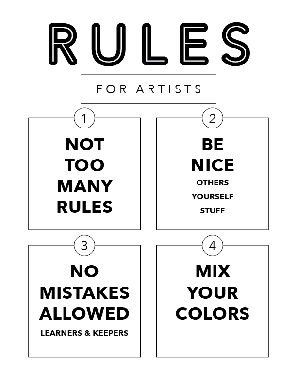
Tap the rules graphic to open a viewer so you can display on a larger screen, or use the printable version below.
Each rule is explained here. This is important because our rules are kind of different; maybe even weird (but awesome!).
Begin by asking if anyone can say the first rule (1. not too many rules!). Then try to get the other 3 rules, in no particular order, and correct the wording if needed. You can finish by displaying them or printing out the poster below.
1.3 Print
Poster
Class Rules
A copy paper sized poster to print and display.

1 Page – Opens in new window
1.4 inform
CREATIONS - tap here to open
Use the Student Instructions printout below to distribute to your Creations students. Tap the image to open the PDF in a new window.
Surrealistic Painting with Neutrals – 3 week project
Overview: Students will begin a larger painting project using mostly neutrals made by mixing perfect pigment opposites. The use of surrealism is encouraged, so drawing and planning is important too. Thumbnails are used to plan. There will be 3 weeks to complete this, so plan accordingly. If a student works fast, they should plan for a series of 2 or 3 paintings that work as a group.
While most colors should be muted neutrals, there can be a few areas of bright color for special emphasis (the most important spot). The neutral and shadow colors must be made using their color star and opposites color journal from 2 years ago.
Week 1: Plan and sketch. Begin underpainting.
- Find inspiration – look at art books, magazines, and Pinterest.
- Find reference.
- Draw lots of thumbnails. Use this time to be creative and to combine ideas.
- Think of the message you want to convey.
- Set up your paint and canvas on a board.
- Use a warm neutral to cover the canvas for an underpainting tone.
- Draw a larger version, practicing, deciding on details, and planning your colors.
Week 2: Painting most of the large areas.
- Draw guide lines on the underpainted canvas using canvas pencil.
- Begin painting – in each area, paint the darkest color first, then work towards lighter colors.
Week 3: Details and highlights to finish.
Tap images to open Creations Student Instructions and Reference Materials in new windows

LEARNING TARGETS
Students know how their pigments fit into a color wheel model
M A T E R I A L S
- Acrylic paints
- Brush – small/medium
- Palette pad
- Water container
- Smocks
- Paper towels
Paint pigment list:
- Napthol or Pyrrol Red
- Hansa or Light Yellow
- Pthalo Green (blue shade)
- Cyan or Cerulean Blue
- Ultramarine Blue
- Dioxazine Purple
- Magenta
- Burnt Umber
- Raw Sienna
2.1 Print
Journal
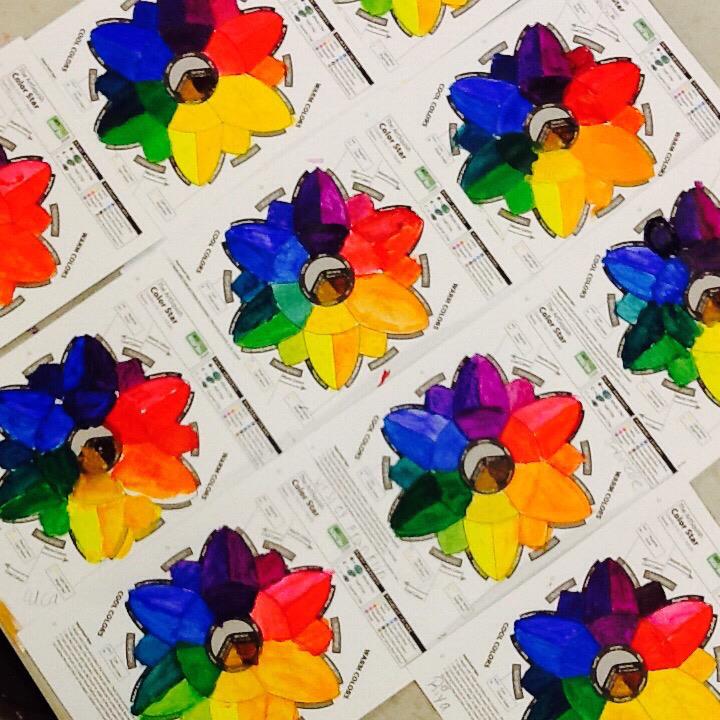
Color Star
Print on CARD STOCK paper and make enough for each student to have one
Hand out the Color Journal prints. Make sure every student understands that this is theirs to create and keep in their folder or binder.
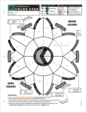
1 Page – Opens in new window
2.2 Print
Example
Finished Color Star
Print one of these to display in your room, and/or show students what the final Color Star will look like.
NOTE: Colors are printed, so they are not going to be nearly as brilliant or accurate as real pigments.
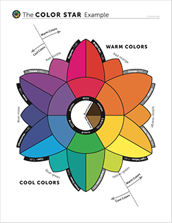
1 Page – Opens in new window
2.3 DEMO
Please learn the demo by watching the video. This week’s demo is ok to show, but has more teacher information than usual, so it’s longer than it needs to be for students. It will be best to do the demo yourself, which is always more interesting to watch.
The class should gather around and watch as you demonstrate how to fill in the color star. During the demo, fill about 3 areas, and make the following points:
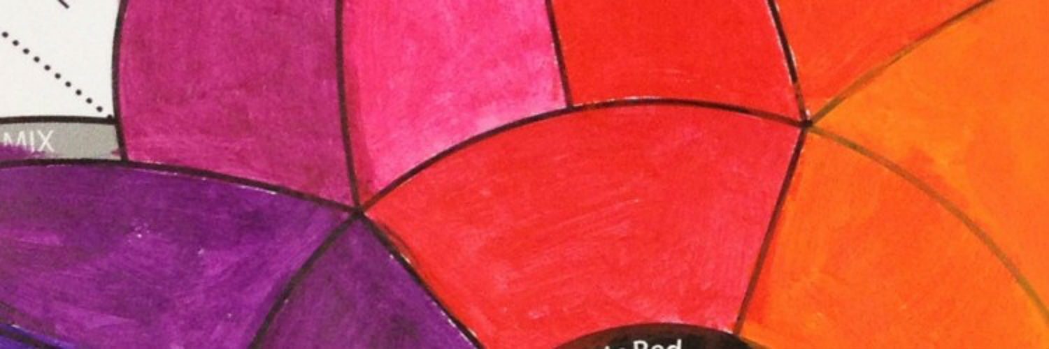
- Do all of the colors one at a time, cleaning the brush well between them. All of the tube colors are labeled with a black banner, and will be used right out of the tube. The grey-labeled colors, and the smaller colors in-between, will need to be mixed. Usually the mixes are pretty easy and need about same amount of the two colors used to make it. The two browns in the center can be done last. There are a few hard-to-make colors that have formulas for you shown in the boxes with arrows.
- Begin with Violet and the rest of the purples. Then move down, doing Ultramarine next. There are numbers to follow that make it easier for mixing and not wasting paints.
- Use small amounts of paint. Spreading paint thin is much better than having thick paint. Get more if you need it though, and/or add a small amount of water.
- Use water to thin the paint some, so that it is not full strength and shows the color well. Cool colors are dark. Purple, Pthalo green, (pronounced “thaylow”) and Ultramarine are the really dark pigments, so these will need just a bit more water than the others, and are indicated with a star. Be careful to not make the colors light though. This is not watercolor. You just want to see the brilliance of the pigment and if it is thick, it will be too dark. Spread the darker cool colors really thin by wiping excess paint off your brush onto a paper towel.
- Do not add white to the colors. If it’s too dark, use a bit of water.
- Use a smaller brush with a nice point, and turn it or the paper to get a nice edge and into all the corners. Be neat and don’t cover up the labels.
- If the paint is dark or you’re getting either globs or dry-brush effect, add water. If it’s too light and pastel, add more paint.
If you have grades 6 and up, show how to fill each area as a light-to-dark gradient, using a little more water to make an area fade lighter. It doesn’t matter where the dark part is or the light part, just that there is at least some amount of value change. This will show the pigment range which is a better reference. Younger students should not be asked to do this, and even some of the older ones may have trouble, so make it optional, and keep the stress out of it. It’s even ok to try just a few areas with gradients, and some without.
Tap the 4 arrows icon to enlarge the video to full screen.
Review the demo video and demonstrate to your students. (The Art Instructor was formerly, ArtSquish).
You can continue going around the color star for each class demo you make, adding 3 more areas for each class.
LEARNING TARGETS
Students know how to set up their work area for painting with acrylics.
M A T E R I A L S
- Acrylic paints
- Brush – small/medium
- Palette pad
- Water container
- Smocks
- Paper towels
- Color Journals
Paint pigment list:
- Napthol or Pyrrol Red
- Hansa or Light Yellow
- Pthalo Green (blue shade)
- Cyan or Cerulean Blue
- Ultramarine Blue
- Dioxazine Purple
- Magenta
- Burnt Umber
- Raw Sienna
3.1 arrange
Once students have collected and laid out all their supplies, they can start prepping their palette pad. For this painting activity, white acrylic paint will not be used so it doesn’t even need to be out on the table. Students are only painting in small areas today so they don’t need to put out a lot of paint. Start with about half a chocolate chip of a color and if they need more, they can get more paint out. There are some formulas, and they can make too much paint if the chips are sized like regular chocolate chips. Students may want to use smaller chips for these special sections today.

LEARNING TARGETS
Students know how their pigments are arranged in a color wheel model.
M A T E R I A L S
- Acrylic paints
- Brushes
- Palette pad
- Water container
- Smocks
- Paper towels
- Color Stars
4.1 paint
Be sure all names are at the top of the paper!
Once the color stars are drying on the drying rack, they will all look the same and it will be difficult to return each paper to the correct person.
The students should be careful to follow the numbers in order and save some of each color for mixing with other ones. This makes it easier to do and eliminates most of the duplicate color mixing.
If dividing into two 52-minute sessions: Part one ends after 20 minutes with a couple of minutes left for cleanup, and the next session is all set-up and finishing the color star.
LEARNING TARGETS
Students know how their pigments are arranged in a color wheel model.
M A T E R I A L S
- Acrylic paints
- Brushes
- Palette pad
- Water container
- Smocks
- Paper towels
- Color Stars
5.1 teach
As you work on your star, you’ll notice that each of the main color families have 3 versions, and that the points of the star are split into 2 variations of that family.”
LEARNING TARGETS
Students know the importance of cleaning up.
M A T E R I A L S
- Paper Towels
- Cleaning wipes
- Sink
- Waste baskets
- Well-lit spot for photos
- Camera or phone-camera
6.1 clean
- Wash hands
- Put art supplies away
- Wipe tables & toss trash
- Remove any smocks (last)
- Check for items on floors and tables
6.2 photo
OBJECTIVES
- Practice and improvement in managing acrylic paints
- Understanding how colors relate to each other
- Accomplishment in making a very important tool
- Fulfillment by respect from you, the teacher
TROUBLESPOTS
Wrong Place – If a student puts the wrong paint in an area you can help fix it. First carefully wipe excess paint off with a paper towel. Then let it dry or use a blow dryer. Get out some white paint and use it to cover the mistake area. While it dries, skip that section and go to the next logical section. Come back at the end to finish, by painting over the white.
Thick paints – The cool colors especially, are so dark out of the tube, that you can’t tell what the color actually looks like. There are 2 instructions on the Color Star printout that address this. 1) Dipping the brush in water and mixing that bit of water into the paint will thin it out some. 2) Wiping the brush on a paper towel first will remove some paint, allowing it to go onto the paper thinner. However, you can get too much water, and have a light version of the color, which is not desirable either.
Hard to mix colors – There are 4 colors indicated with some formulas to address this. These are hard to get a good happy medium (pardon the pun), because one of the pigments used is so much stronger than the other one. The yellows are the most difficult of these. The bright yellow is pure tube color and very intense (not very suitable for using without mixing with other colors). The deep yellow next to it is almost a school bus yellow, but far enough away from yellow-orange that you don’t confuse it with that tertiary. The center yellow is in-between these two, so it will be a strong canary yellow.
The Bright Green is mostly yellow, because Pthalo Green is very blueish and extremely powerful. Yellow-green is also hard to make unless you clean your brush and use almost all yellow with a dab of the bright green.
Painting over the words – Be careful about the labels. The Color Star makes a better tool if you can read them!
ART WORDS
Gradient – When a color gradually changes from one color to another, or from dark to light.
CLASSROOM
PREP
What your room needs
Here are your printable lists and room prep instructions.
Opens in new window
CLASSROOM
MATERIALS
- Water container
- Paper towels
- Smocks
- Color Star PDF
STUDENT’S
MATERIALS
- 14″ x 17″ Sketch Paper
- 2B Pencil
- White erasers
- Oil pastels
- Blender sticks (stumps)
- Sandpaper boards (to clean blenders)
- Acrylic paints
- Brushes
- Palette Pad
PREVIEW
Week 22: Clay Sculpture and Drawing
Week 23: Opposites Color Journal
Our Color Journals continue with what might be the most important one we do in our full two years of Foundations. Each pigment in the color palette is matched with an opposite pigment or mix of two pigments, that produces the most neutral color possible. First the opposites create shadow colors of each pigment, and then they mix to a full neutral. We create 2 rich blacks, several grays, and 2 browns. Each mix is also used with white to create a lighter version.