
Painting
Each lesson Plan focuses primarily on one of the 4 Cornerstones of Art:
Drawing | Painting | Color | Style
OVERVIEW
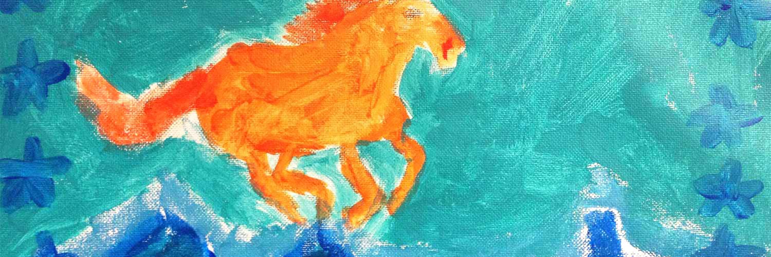
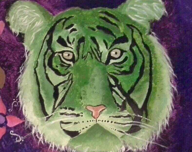
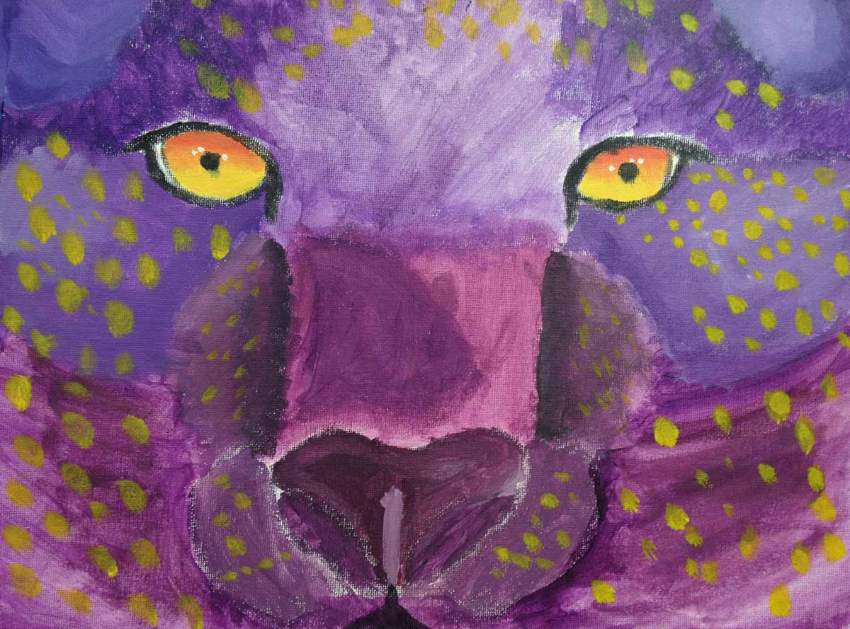
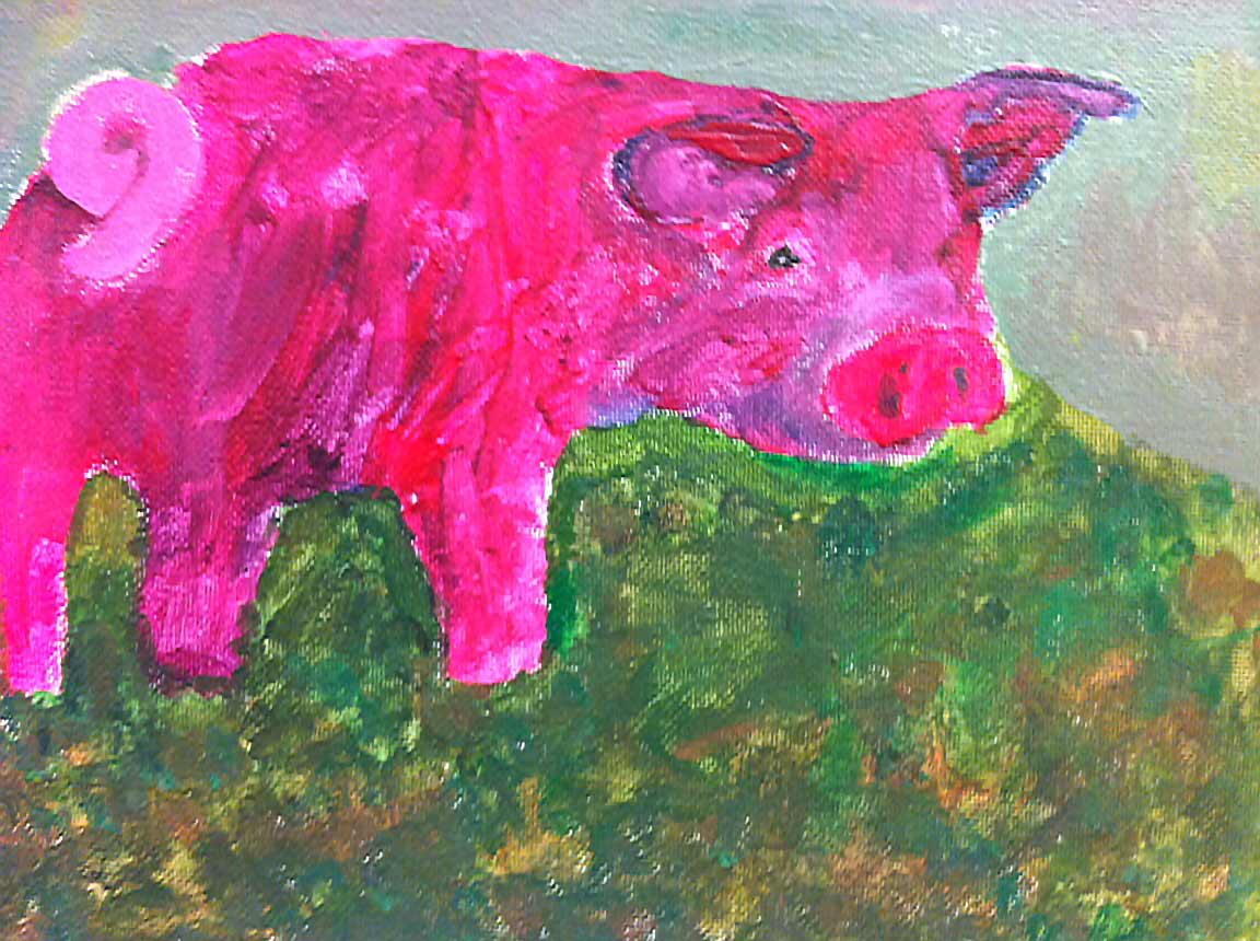
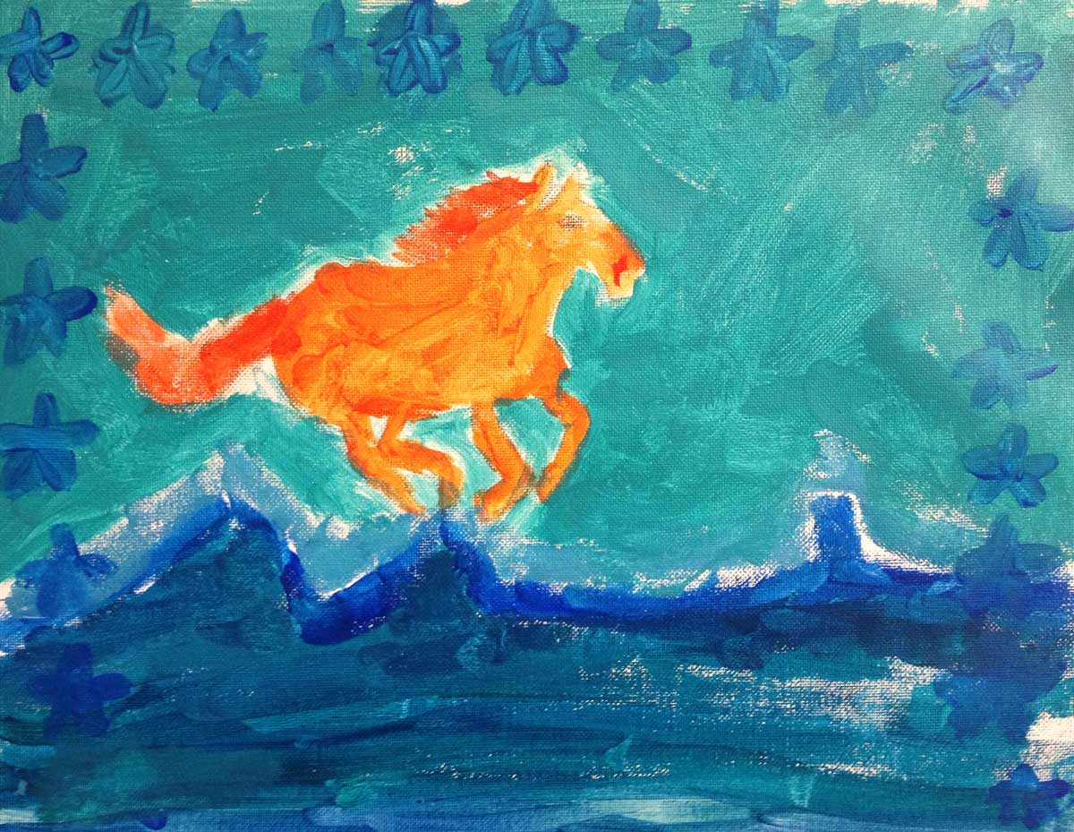
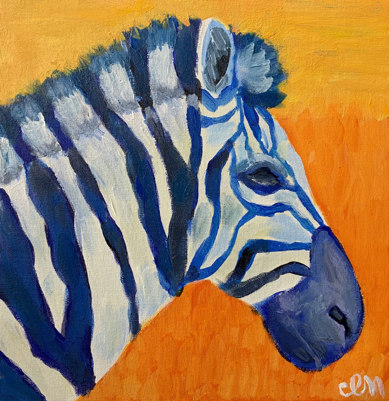
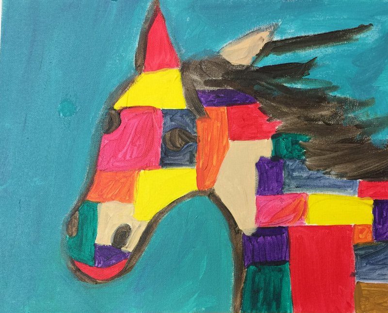
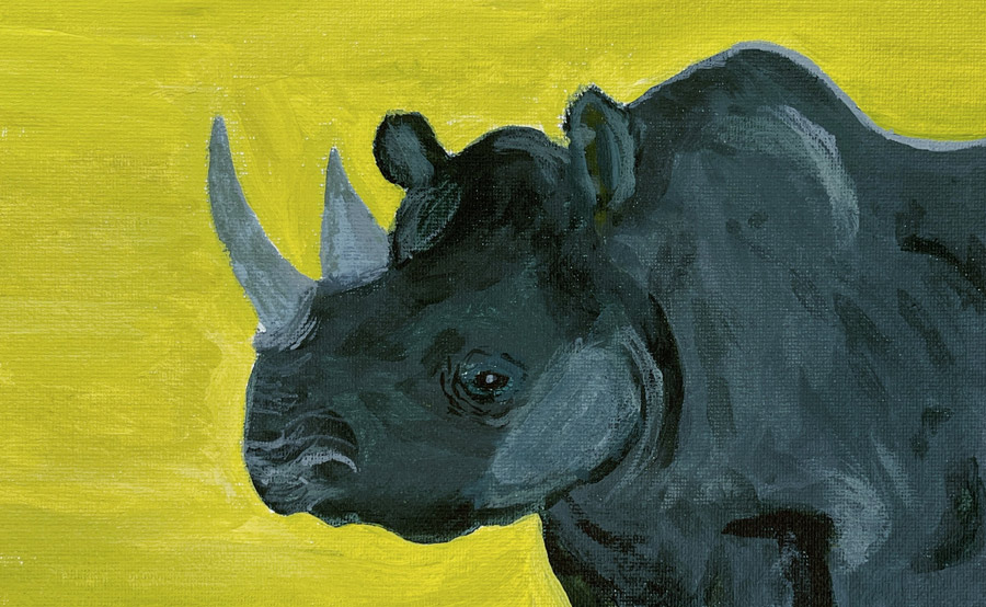
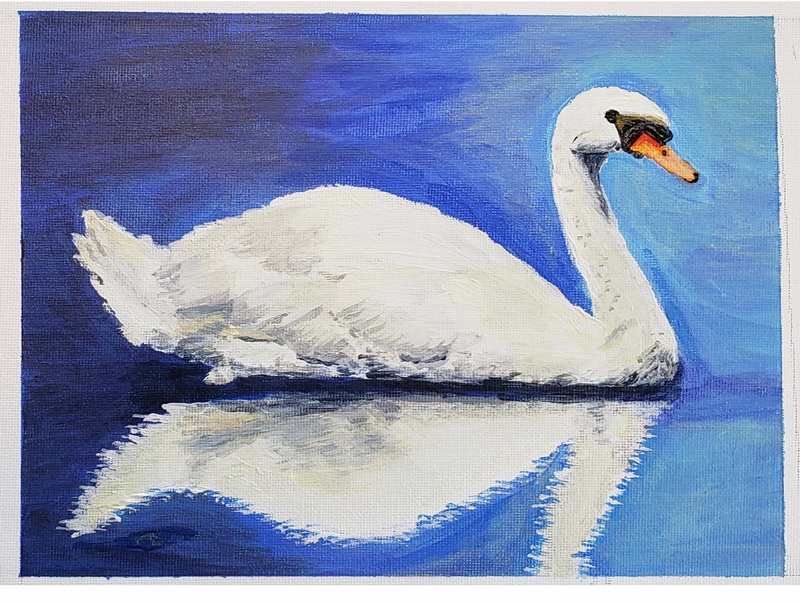
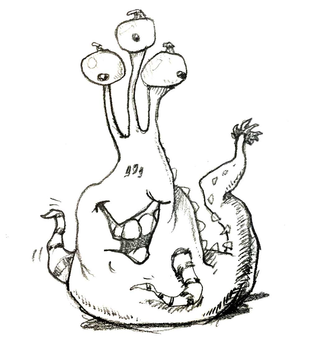
Complementary colors are used for a 2-week project: a colorfully expressive animal painting in acrylics on canvas. Students will choose an animal, draw it, and will then use expressive complementary colors to paint a bright and unusual work. The colors may be natural complements, such as a brown (orange) animal and a blue sky, or unnatural complements, such as a red and green zebra.– – –
Grades 3 – 5
Week of March 2 – 6
1 Hour & 45 Minutes
SCROLL & TEACH LESSON PLAN
Don’t worry about rewriting anything. Just spend a few minutes reading the lesson plan and printing out your PDFs. Then check out the READY, SET, GO! section and print your prep-page, which includes checklists and an “at a glance” outline of the lesson so you can stay on track when you’re teaching. Set out the materials from the list on your prep page and you’re ready.
That’s all you need to know. Use your smartphone to Scroll & Teach!
Lesson At A Glance
A brief overview of each step. Buttons jump to each section for detailed information.
10 Min – Painting tips
12 Min – Small color study with oil pastels
5 Min – Create a neat work area
10 Min – Big shapes with canvas pencil
35 Min – Paint
5 Min – Paint the lightest spots
SCROLL & TEACH
LESSONPLAN
Each section is a different color. Read over once and then you can SCROLL & TEACH using any device you like. It’s designed to work best with your phone.
LEARNING TARGETS

Students know how to pratice sketching
M A T E R I A L S
- 14″ x 17″ Sketch Paper
- 2B Pencil
- 4B Pencil
- White Eraser
1.1 Print
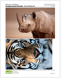
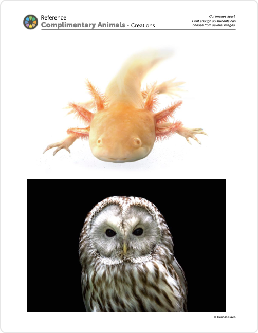
Reference
Animal Photos
Cut images apart and print enough for each student to choose from several.
If you have more photos of animals, add a few more if you like. It helps to limit the number and the time allowed for selecting.
5 Pages – Opens in new window
PRINT 2
3 Pages – Opens in new window
1.2 Choose
It’s helpful to allow students to switch after they’ve begun sketching if they find that a subject is too hard. Try to steer them towards a more simple animal if you can.
Limit students to only one referrence change though, or they will not have time to sketch and become familiar with their subject, leading to frustration and disatisfaction with the end result.
1.3 sketch
Make sure they understand that their choice will become a full color painting for this week and next. Students are free to change their animal reference within the first 10 minutes of class.
Types of practice drawings:
1. Thumbnails – Do at least 2 of these.
Make very small postage stamp sized boxes to plan how the big shapes will be arranged in the frame.
2. Speed sketches – Do 2 to 4 of these.
A large version of a thumbnail, that helps you practice the big shapes at the size you’ll paint, without worrying about the details. It helps to use charcoal so you don’t even try to draw details.
3. Study sketches – Do 1 or 2 of these.
Any detailed sketch with shading, of a portion of your reference.
1. Frame – Get the proportion accurate first
2. Big Shapes – Look at size, shape, proportion, and relationship to other shapes or points of reference. Look at the Air Shapes too.
3. Details – The fun part is more fun after getting the Frame and Big Shapes accuracte. This is main part of doing any artwork, just don’t skip right to it or it will be frustrating.
CREATIONS - tap here to open
Use the Student Instructions printout below to distribute to your Creations students. Tap the image to open the PDF in a new window.
Painting
Overview: Students will create a painting of their own choosing: Artists’ Choice. They should also review and follow the 7 Stages of Art (see STEP 2 below). One of the objectives is to quickly move from inspiration to choosing reference and joining the rest of the class in moving through the stages.
If they are still working on the portrait from the last 2 weeks, they should finish that first.
Use this button to jump down to the preparation section.
STEP 2. The 7 Stages of Art
Students will learn a memory technique to help them stay organizedLEARNING TARGETS
Students know how to move from stage to stage for creating artwork
M A T E R I A L S
- 14″ x 17″ Sketch Paper
- PDFs
2.1 Print
infoGraphic
Poster or Handout
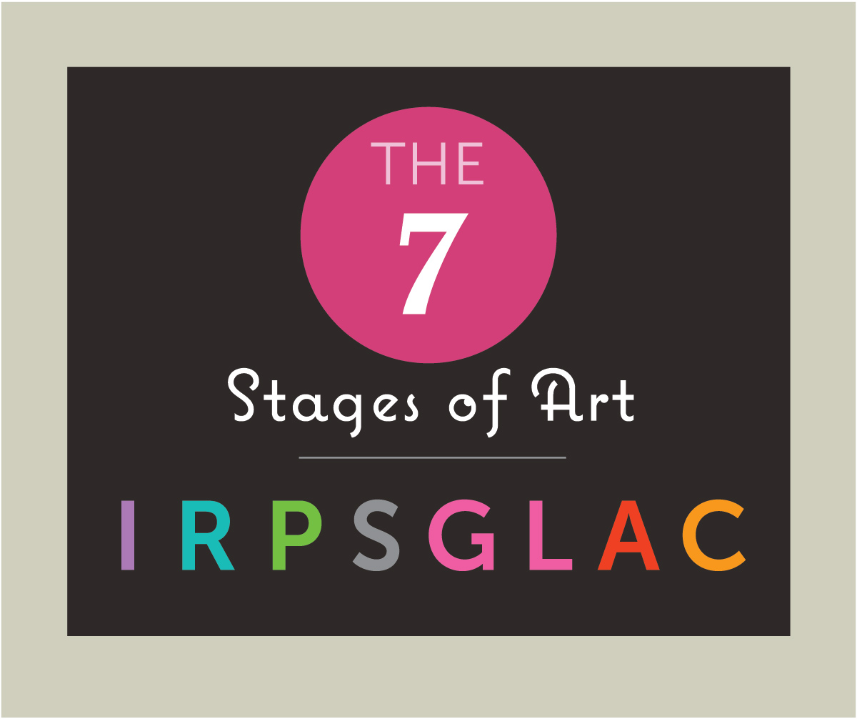
The infographic reminds students of the 7 stages of creativity using the acryonym, IRPSGLAC.
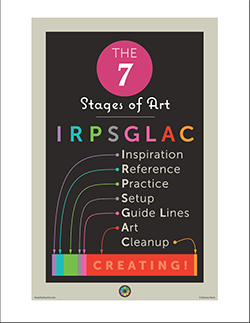
1 Page – Opens in new window
There are 7 States of Art
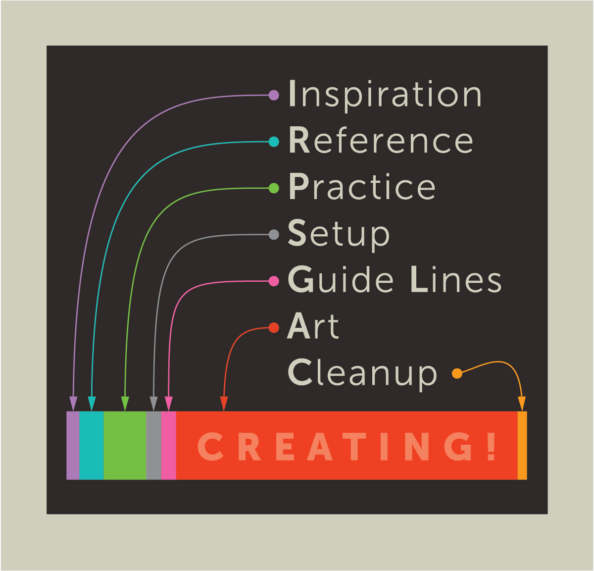
The first 5 stages take little time, but are very important.
This is what an IRPSGLAC actually looks like
2.2 learn
Alternatively you can provide a print of the PDF for every student to keep as reference.
Encourage drawing little pictures of the steps along with the notes the students are taking. Artists retain information better when doodling.
IRPSGLAC
Go over each stage briefly while you’re on the 2nd slide.
1 Inspiration – what makes you eager to begin?
2 Reference – find good pictures or objects
3 Practice – There are 3 practice sketches you can do:
Thumbnails for Design
speed sketches for big shapes
study sketches for details
4 Set up – An organized work area
5 Guide lines – light, lighter and lightest – modify until accurate
6 Art – Have fun!
7 Cleanup – Superwash, trash, check for stray supplies
Use this button to jump down to the preparation section.
LEARNING TARGETS
Students know how to identify complementary colors
M A T E R I A L S
- 14″ x 17″ Sketch Paper
- Color Wheel PDF
3.1 learn
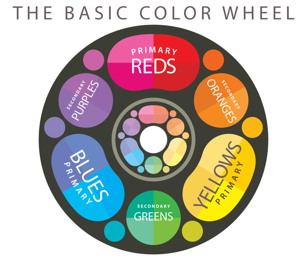
Read the teacher talk below. If students do not have their Color Star, use the graphic below to display to the class. Any color that lies directly across the middle from a color, is a complementary color.
Any red is a complement to any green. A primary always has a secondary complement, and tertiary colors have other tertiaries for complements, ie: red-violet is the complement to yellow-green.
Pigment opposites, which we covered a few weeks ago, are very specific and help with mixing, whereas complements are more generalized visual pairings of colors – a color scheme. Students will need to begin to understand the difference between the two kinds of opposites, if they want to master color mixing as well as color schemes.
So, lets get out our notebooks and look at the color star.
Choose 2 colors for your animal painting from your color star that are situated directly across from each other. These are called complementary colors, and are always directly across from each other on a color wheel.
As a color scheme, Complements are tried and true. All kinds of reds look good with all kinds of greens. You can put dark olive green with magenta or light pink, for instance, and this is a complementary color scheme.
If you were here a few weeks ago, we mixed perfect pigment opposites. Complementary colors seem very similar, but there is a difference. Pigment opposites are specific, and help you mix colors, making shadow colors by darkening and dulling. Every pigment has it’s one best opposite pigment, not just any complementary color.
Complementary colors are all about how they look when next to each other on your canvas. They complement each other because there is a lot of color contrast.
You can use primaries with the secondary color on the other side, or any tertiary with it’s complementary tertiary color.
While painting, you should use pigment opposites to mix dark variations of each color for shadows. Use white to lighten
Neutrals are also fine to use in your painting, and can make the opposites less vivid. Neutral colors, such as white, black, or grey, can be mixed using 2 pigment opposites and blended with white for lighter versions.
Do not use any brown pigment as a color by itself, or to darken any light colors, unless they are the pigment opposite. Use browns only to warm up dark colors or to make black and gray.”
Use this button to jump down to the preparation section.
LEARNING TARGETS
Students know how to plan out their painting
M A T E R I A L S
- 14″ x 17″ Sketch Paper
- Oil Pastels
- 2B Pencils
- White Eraser
4.1 color
Use this button to jump down to the preparation section.
LEARNING TARGETS
Students know how to set up their work area for painting with acrylics.
M A T E R I A L S
- Acrylic paints
- Brushes
- Palette pad
- Water container
- Smocks
- Paper towels
Brushes should be nylon for springiness and durability. Round brushes are the most versatile.
Paint pigment list:
- Napthol or Pyrrol Red
- Hansa or Light Yellow
- Pthalo Green (blue shade)
- Cyan or Cerulean Blue
- Ultramarine Blue
- Dioxazine Purple
- Magenta
- Burnt Umber
- Raw Sienna
- Titanium White (professional grade only)
5.1 setup
Create a neat work area.
- Water should be near the palette
- Tubes should not be standing up because they fall into your work or palette
- Palette, brushes, water, and paper towel should be on the right if you are right handed.
- Set up your reference so you can see it easily without having to turn your head or stand up.
- Tape your canvas to a board
- Smocks
- A table or floor easel may be used if available

Use this button to jump down to the preparation section.
LEARNING TARGETS
Students know how to draw guidelines for their paintings
M A T E R I A L S
- 14″ x 17″ Sketch Paper
- Canvas Pencil
- White Eraser
6.1 draw
Take your time so you can be accurate, but only do the 5 or 6 biggest shapes and a few other important guide lines such as eyes and nose or tail.
Use this button to jump down to the preparation section.
LEARNING TARGETS
Students know how to create a painting using complementary colors
M A T E R I A L S
- Acrylic paints
- Brushes
- Palette pad
- Water container
- Smocks
- Paper towels
7.1 paint
- Paint the background first, one area at a time.
- Work from the top and come downward as you finish areas.
- Work from dark to light, in the sunrise method.
- Mix colors. Do not use them right out of the tube (bright red is ok)
- Mix water or have enough paint so you’re not scraping dry brush
- Cover the canvas so that there is no gesso showing. Very important!
Use this button to jump down to the preparation section.
LEARNING TARGETS
Students know the importance of cleaning up.
M A T E R I A L S
- Paper Towels
- Cleaning wipes
- Sink
- Waste baskets
- Well-lit spot for photos
- Camera or phone-camera
8.1 CLEAN
- Wash hands
- Super-wash brushes if used
- Put art supplies away
- Wipe tables & toss trash
- Remove any smocks (last)
- Check for items on floors and tables
8.2 PHOTO
OBJECTIVES
- Practice and improvement using acrylic paints on canvas
- Understanding how to use color schemes in artwork
- Accomplishment in creating an animal painting
- Fulfillment by choosing subject and design elements
TROUBLESPOTS
Using color out of the tube – Out of the thousands of colors we like to use, only pure white, and the brightest red are available straight from the tube. All the others must be mixed.
Being hasty instead of speedy – A speed drawing is done quickly so that you skip the details. If it’s done so fast that you don’t actually attempt accurate shapes, it does no good at all for learning your subject. At that point you’re playing and scribbling.
3 Tubes of paint woes – 1) Tubes for students often have large flat snap tops. We have our artists tape the snap (don’t snap your cap!) 2) When squeezing out the paint, think of the tube as if it was a bottle of liquid, not a tube of toothpaste. It comes out fast. 3) Many students love to set the tubes up on their caps. They will inevitably fall into their wet paint and/or their artwork, so we have them lay them down.
ART WORDS
Complementary colors – Any two colors that are on the opposites sides of a color wheel. There are 2 reasons for pairing opposite colors.
- Perfect opposite pigments will dull and darken each other. Use them together to create vibrant shadow colors. The ArtSquish Color Star helps to find perfect opposites. See the PDF in Step 3.
- Generally opposite visual colors tend to look good together. This is a complementary color scheme.
Guide Lines – Drawing very lightly, and without details or shading, allows an artist to erase, modify, and define the biggest shapes as a guide for where to paint. Using what we call a canvas pencil (colored pencil that is dark gray), we don’t have the problem of messy graphite mixing with our colors or staining the canvas surface.
CLASSROOM
PREP
Print all of your PDFs from the lesson plan and cut any references apart as needed.
What your room needs
Here are your printable lists and room prep instructions.
Opens in new window
CLASSROOM
MATERIALS
- 8.5″ x 11″ copy paper
- 8.5″ x 11″ card stock
- 11″ x 17″ copy paper
- Rulers
- Scissors
- Box cutter (teacher only)
- Large Drawing boards with clips
- Water containers
- Spray bottles
- Water droppers
- Paper towels
- Smocks
STUDENT’S
MATERIALS
- 14″ x 17″ Sketch Paper
- 2B Pencil
- 4B Pencil
- White Eraser
- Oil Pastels
- Acrylic paints
- Brushes
- Palette Pad
- Canvas Pencil
PREVIEW
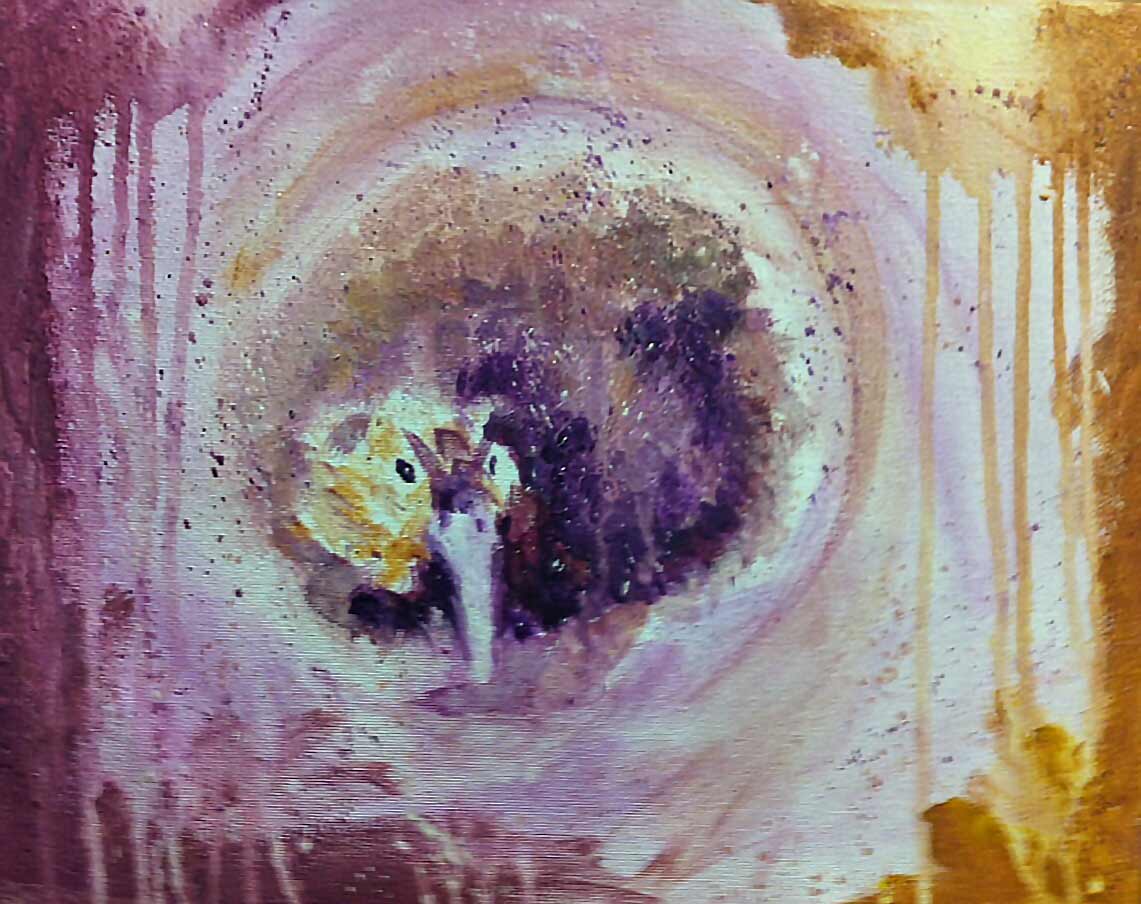
Week 25: Complementary Finish
This week everyone will continue on their animal paintings using the complementary color schemes and mixing opposites for shadow colors. Paintings should be finished this week. There is a fun drawing in the round game for early finishers
Week 26: Colors Under the Knife
Continuing with painting, Students will learn how to use the palette knife painting technique before working on a landscape. There are specific colors that must be mixed and used side by side. This helps artists see how expanding your colors to several variations enhances the final painting.