
Painting
Each lesson Plan focuses primarily on one of the 4 Cornerstones of Art:
Drawing | Painting | Color | Style
OVERVIEW
Students will choose from a set of landscape photo references, and paint in acrylics on canvas. They’ll learn to show depth by using atmospheric perspective, working from farthest to closest, and top to bottom. Two color techniques are used: 1) mixing colors from other parts of the painting into each color for harmony, and 2) Color splitting. The lesson takes 2 weeks.– – –
Grades 3 – 5
Week of September 16 – 20
1 Hour & 45 Minutes
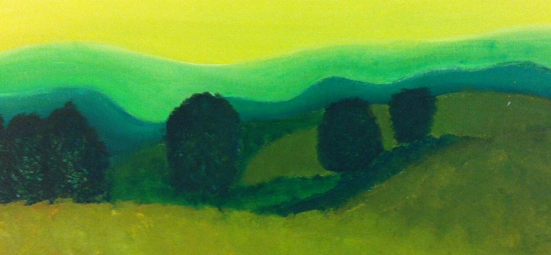
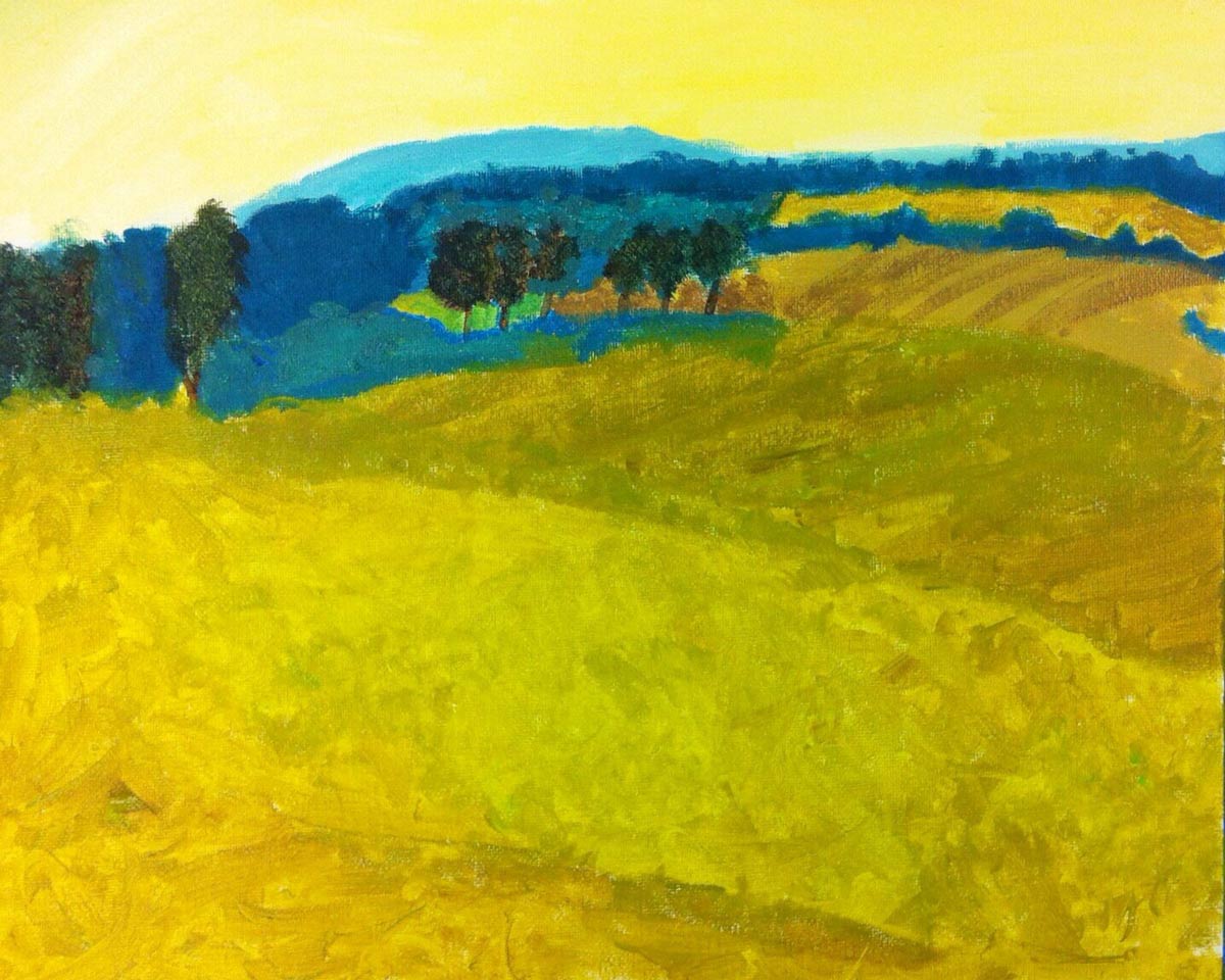
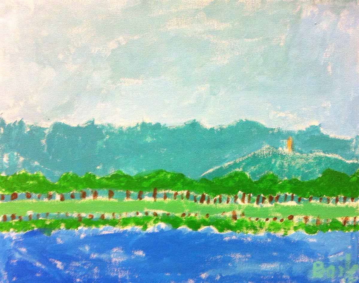
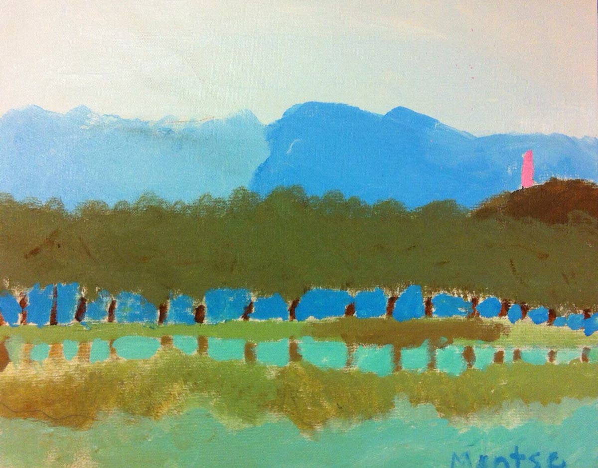
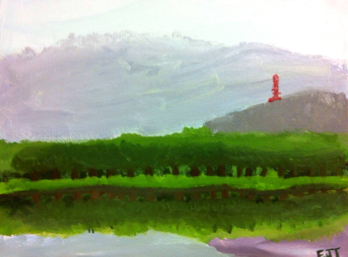
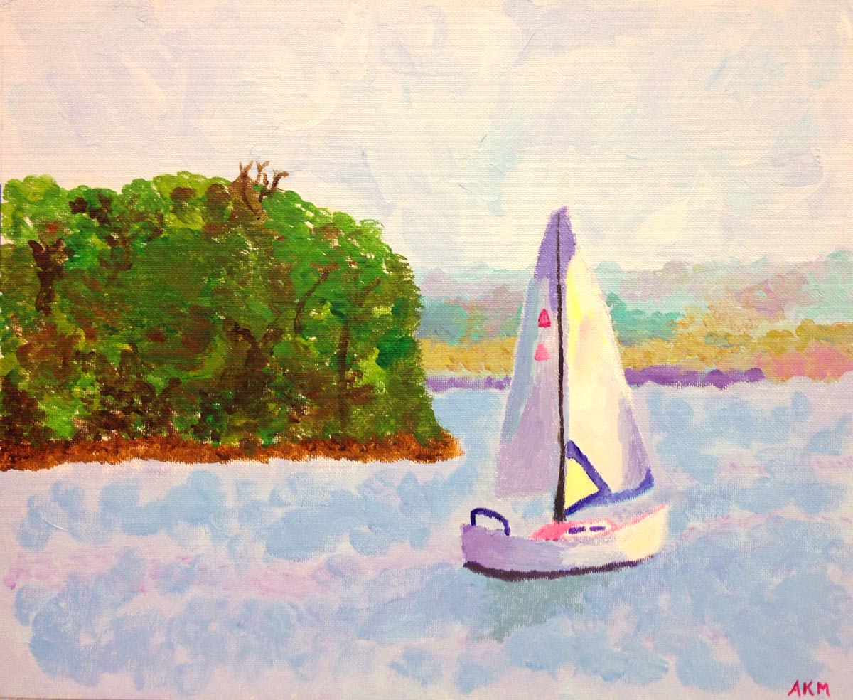
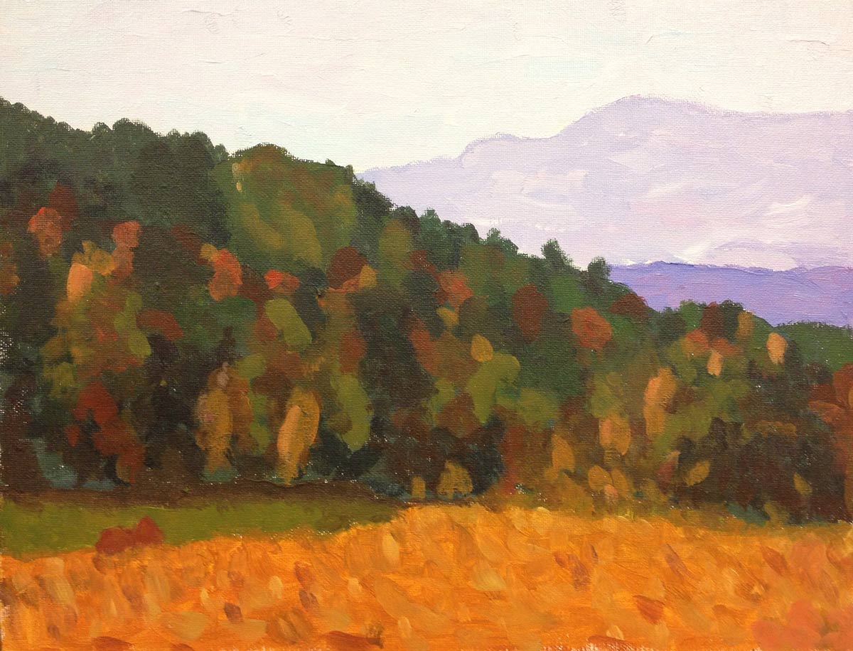
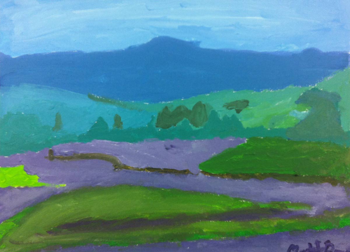
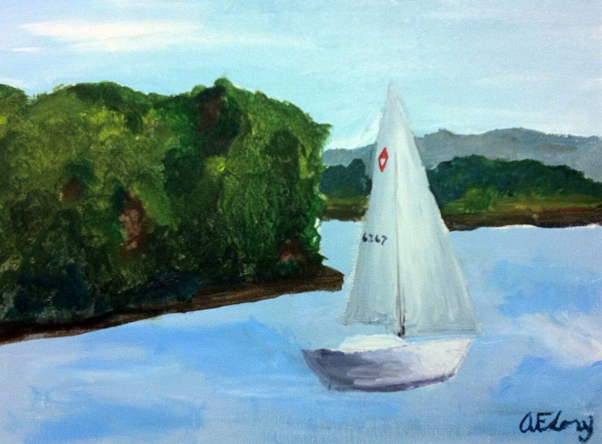
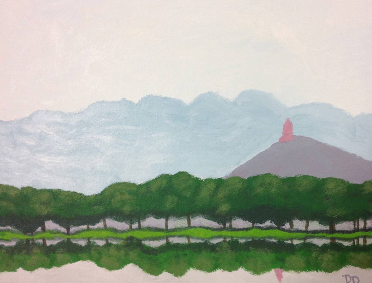
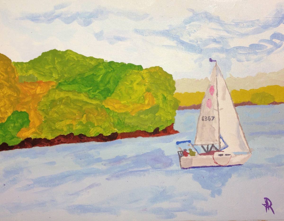
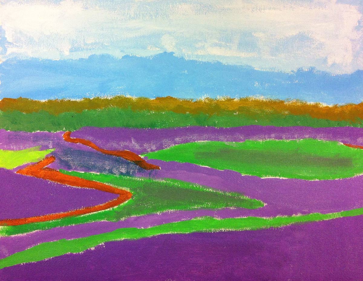
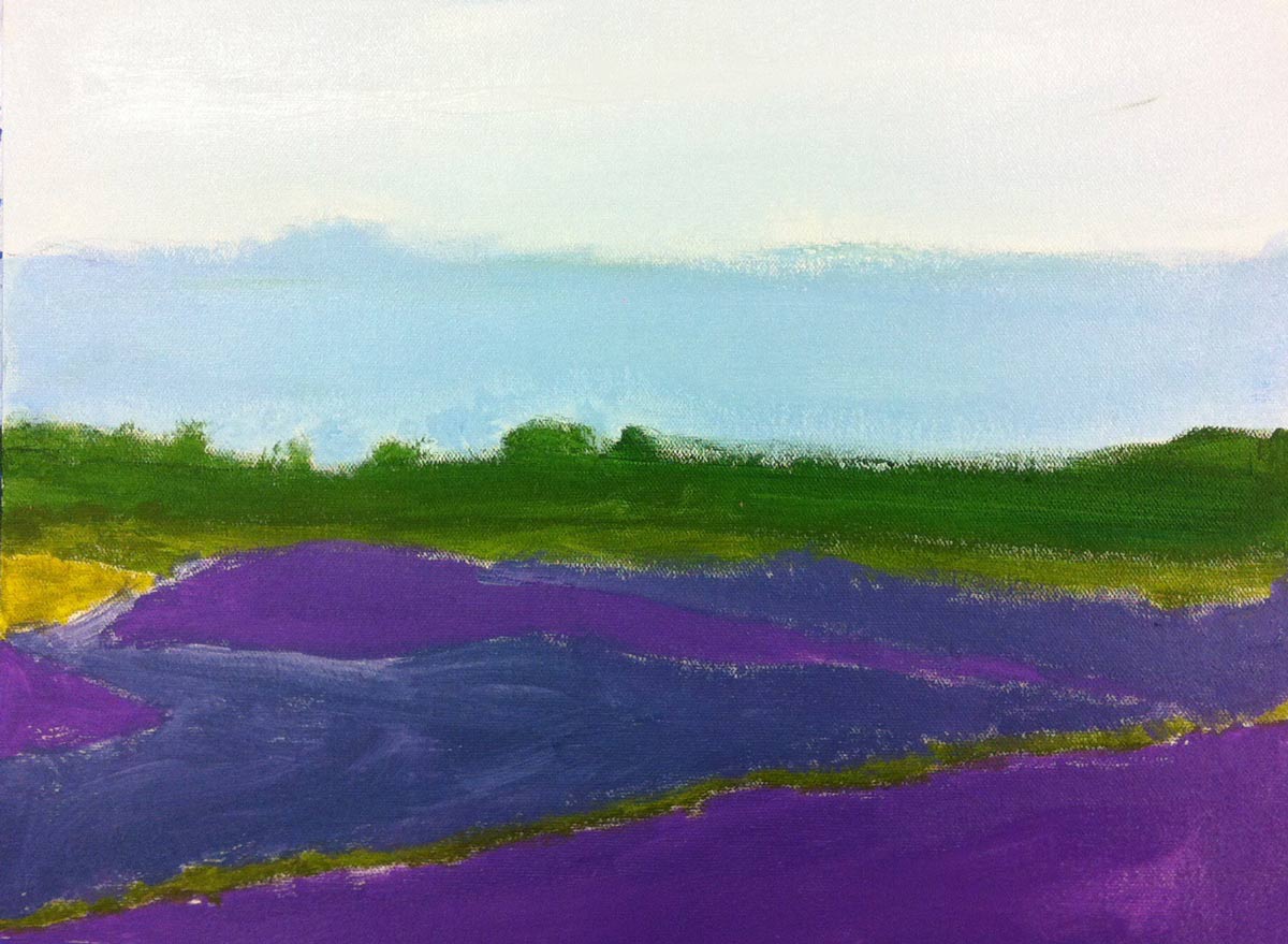
Student Work
Lesson At A Glance
A brief overview of each step. Buttons jump to each section for detailed information.
15 Minutes – reference, Pin board, & speed sketching
15 Min – Big Shapes first, then add shading
7 Min – Demo tearing canvas sheets & taping to boards.
15 Min – Students draw in reference onto their canvas.
15 Min – Sky colors are mixed & painted onto the canvas.
20 Min – Students begin painting the distant land.
12 Min – Adding color to the next closest land.
5 Min – Everyone helps
Use this button to jump down to the preparation section.
SCROLL & TEACH
LESSONPLAN
Each section is a different color. Read over once and then you can SCROLL & TEACH using any device you like. It’s designed to work best with your phone.
LEARNING TARGETS

Students know how to identify the Steps To Accuracy
M A T E R I A L S
- 14″ x 17″ Sketch Paper
- Compressed charcoal
- 2B Pencil
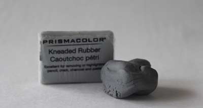
- Kneaded Eraser
All materials are suggestions and may be modified as you see fit. We have tried many items, and these seem to allow the most versatility for the cost. Here is a Kneaded eraser below, one in package and one that has been kneaded:
1.1 Print
Reference
Landscapes
These have been chosen for ease, variety, and atmospheric perspective.
Hand out reference prints. Cut images apart and print enough for each student to choose from several.
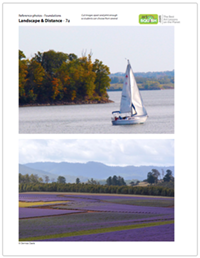
3 Pages – Opens in new window
1.2 Choose
As students arrive, have them choose a reference photo.
Cut the photos out and arrange on a table or counter so students can access them right as they arrive. Explain that they are going to do a two-week landscape painting.
1.3 Sketch
Everyone should make 2 quick charcoal sketches.
Using the charcoal stick, and holding it like a stick instead of a pencil, have students draw two frames on one page (rectangles that match the proportions of their photo reference). Then take only about 60 seconds to make a super-rough sketch of the landscape, trying to get the big shapes in the right places and sizes. Shading can be applied if time allows, using the side of the charcoal.
While students work, show the Landscapes Pinterest Page and discuss atmospheric perspective. You can pause the presentation to move to each step so you don’t get behind.
Landscape Paintings (tap any image to open viewer)


Use the canvas pad for a template.
Everyone can set the canvas pad onto a new clean page in their large sketch pad and use a regular pencil to trace the edges. That’s the FRAME (the first step) made easy!
Continue on to the second step to accuracy with BIG SHAPES and guidelines. Remind them to use the edges of the frame to see where the big shapes touch, and only draw the 3 or 4 biggest shapes before anything else. Erase and modify often for the best accuracy.
While students work, show the Landscapes Pinterest Page and discuss atmospheric perspective.
1.4 Trace
Use the Canvas pad as a template for a new FRAME.
Everyone can set their canvas pad in the middle of a new clean page in their large sketch pad. Use a regular pencil to trace around all 4 edges.
That’s the FRAME – the First step in the 3 steps to accuracy.
1.5 Draw
Use a pencil to draw super-light guidelines.
Continue using the pencil and move on to the Second step to accuracy with BIG SHAPES, and make some very light guidelines – for only 4 or 5 of the biggest shapes. Remind them to use the edges of the frame to see where the big shapes touch. Erase and modify often for the best accuracy.
While students work, continue to show the Landscapes Pinterest Page and discuss atmospheric perspective.
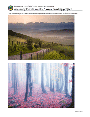
CREATIONS - tap here to open
Our Creations lessons are for students who have completed the two years of Foundations and are ready to begin using all that they have learned to create new work. These more challenging versions of the same concepts and techniques are easily taught along-side students in the Foundations course. This allows for excellent review, and is encouraging for students to see progress from each viewpoint.
Use the Student Instructions printout below to distribute to your Creations students. Tap the image to open the PDF in a new window.
3 Week Landscape Painting
Overview: Students will find reference, create sketches and compositions, set up a canvas, and paint a landscape using atmospheric perspective. Architectural elements can be involved as well.
STEPS 1 & 2 – Inspiration & Reference – Should take 10-20 minutes
Find a reference or use one from the provided printout. Make sure at least part of the image is something you are happy about working on.
STEP 3 – Practice drawings – Should take at least 30 minutes – up to an hour
There are 3 kinds of practice drawings. The first two are required. Detailed drawings are optional.
- Quick rough sketches – No more than a couple of minutes each. Charcoal is great for this.
- Thumbnail composition sketches – These should be very small, and only for quickly manipulating the Frame and Big Shapes to try different compositions quickly. Very much like moving cut paper or puzzle pieces around to experiment and see what works best.
- Detailed practice drawings (of important areas)
STEP 4 – Set up canvas – Should take 5 minutes
Use a canvas board, a stretched canvas, or tape a canvas sheet to a drawing board. Write your name on the back or on the tape using a bold marker.
STEP 5 – Guidelines – Can take 10 to 30 minutes
Use a canvas pencil (gray colored pencil – doesn’t mix into paints) and draw very lightly on your canvas. Make lines that will help you with accuracy, but defining the Big Shapes first, and then adding any details that you need to define where they will go.
STEP 6 – Set up paints – Should take 5 minutes
If you have time to paint at least an underpainting or the sky, you can go ahead and set up for this today (first week). If not, you should wait and find something simple and fun to sketch for the rest of this session today.
STEP 7 – Begin painting
Start with the sky (farthest away, and highest on the canvas) unless you’re doing an underpainting. You can underpaint for landscapes in two methods: 1. Put opposite colors under each area (orange under a blue sky, or purple under an orange sunset sky), or 2. change the color of your canvas from white to something warm such as red, orange, or brown. Underpainting colores should be thinned with a bit of water and they will normally be streaky, but it won’t show.
Tap images to open Creations Student Instructions and Reference Materials in new windows

Early
Finishers
Print the Artists’ Choice Expressions instructions for students who have finished their landscape
Use this button to jump down to the preparation section.
LEARNING TARGETS
Students know how to draw using the Steps To Accuracy
M A T E R I A L S
- 14″ x 17″ Sketch Paper
- Charcoal
- Kneaded eraser
2.1 Sketch
Continue working on large sketch (guidelines) from Step 1.
Use the side of a stick of compressed charcoal to create shading and details. Use the tip to make lines if you like.
Working with the side instead of the tip creates large gray areas. Add gray tones with this technique to match the light and dark areas in the photo reference. press lightly to create very light areas at the top, and press harder to create the darker areas and shadows towards the middle and bottom.
Then add some details and texture. This shouldn’t take long. Afterwards students should put away all these materials except for the reference.
Use this button to jump down to the preparation section.
LEARNING TARGETS
Students know how to set up their work area for painting with acrylics.
M A T E R I A L S
- Canvas Pad
- Drawing Board
- Blue Painter’s Tape
If you don’t break into two sessions, also set up paints:
- Acrylic Paints
- Water container
- Brushes
- Paper towels
- Smocks
Brushes should be nylon for springiness and durability. Round brushes are the most versatile.
Paint pigment list:
- Napthol or Pyrrol Red
- Hansa or Light Yellow
- Pthalo Green (blue shade)
- Cyan or Cerulean Blue
- Ultramarine Blue
- Dioxazine Purple
- Magenta
- Burnt Umber
- Raw Sienna
- Titanium White (professional grade only)
Canvas DEMO Steps – 6 images (tap any image to open viewer)

Canvas Pad
This is a pad of real canvas with gesso. Don’t use “canvas paper”, which is just paper with a textured surface.

Angle
Tear off sheets at a 45 degree angle, pulling from the outside corner.

Gesso
The back is not primed with gesso, and should be recognizable by specks of color, and a slightly off-white color that is not as shiny. Never try to paint on the back!

Measure
Use a long piece of tape and make sure it’s half on the canvas and half on the board.

Pinch
Pinch with both hands close together to tear the painter’s tape.

Done
Finished set up with 2 pieces of tape pressed securely.

Pencil
This is a canvas pencil. A colored pencil in dark brown/gray to mimic graphite.
3.1 Demo
Show everyone how to set up the canvas.
Ask a student who is young and would have a hard time tearing out a sheet of canvas, if you can use their materials to demo with.
Students should watch you demo before following along.
- Open the pad like a book and set down on the table.
- Take the first sheet and “turn the page” holding the canvas firmly at the outside top corner.
- Place other hand on the rest of the pages as close to the top seam as possible. Lean to hold it down.
- Pull the first hand and the first page towards you at an angle.
- Place the sheet of canvas on the drawing board.
- Tape the two short ends completely and press well.
3.2 Setup
Students set up their own canvas.
If you’re heading into the second half of the lesson today, also get out all of the paints along with palette pads, brushes, water tubs, paper towels, and smocks.
Use this button to jump down to the preparation section.
LEARNING TARGETS
Students know how to draw guidelines before they start a painting
M A T E R I A L S
- Canvas Pencil
The Canvas Pencil shown here is a Prismacolor Premier Warm Gray 90%. French Gray 90% can also look good. These mimic a regular pencil, but colored pencils are waxy, so they don’t lift up into the paints and ruin the color like graphite pencils do.
4.1 draw
Encourage students to draw in very, very light guide lines using their canvas pencil.
Remind your students again about using the edges of the Frame to find the Big Shapes. Draw all the big shapes, and then fill in any smaller detailed shapes that are needed.
Explain that these lines ARE NOT ARTWORK. They are there only to help you paint accurately. Don’t do any shading with the canvas pencil; only draw light lines.
TIP
Make sure to check that students are not using the EBONY branded graphite pencil which is also dark gray on the outside – use only the Gray colored pencil, which we refer to as a canvas pencil. This is wax based, so it won’t mix into the paints and change the color. It also can erase easier than graphite if you use it lightly.
Use this button to jump down to the preparation section.
LEARNING TARGETS
Students know how to mix variations of their colors
M A T E R I A L S
- Canvas Pad
- Drawing Board
- Acrylic Paints
- Water container
- Brushes – all sizes
- Paper towels
- Smocks
Brushes should be nylon for springiness and durability. Round brushes are the most versatile.
Paint pigment list for just the SKY color mixing:
BLUES AND GRAYS
- Cyan or Cerulean Blue
- Ultramarine Blue
- Burnt Umber
- Titanium White (professional grade only)
CREAM (the last picture ref)
- Yellow
- Warm red (just a tiny bit)
- Purple (tiny, tiny bit)
- White
5.1 Mix
Squeeze out chips to begin, and use a SMALL brush to practice mixing colors.
After students find a good sky color, have them create a larger amount of paint. You want plenty of paint for two good reasons.
- You want to paint the whole thing at once
- You’ll need extra sky-colored paint in the next step, to mix into the distant land colors!
It’s usually best to make less paint than you need, because variation in your colors is good. However, with the sky colors, it is best to paint the whole thing at once, and to have a buttery look to it, so being stingy with the paint will work against your efforts. Just be aware of students who love to squeeze tons of paint.
5.2 Split
Use part of the color to make two more variations.
Split the color blob into 3 equal parts. Then add some white to one, and a very small amount of color to the other.
“After you find the color that looks good to you, make more than one version of it. Make a lot of the color so you can do this, and so you’ll have enough to use in the next step after you paint the sky.
Split the color into 3 parts, and make one of them lighter and more cool, and another one just a bit darker, or maybe less cool. This gives you 3 variations of your original color.
Then paint your sky all at one time with lots of thick buttery paint. You will finish the sky before moving on to the next part, which is the farthest hills or trees which are touching the sky. Try to just cover up your pencil guide line so that you can cover the edge of the sky with the next layer of paints.
Remember, make at least 3 versions of your sky color to paint the sky with. A painter doesn’t want a simple one-color sky, but a mix of several variations.”
5.3 paint
Fill the sky area.
Watch the students work and offer help if needed.
IMPORTANT!
Make sure students don’t blend all their 3 colors together! Painting is fun, but you need to quit before you turn the 3 colors back into one.
Use this button to jump down to the preparation section.
LEARNING TARGETS
Students know how to paint a landscape with acrylics
M A T E R I A L S
- Canvas Pad
- Drawing Board
- Acrylic Paints
- Water container
- Brushes
- Paper towels
- Smocks
Paint pigment list:
- Napthol or Pyrrol Red
- Hansa or Light Yellow
- Pthalo Green (blue shade)
- Cyan or Cerulean Blue
- Ultramarine Blue
- Dioxazine Purple
- Magenta
- Burnt Umber
- Raw Sienna
- Titanium White (professional grade only)
6.1 paint
Help students mix their land colors to look very light, by mixing the leftover sky color into the land color.
The land next to the sky must be a little darker than the sky, so they may need to create more of the sky color to mix into the first land color.
Again, split into at least 3 variations, use thick, buttery paint, and finish the next area all at once. The farthest land will look flat, much like the sky.
“Use some of the sky colors to mix into the farthest land area! The land in the distance is very light, and has a lot of air, or sky, in-between it and the viewer. So make it lighter than you think, but some darker than the sky. In some cases, the distant land can look almost like a cloud, being very close to the sky color.”
TIP
If there is enough paint left over, and you can get back to the project within a week, spray a bit of water on the paint blob, put a sheet of Press N Seal plastic wrap over it, and save it for next time. 2 layers of Press N Seal will really help it last if there is not much paint.
Use this button to jump down to the preparation section.
LEARNING TARGETS
Students know how to paint a landscape with acrylics
M A T E R I A L S
- Canvas Pad
- Drawing Board
- Blue Painter’s Tape
- Acrylic Paints
- Water container
- Brushes
- Paper towels
- Smocks
7.1 paint
Students can continue in the same fashion, adding the previous land color to the next “closest” subject matter, such as a closer line of trees or hills.
Make plenty of paint but remember to practice mixing first. The paints should gradually be getting more colorful, and more varied for some contrast as you move down the canvas, which is also closer to the viewer.
TIP
Once you get to an area that does not show atmosphere, it will no longer need to have other colors mixed in, but it doesn’t hurt either. It’s actually helpful to use a brush that has only been wiped off, so you get colors that are related, and have harmony.
Use this button to jump down to the preparation section.
LEARNING TARGETS
Students know the importance of cleaning up.
M A T E R I A L S
- Paper Towels
- Cleaning wipes
- Sink
- Waste baskets
- Well-lit spot for photos
- Camera or phone-camera
8.1 clean
Students clean up their work area.
- Wash hands
- Super-wash brushes if used
- Put art supplies away
- Wipe tables & toss trash
- Remove any smocks (last)
- Check for items on floors and tables
8.2 photo
Try to get photos of your student’s artwork. Find a good spot for quick lighting without highlights or shadows from your hands and device. Ideally in-between two strong lights on each side.
OBJECTIVES
- Practice and improvement in applying paint and mixing colors
- Understanding the steps involved in creating a painting, and how depth is achieved with atmosphere
- Accomplishment by making variations of colors for the canvas
- Fulfillment in choosing the reference photo
TROUBLESPOTS
Guide lines – Some students will have trouble remembering to use whisper lines & not add shading. Remind them that it’s important to keep lines light so that they can easily erase if necessary.
Not enough variety – Not mixing variations of each color and painting with one simple color instead of 3 or 4 variations.
Stamping with a brush – You can sometimes see newer students pressing and lifting the brush without moving it. This creates a fan-shaped pattern, and while interesting, is not an attractive technique because paintings generally do not look as good when there is a pattern in the brush application. Encourage sliding the brush at least a little bit on every stroke.
ART WORDS
Depth – When a 2-dimensional work creates an illusion that some of the subject matter is far away. Depth is achieved with overlapping, perspective rules, atmospheric perspective, size, contrast, and details. The last 3 of these all decrease to make things look farther away.
Sunrise Method – When painting anything in opaque colors, such as acrylics or oils, you should work placing the darkest colors first, and working only towards lighter and lighter colors – like a sunrise. This mimics the real world, where shadows are underneath things, and the paint looks like light. Placing a dark color over a light color mimics how things become dirty. That means we don’t like the way it looks.
Color Splitting – Taking a basic color and creating several other colors from it, for variety in a painting. Each area of a painting should have at least 3 versions of a color. Artists will take a mix of paint and split it into 3 parts. 2 parts are then modified to create slightly different variations of the original. All 3 colors are used on the canvas, but care must be taken to not blend back into one color.
Atmosphere – Also called atmospheric perspective. A term used to show that things are farther away by depicting the increasing amount of air between the viewer and the objects (such as hills in the distance). You can imagine that the air is like a series of plastic curtains, and the farther away something is, the more curtains of air are in the way, making things softer, lighter, & less detailed. Air is also the color of the sky, so adding sky-colors to the distant subject matter adds to the effect.
Another way to view atmospheric perspective is that there is very low contrast in the distance, but high contrast close up.
CLASSROOM
PREP
THIS SECTION TO COME SOON.
Print all of your PDFs from the lesson plan and cut any references apart as needed.
What your room needs
Here are your printable lists and room prep instructions.
Opens in new window
CLASSROOM
MATERIALS
- Drawing Board
- Water Container
- Paper Towels
- Smocks
- Cleaning Wipes
- Camera or Camera-Phone
STUDENT’S
MATERIALS
- 14” x 17” Sketch Paper
- Compressed Charcoal
- 2B Pencil
- Kneaded Eraser
- Canvas Pad
- Blue Painters’ Tape
- Acrylic Paints
- Brushes
- Canvas Pencil
PREVIEW
Week 6: Finish Landscapes
Students will finish painting their landscapes with atmospheric perspective (depth) by working their way down the canvas, top-to-bottom, which is also distant-to-close.
Week 7: Color Journal – Yellow & Orange
Students learn how color changes by making 5 mixes of colors, and adding colors to each one to make a page with 25 different variations of yellows and oranges. Specific formulas are followed that correspond to the pigments used in The Art Instructor program, and produce colors that artists need to use most often.
Use this button to view our parent’s blog. Share the link: http://parentart.org, with your student’s parents so your they can read about the lesson each week.