
OVERVIEW
Students learn how to mix darker and muted shades with every tube-color on their palette. Using opposites, or complimentary colors on our printed work-page, they’ll use small amounts of colors in combinations that produce the most vibrant and realistic shadow colors and neutrals.– – –
Grades 6 – 12
Week of February 2 – 6
1 Hour & 45 Minutes
Lesson At A Glance
A brief overview of each step. Buttons jump to each section for detailed information.
10 Min – Handout of Color Star with opposites
20 Min – Begin Color Journals
30 Min – Finish color journals
18 Min – Early finishers – Artists’ Choice finishing past projets
4 Min – Everyone Helps
SCROLL & TEACH
LESSONPLAN
Each section is a different color. Read over once and then you can SCROLL & TEACH using any device you like. It’s designed to work best with your phone.
LEARNING TARGETS

Students know how to set up their work area for painting with acrylics.
M A T E R I A L S
- Acrylic paints
- Brushes
- Palette pad
- Water container
- Smocks
- Paper towels
Brushes should be nylon for springiness and durability. Round brushes are the most versatile.
Paint pigment list:
- Napthol or Pyrrol Red
- Hansa or Light Yellow
- Pthalo Green (blue shade)
- Cyan or Cerulean Blue
- Ultramarine Blue
- Dioxazine Purple
- Magenta
- Burnt Umber
- Raw Sienna
- Titanium White (professional grade only)
1.1 arrange
Have water containers filled with water, smocks for students, and paper towels ready.
If you’ve been using the lessons, by now they should understand the setup routine. Remind them of the steps and help out where needed. Students will be painting on a canvas sheet so they will their board and tape.
1.2 Bookend
A bookend is at the beginning and the end of each lesson.
This is where you go over what the lesson is about and what the main learning points are.
Making this clear, helps students remember what they’ve learned and understand the processes they’re going through.
Today we’re going to create a color journal, that is the foundation of every other color journal we do over the entire 2 years of foundations lessons.
That means this is super-important!
When painting, every artist needs to make shadows and softer colors. This means being able to make any color darker, and any color duller. Dull colors can be either dark or light.
There are two ways to darken and dull colors, and we use the method that was employed by the impressionists over 150 years ago. The impressionists were known for their gorgeous, colorful paintings and their deep and vivid colorful shadows. Everyone agrees that their dark and dull colors were more life-like than any other group of painters.
Their secret? They stopped using black and gray to mix into other colors. Instead, they used Perfect Pigment Opposites.
The Opposites color journal we’re creating today, uses every pigment you have, and pairs it with the perfect opposite pigment, or a simple mix of two pigments.
You’ll first darken and dull colors, and then make 4 black and gray sets of neutral mixes. There will also be two brown neutral mixes at the bottom.
Having the pigment color star we created 2 weeks ago, and this opposites color journal, gives you everything you need to know how to darken and dull any color. You’ll be able to create tens of thousands of different colors!

CREATIONS - tap here to open
Our Creations lessons are for students who have completed the two years of Foundations and are ready to begin using all that they have learned to create new work. These more challenging versions of the same concepts and techniques are easily taught along-side students in the Foundations course. This allows for excellent review, and is encouraging for students to see progress from each viewpoint.
Use the Student Instructions printout below to distribute to your Creations students. Tap the image to open the PDF in a new window.
Surrealistic Painting with Neutrals – 2 week project
Week 3
Overview: Students will begin a larger painting project using mostly neutrals made by mixing perfect pigment opposites. The use of surrealism is encouraged, so drawing and planning is important too. Thumbnails are used to plan. There will be 3 weeks to complete this, so plan accordingly. If a student works fast, they should plan for a series of 2 or 3 paintings that work as a group.
While most colors should be muted neutrals, there can be a few areas of bright color for special emphasis (the most important spot). The neutral and shadow colors must be made using their color star and opposites color journal from 2 years ago.
Week 1: Plan and sketch. Begin underpainting.
- Find inspiration – look at art books, magazines, and Pinterest.
- Find reference.
- Draw lots of thumbnails. Use this time to be creative and to combine ideas.
- Think of the message you want to convey.
- Set up your paint and canvas on a board.
- Use a warm neutral to cover the canvas for an underpainting tone.
- Draw a larger version, practicing, deciding on details, and planning your colors.
Week 2: Painting most of the large areas.
- Draw guide lines on the underpainted canvas using canvas pencil.
- Begin painting – in each area, paint the darkest color first, then work towards lighter colors.
Week 3: Details and highlights to finish.
Tap images to open Creations Student Instructions and Reference Materials in new windows

STEP 2. Intro to Opposite Colors
Students will be introduced to the opposite color journal 10 MinutesLEARNING TARGETS
Students know how perfect pigment opposites make perfect neutrals.
M A T E R I A L S
- Acrylic paints
- Brushes
- Palette pad
- Water container
- Smocks
- Paper towels
2.1 Print
Info
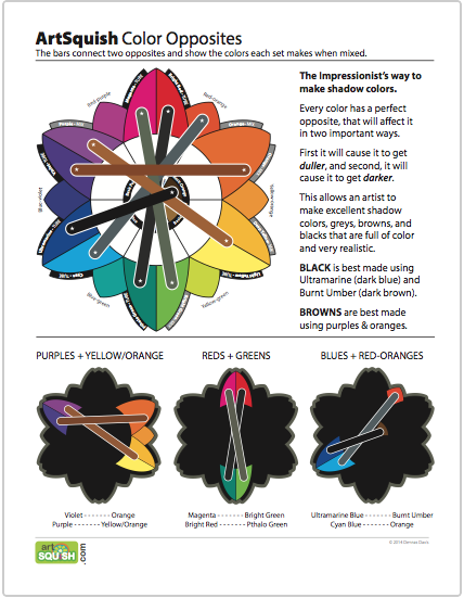
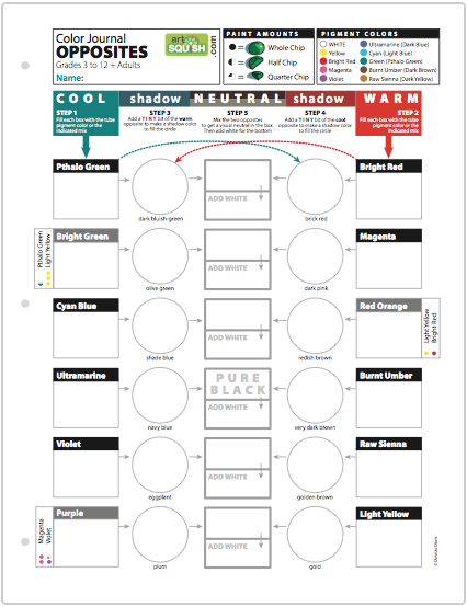
Perfect Opposites Chart
Print enough for each student to have one to keep.
Punch holes to place into a 3-ring binder or folder.
1 Page – Opens in new window
2.2 explain
Most people, including artists, do not always use these methods, or even fully understand them. Like the Color Star, this is set up to use the specific pigments in your Firstlight color palette so you can know what you’re doing when you paint.
Colors change like this too, when mixed with their opposite, or what we call their complimentary color. They will change in two ways, becoming duller, and also darker. When opposites mix, they will look either greyish or brownish. We call greys and browns neutral. It makes sense that two opposites would cancel each other out, becoming colorless, doesn’t it?
Most colors have general opposites, like greens are opposites of reds, but it’s really important to understand that every pigment will have a perfect opposite. Which green works best with which red? That’s what we are learning about today with your pigments: Perfect Pigment Opposites.
Opposites are essential to each other and it is good to always be able to choose a color and it’s perfect opposite when painting.”
LEARNING TARGETS
Students know how to create shadows using opposite colors.
M A T E R I A L S
- Acrylic paints
- Brushes
- Palette pad
- Water container
- Smocks
- Paper towels
- Color Journals
3.1 Print
Reference
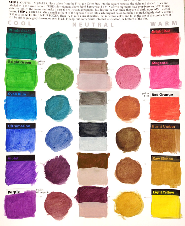
Example Journal
This is a preprinted version of the opposites color journal for students to see what to expect. Print enough so everyone can look at a copy when needed (one per 2 or 3 students should work).
1 Page – Opens in new window
3.2 DEMO
Even if you have students have already completed a color journal, it is important that you go through this step, because this color journal is different than our others. You will need a printed journal page, a palette pad, small paint brush, acrylic paints, water container, and paper towels for your demo.
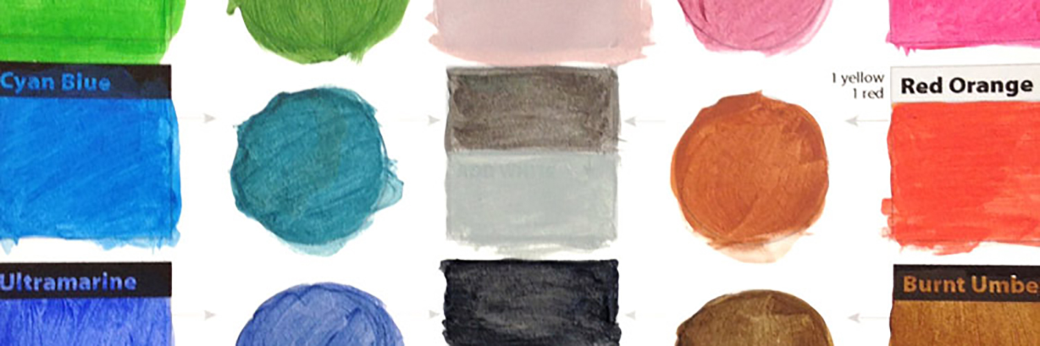
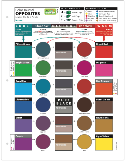
Step by step journal. Wash your brush well after each mix!
- Squeeze out one chip of each tube color along the top edge of your palette
- Fill in all of the COOL colors on the left side –
- Black banners show the tube colors.
- Gray banner have mix formulas.
- Fill in all of the WARM colors on the right side.
- Use a tiny amount of the perfect opposite to make a shadow version of each COOL color to fill into the circles.
- Use a tiny amount of the perfect opposite to make a shadow version of each WARM color to fill into the circles.
- Create perfect neutrals by balancing the two opposites for the middle section.
- Finish by adding white to each neutral color before moving to the next one.
Here is something very important. When you make the shadow colors in the circles, be very careful at first! Only use a teeny tiny amount of the opposite. These colors can change each other drastically. If there is little or no effect, then you know you can add more and not worry as much. Sometimes that teeny tiny amount is all you need. Please pay attention as this is the most difficult part of this Color Journal. You must use a very, very tiny speck of red to make a shadow green, and a tiny speck of green to make a shadow red. If it gets really dark, or becomes the color you just mixed in, you’ll need to clean your brush and add more of the original color back in.
In the middle column, you need to work on your colors until you get a visual middle ground that doesn’t look like the hot color or the cold color. It can be hard to do, and again, using teeny tiny amounts can make fine tune it better than larger amounts.
Finally, add some white to the middle neutral color to make a lighter gray or brown. It doesn’t matter how much or how light you make it, just so it looks lighter and shows more about the color since dark colors are harder to see. Fill that into the bottom of the middle box. Make sure your name is at the top!”
LEARNING TARGETS
Students know how to mix opposite colors to create neutrals.
M A T E R I A L S
- Acrylic paints
- Brushes
- Palette pad
- Water container
- Smocks
- Paper towels
- Color Journals
4.1 print
journal
Perfect Pigment Opposites
This color journal allows students to practice and experience perfect neutrals from perfect opposite pigments.
1 Page – Opens in new window
NOTE: Here is a new BLENDING version of the Opposites Color Journal, with several steps added to each line. Use this for speedy or advanced students.
journal
BLENDED VERSION Pigment Opposites
This color journal allows students to practice and experience perfect neutrals from perfect opposite pigments.
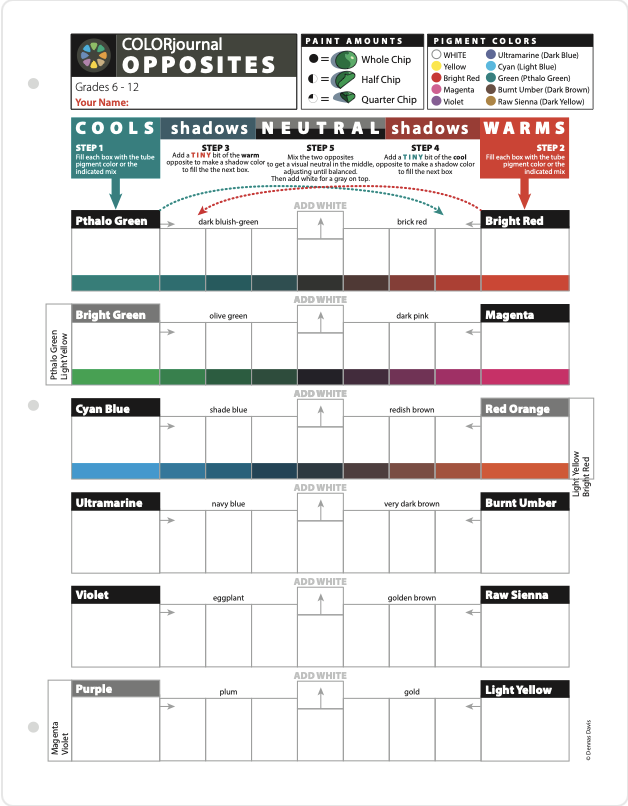
1 Page – Opens in new window
4.2 paint
- Do all mixing on your palette
- Squeeze ONLY chocolate chip sized paint blobs (be careful with larger tube openings)
- DO NOT let a paint tube touch other colors. Squeeze nearby, not on top of paints.
- Squeeze one “chip” for each dot on the journal formula
- When you need a smaller part of a chip, set the regular sized chip over to the side and get some with your brush.
- Mix ALL of the paint, keeping the blob as small as possible on the palette
If you are dividing the class into two lessons, stop after 20 minutes and continue at the next class-time. This will give you 2 minutes to clean up before the end of this session.
Do not place these into binders or in stacks for at least 24 hours!
LEARNING TARGETS
Students know how to mix opposite colors to create neutrals.
M A T E R I A L S
- Acrylic paints
- Brushes
- Palette pad
- Water container
- Smocks
- Paper towels
- Color Journals
5.1 setup
5.2 finish
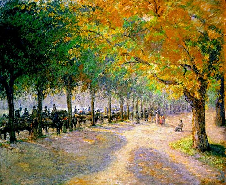
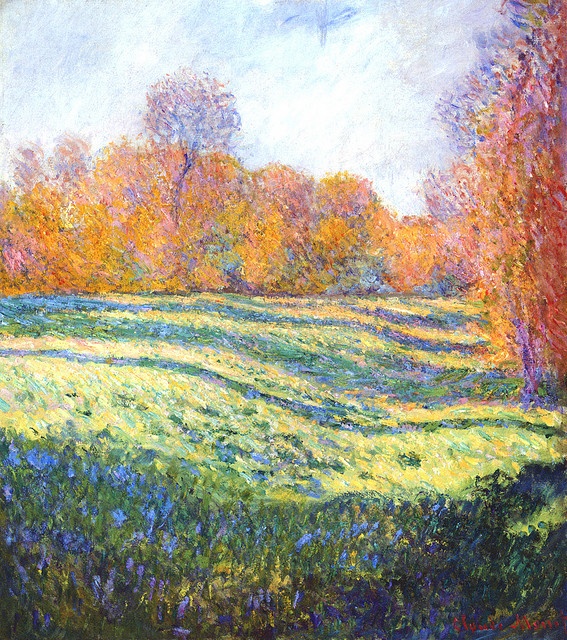
When everyone is cruising and knows what to do, take a few minutes to show the slides and explain how the impressionists revolutionized color.
1
Camille Pissarro, Hyde Park London 1890
2
Meadow at Giverny, Claude Monet 1886
3
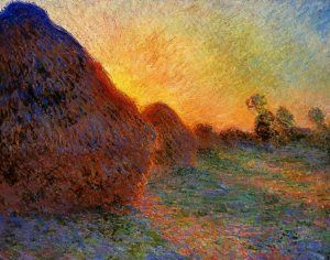
Haystacks at Sunset, Claude Monet 1890
4
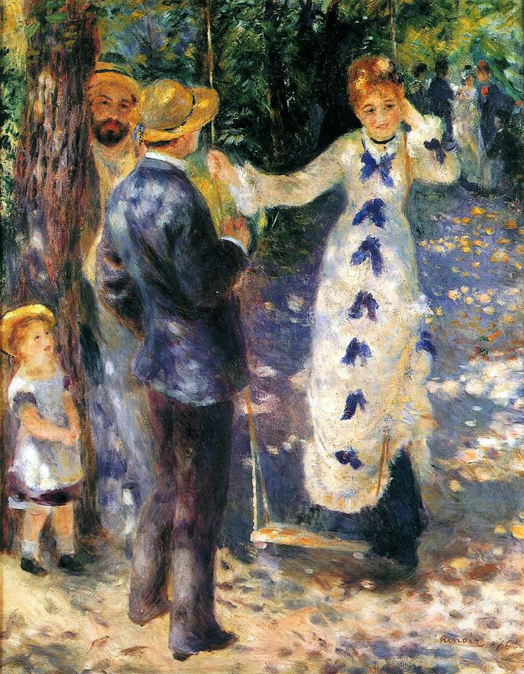
La Balançoire, Auguste Renoir
5
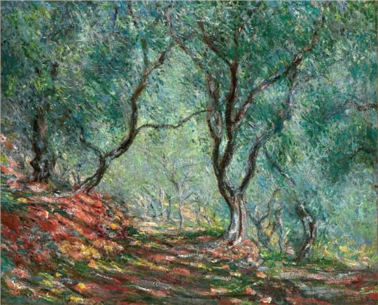
Olive Tree Wood in the Moreno Garden, Claude Monet
6
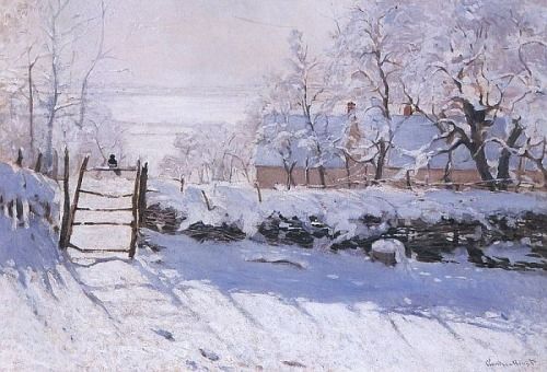
The Magpie, Claude Monet 1869
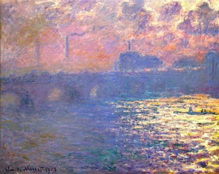
7
Waterloo Bridge, Claude Monet 1903.
LEARNING TARGETS
Students know how to complete artwork
M A T E R I A L S
- unfinished artwork from past lessons
6.1 create
The timer is set for 18 minutes but use whatever time is left for this step. Save around 4 minutes to clean up.
Everyone should try to finish any color journals that are not done, and then paintings they may have not quite finished. If they don’t finish today, next week is ketchup day!
If students finish early, they can have an artist’s choice time with dry media. Have them clean up their paints and super wash their brushes first, and then they can use charcoal, pencils, colored pencils, or oil pastels in their sketch pads.
6.2 Bookend
A bookend is at the beginning and the end of each lesson.
This is where you go over what the lesson is about and what the main learning points are.
Making this clear, helps students remember what they’ve learned and understand the processes they’re going through.
Today we’re going to create a color journal, that is the foundation of every other color journal we do over the entire 2 years of foundations lessons.
That means this is super-important!
When painting, every artist needs to make shadows and softer colors. This means being able to make any color darker, and any color duller. Dull colors can be either dark or light.
There are two ways to darken and dull colors, and we use the method that was employed by the impressionists over 150 years ago. The impressionists were known for their gorgeous, colorful paintings and their deep and vivid colorful shadows. Everyone agrees that their dark and dull colors were more life-like than any other group of painters.
Their secret? They stopped using black and gray to mix into other colors. Instead, they used Perfect Pigment Opposites.
The Opposites color journal we’re creating today, uses every pigment you have, and pairs it with the perfect opposite pigment, or a simple mix of two pigments.
You’ll first darken and dull colors, and then make 4 black and gray sets of neutral mixes. There will also be two brown neutral mixes at the bottom.
Having the pigment color star we created 2 weeks ago, and this opposites color journal, gives you everything you need to know how to darken and dull any color. You’ll be able to create tens of thousands of different colors!
LEARNING TARGETS
Students know the importance of cleaning up
M A T E R I A L S
- Paper Towels
- Cleaning wipes
- Sink
- Waste baskets
- Well-lit spot for photos
- Camera or phone-camera
7.1 clean
- Wash hands
- Super-wash brushes if used
- Put art supplies away
- Wipe tables & toss trash
- Remove any smocks (last)
- Check for items on floors and tables
7.2 photo
OBJECTIVES
- Practice and improvement using & mixing paint
- Understanding how to mix vibrant shadow colors & neutrals
- Accomplishment in completing a journal page
- Fulfillment in finishing other projects (if time)
TROUBLESPOTS
Squeezing paints out ahead of time – Don’t let students get going before knowing the color journal instructions. This is not like painting. Do not let them begin working until after the demo.
Mixing on the journal – Don’t let students skip mixing on the palette. There is no way to do this journal without mixing on a separate palette. It not a good idea to mix on a painting either, so this is good practice.
Big blobs – There are 3 formulas for mixing paint. They show “chips” that are the sizes of chocolate chips, so everyone can measure the mixes fairly accurately. It’s impossible to judge how much 3 or 4 chips are in one big blob accurately! If someone tries this, see if you can help them by separating the blob into chip-sized bits. Carry a brush and palette knife with you today.
Can’t. Do. This… – If you have a student who simply cannot stand the relatively uncreative process of mixing and filling boxes, set a goal for one row at a time. It’s very rare, but sometimes you’ll see a student not able to do this very well. Be happy if they get one row done.
ART WORDS
Tube-color – What we use when referring to the raw single-pigment colors straight out of the tubes. It’s helpful to differentiate between the millions of beautiful painting colors, and these few intense raw colors that are generally meant to be mixed before painting with.
Complimentary color – Also called opposites, these are usually found on the opposite sides of a color wheel. Perfect compliments create the best neutral grays, blacks, and browns.
Perfect Opposite – An ArtSquish term for the specific color that will make the easiest and best neutrals and shadow colors. Each of our tube-colors has a perfect opposite.
Shade or Shadow color – Technically, a shade is the term for a color that has been mixed with black. However, the most realistic shadows are made with complimentary colors. Sometimes we refer to a darkened color as a shade even though we don’t use black to create it.
CLASSROOM
PREP
Print all of your PDFs from the lesson plan and cut any references apart as needed.
What your room needs
Here are your printable lists and room prep instructions.
Opens in new window
CLASSROOM
MATERIALS
- Water container
- Paper towels
- Smocks
STUDENT’S
MATERIALS
- 14″ x 17″ Sketch Paper
- Acrylic paints
- Palette Pad
- Brushes – All sizes
PREVIEW
Week 24: Ketchup Day
There are many projects that have been in the works. Students will tackle each one until several are finished. If no projects are left, then it is time for self-expression with artists’ choice.
Week 25: Modeling Clay Faces
A portrait is easier to draw or paint if an artist understands the 3-dimensional form of the human face. When a person sculpts and holds a form, and then draws it, there is a strong connection made in the mind, that will help all drawings in the future. The younger this is done, the better.