
OVERVIEW
Students will create simple artwork in oil pastels using only colored lines. Then they’ll examine their efforts and learn the 6 design principles. Students will apply principles to modify their work and improve their overall design before finishing it.Grades 3 – 5
Week of January 5 – 9
1 Hour & 45 Minutes

Lesson At A Glance
A brief overview of each step. Buttons jump to each section for detailed information.
12 Min – 6 Elements of Design
10 Min – Create different types of line and bends
10 Min – Practice Guide Lines
35 Min – Fill in lines and areas with pastels. Blend colors
Extra – Light swords in oil pastels
2 Min – Everyone Helps
LESSONPLAN
Each section is a different color. Read over once and then you can SCROLL & TEACH using any device you like. It’s designed to work best with your phone.
LEARNING TARGETS

Students know how to create a line drawing from a reference
M A T E R I A L S
- 14″ x 17″ Sketch Paper
- Reference Image
- Cheasel
- Ebony Pencil
- Kneaded Eraser
- Oil Pastels
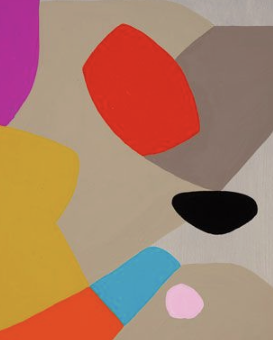
1.1 Prints
Reference
Line & Design
Cut images apart and print enough for each student to choose from several.
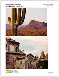 3 Pages – Opens in new window
1.2 Warmup
Introduce class by beginning with a drawing warm up.
The artists will choose an image from the references to draw or you can just assign them. They can clip the reference to a cheasel and place it in front of a blank page in their large sketchpads. The first part of the warm up is a bold and simple line drawing of the image using an ebony pencil. The drawing should be at least as large as a sheet of copy paper or larger.
Do not shade the drawing at all. It should only be thick and bold outlines of the shapes in the picture. Tell students to not worry about accuracy too much, and to just do their best.
Display the examples below:
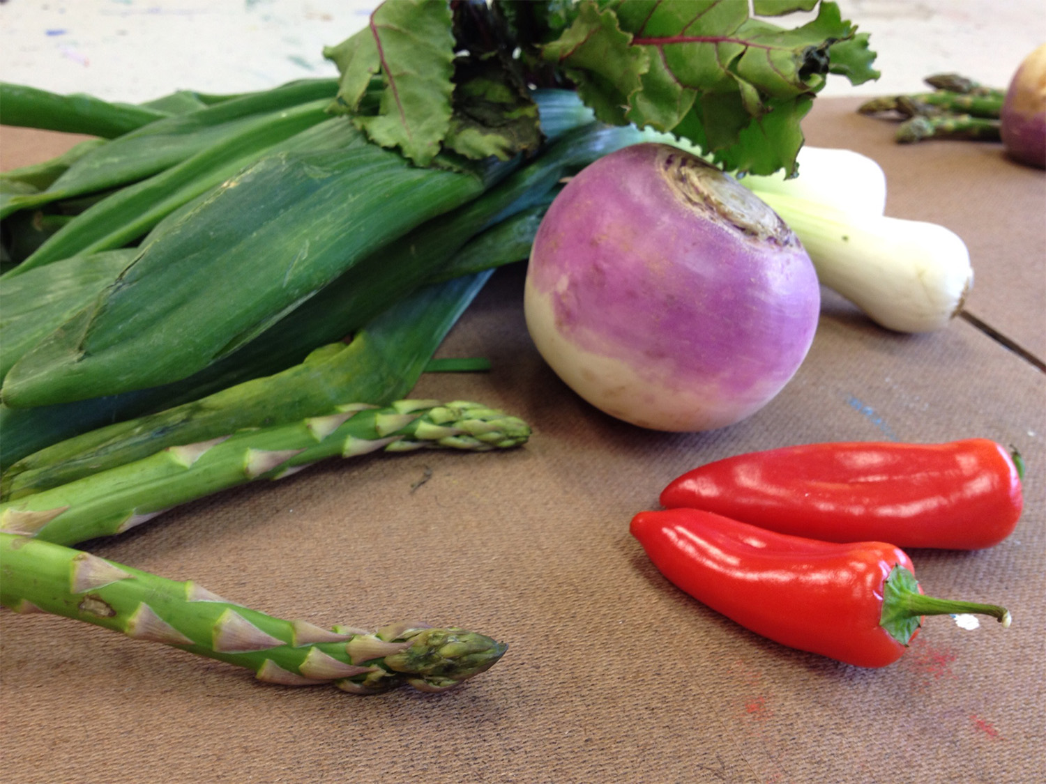
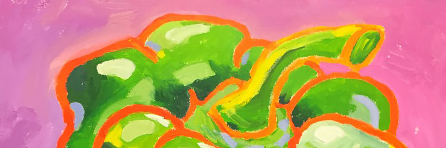
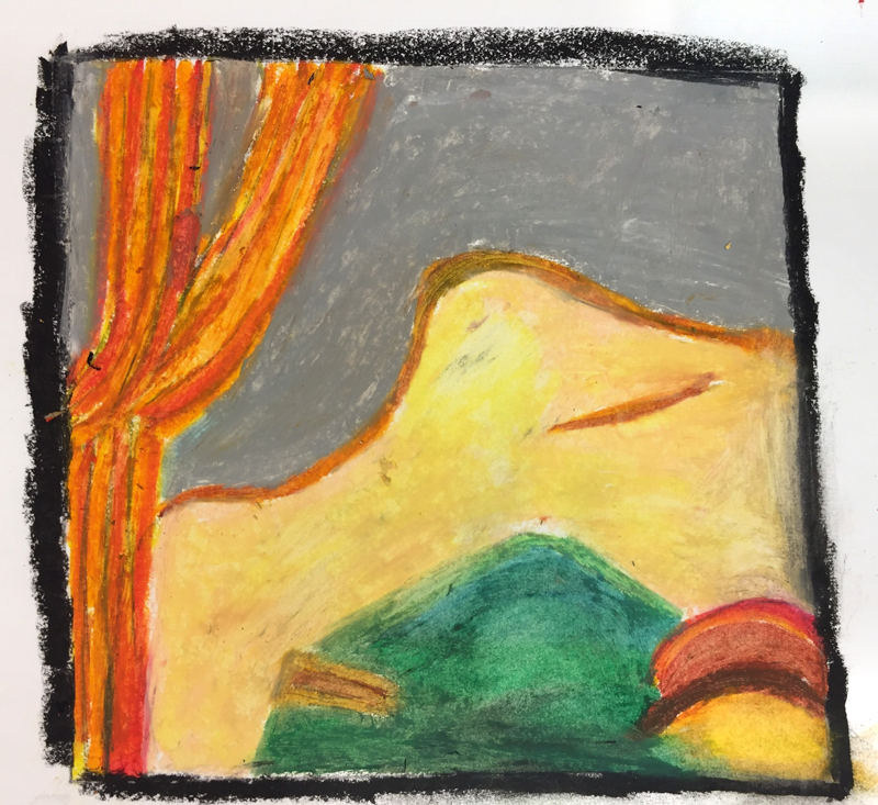
Veggie Still Life
Here is one of the reference pictures. There are several shapes.

Bold Line Drawing
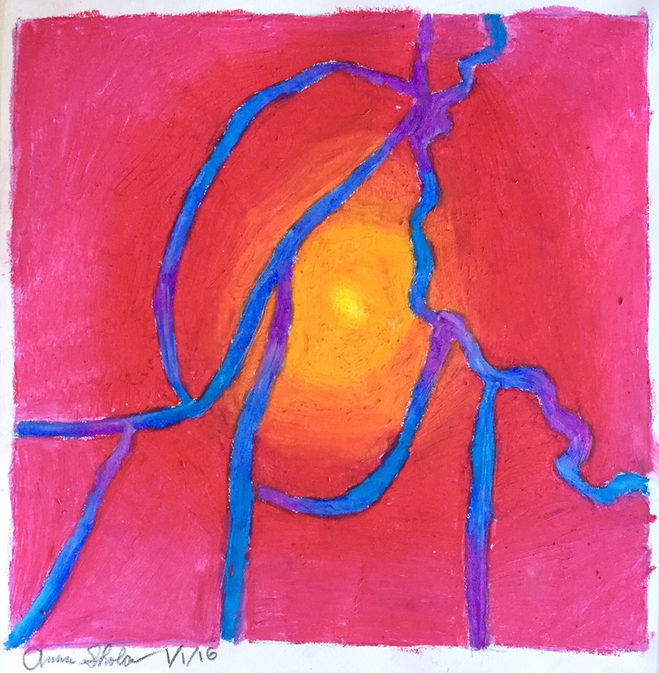
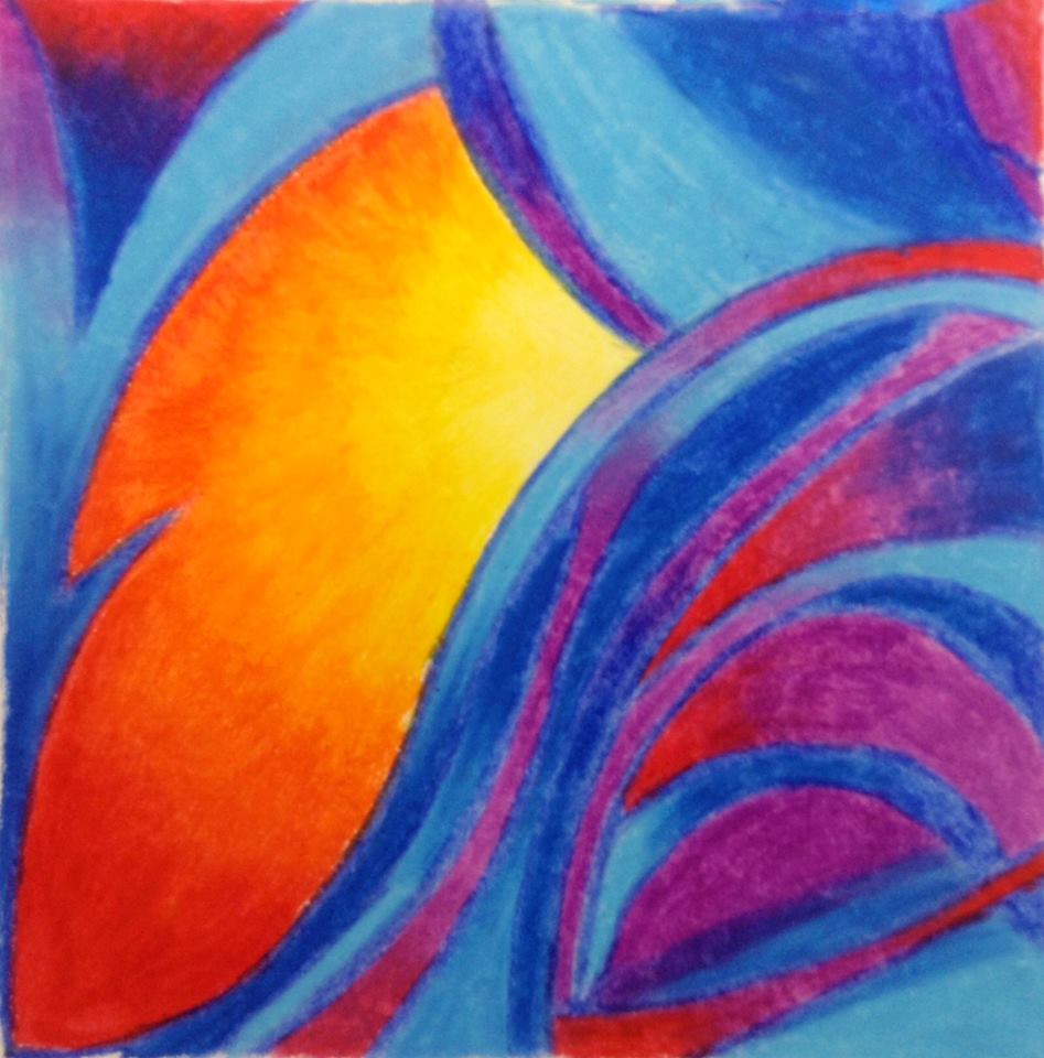
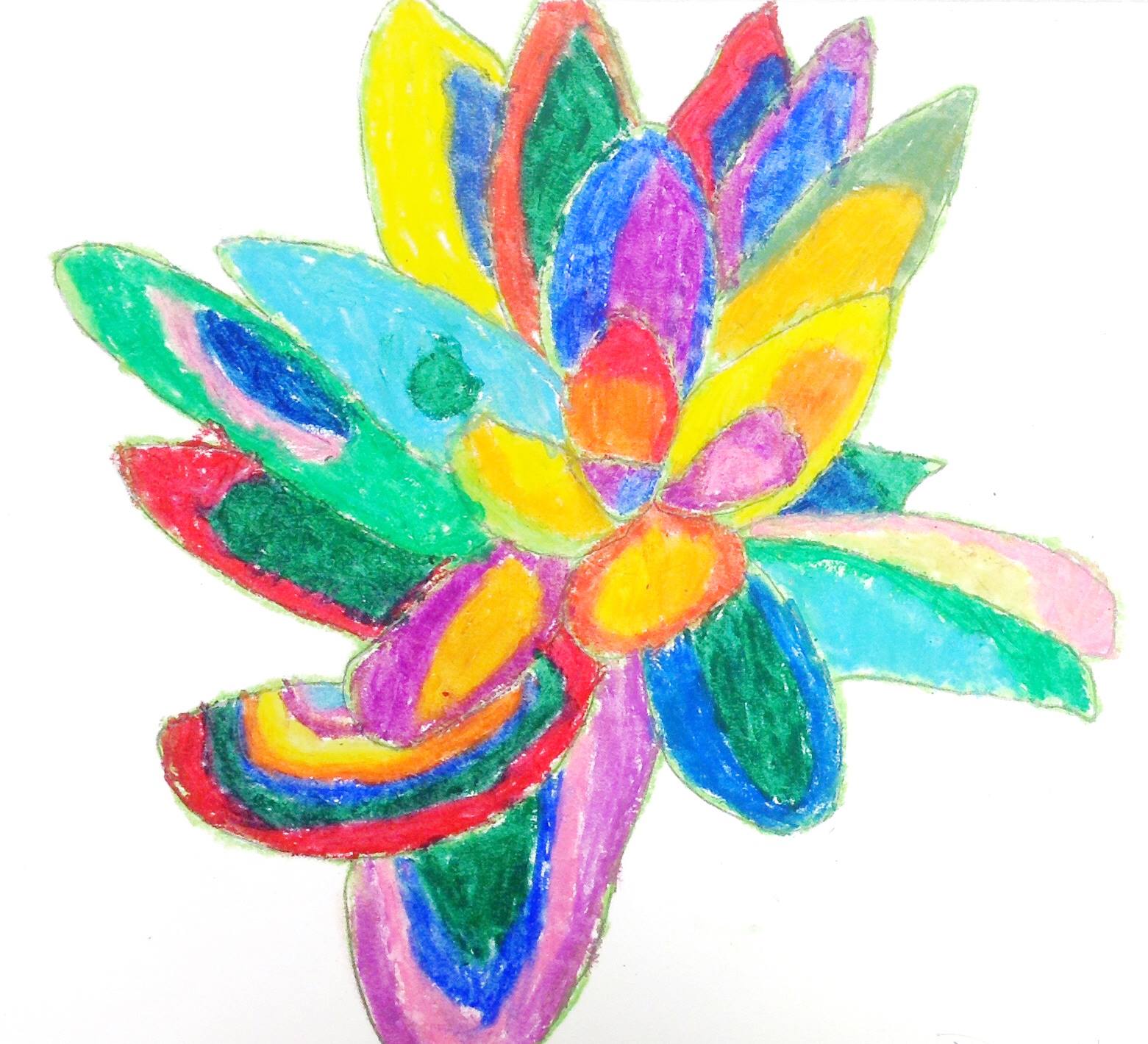
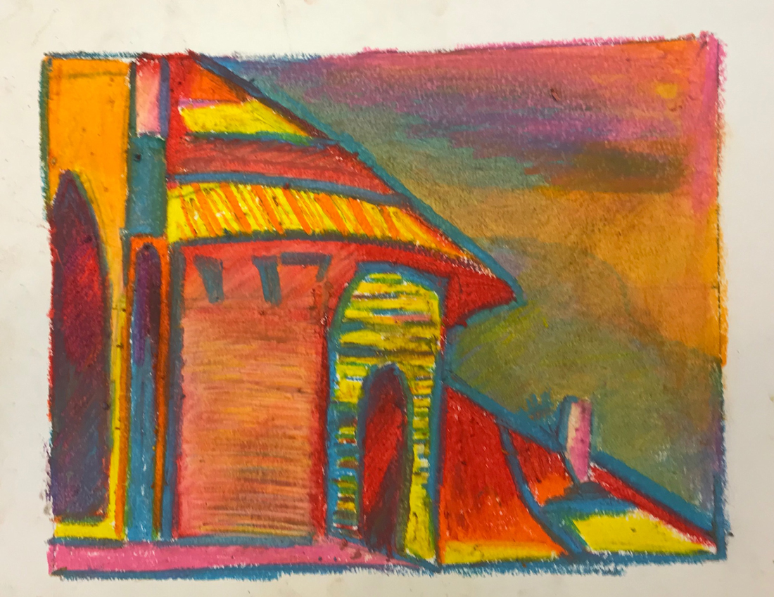
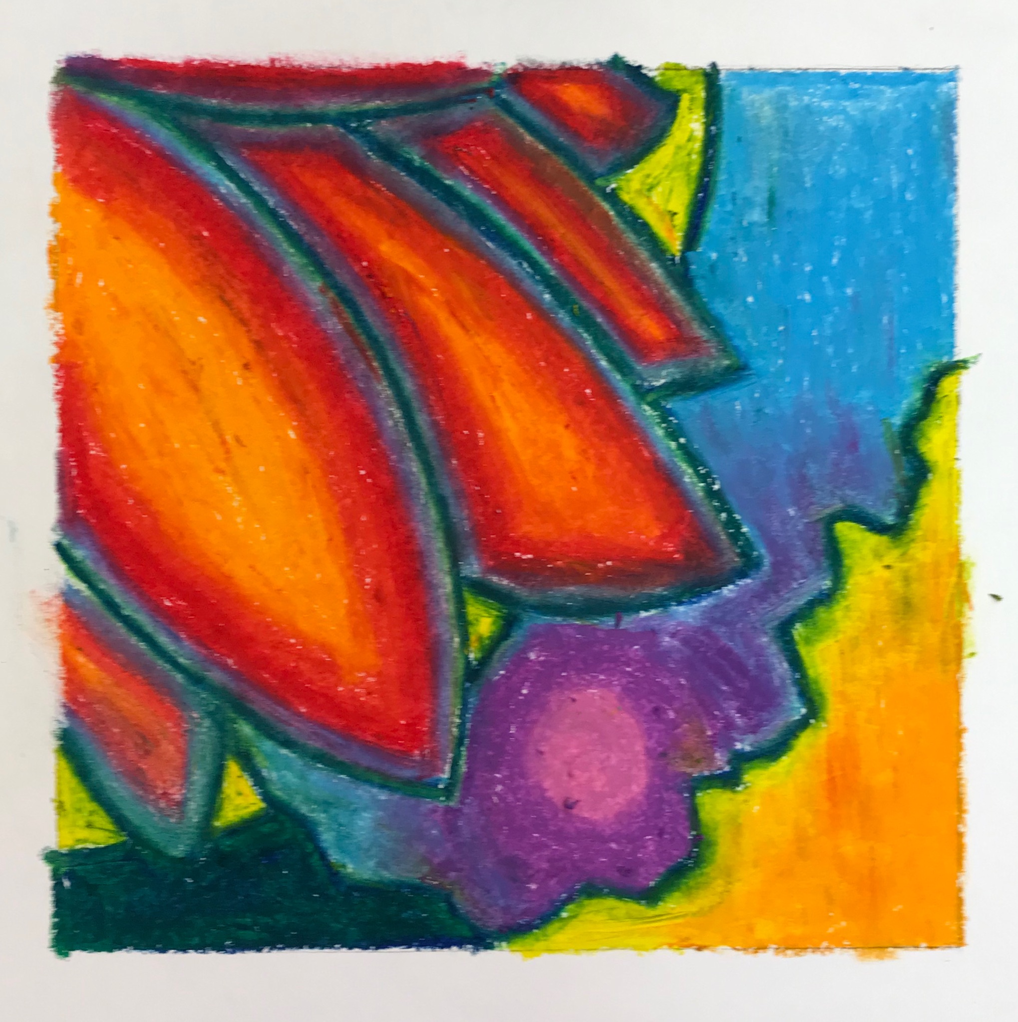
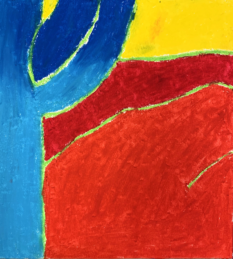
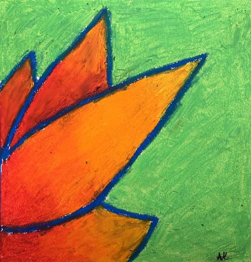
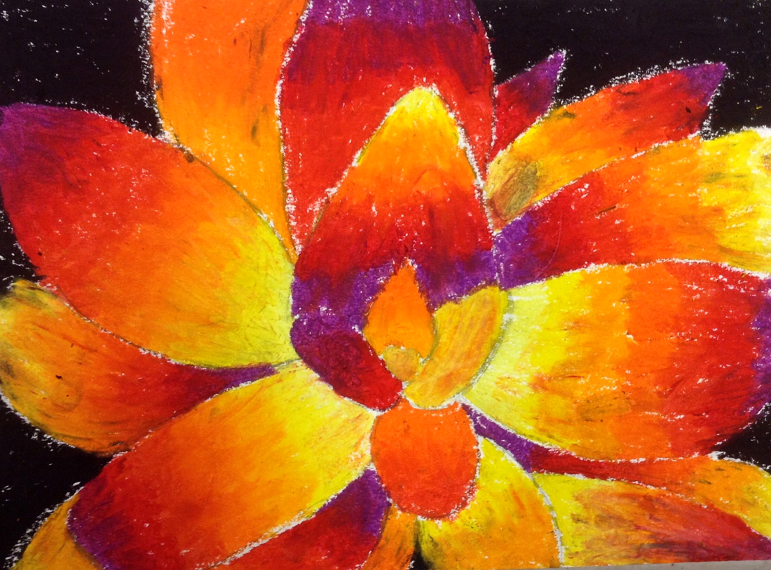
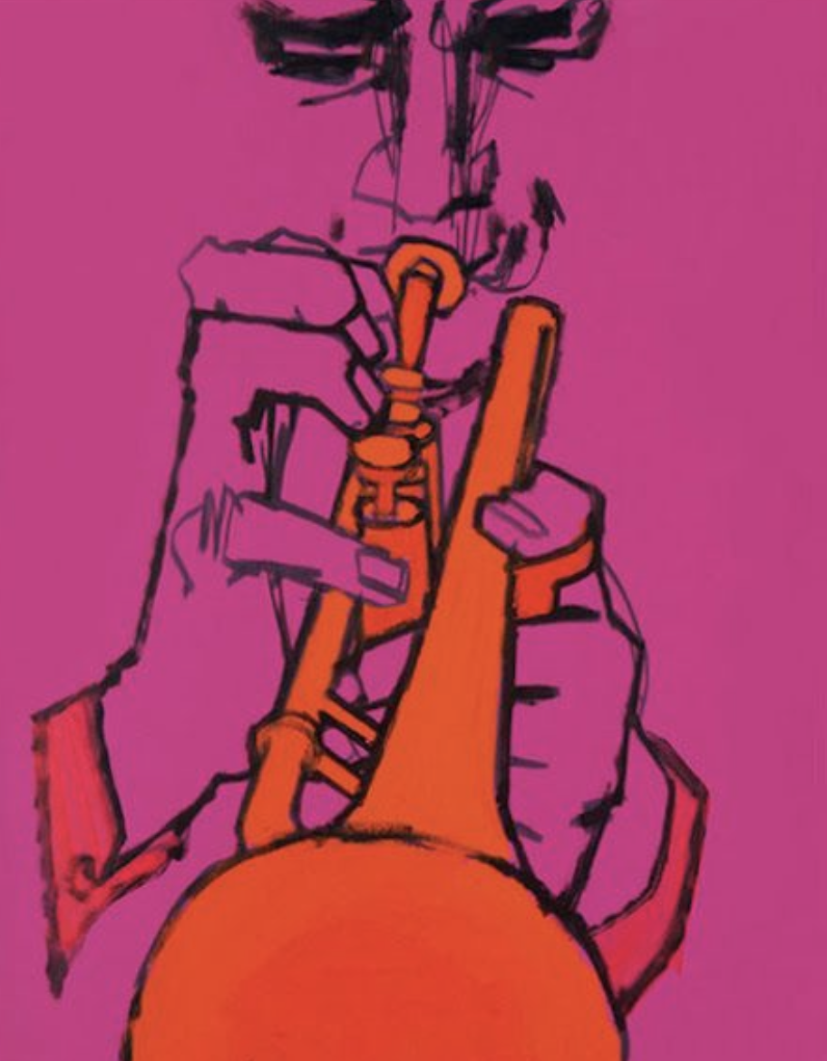
Line and Design Ideas (tap any image to open viewer)


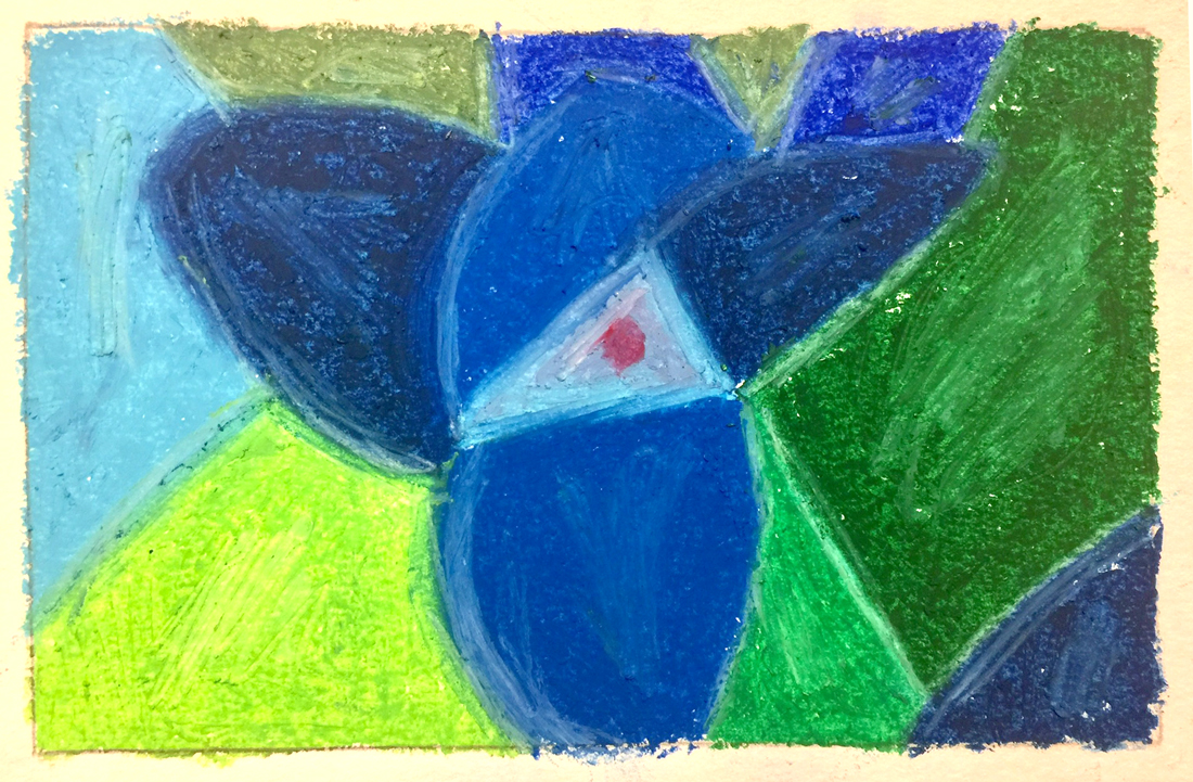
CREATIONS - tap here to open
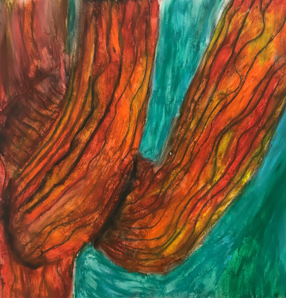
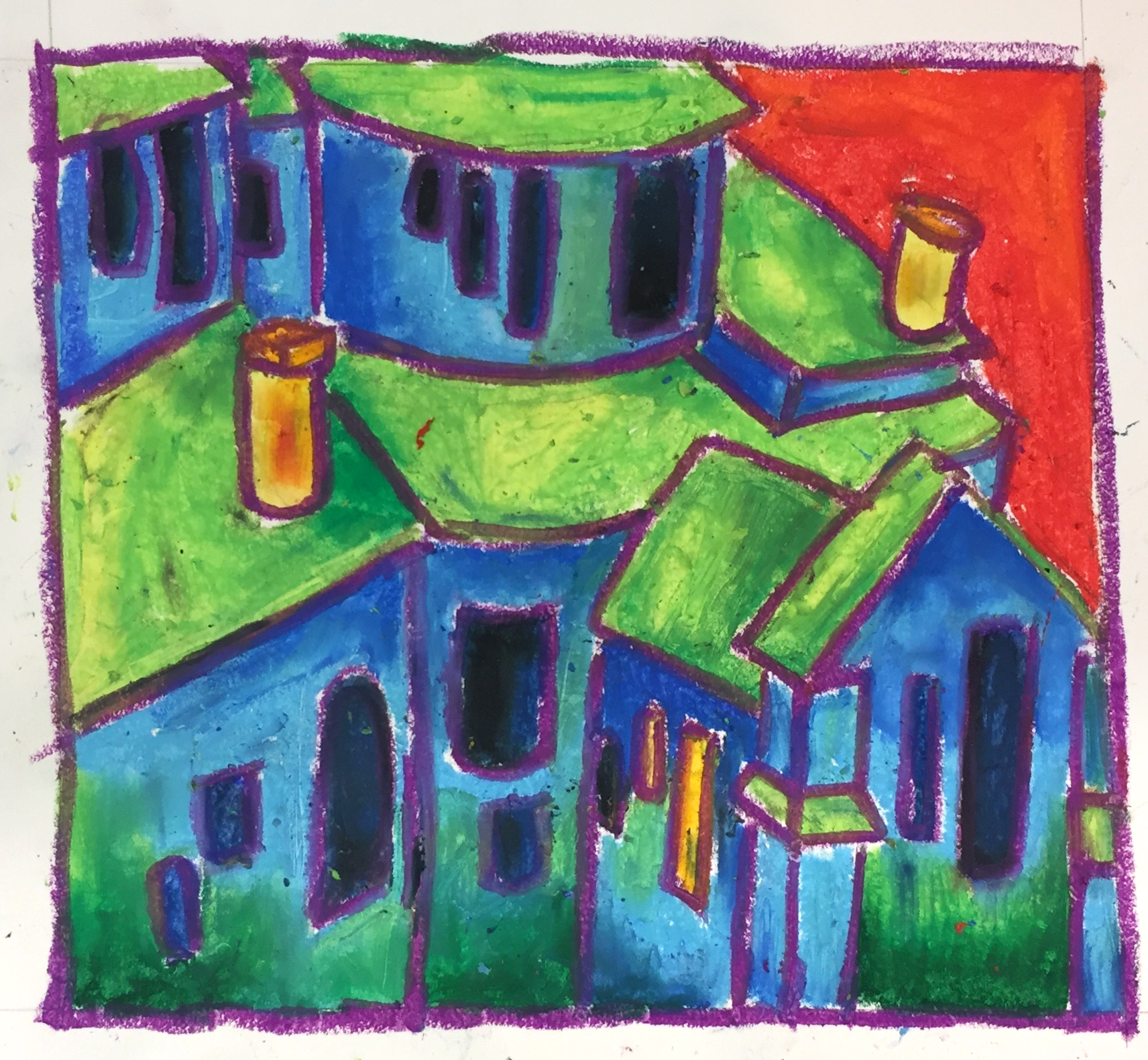
Line and Color Painting
Overview: Advanced 3rd and 4th year students should review or get a new handout of the 6 Principles (next step). Choose any reference, from the prints above, or from other sources. Any work may be done as artists’ choice in oil pastels OR acrylic paints with the following parameters:
- Must be from photo reference or life, but the subject is Artists’ Choice. View the Pinterest board for inspiration.
- Must use line as a primary element.
- 3 – 5 thumbnails (very small 2″ or less) must be produced with written notes about first 3 Principles of Design and which thumbnails are showing each of them best.
- Should be at least 9 inches on shortest side.
If working in acrylics, the work should be done on canvas, as large as the student would like. This painting will be worked on for 2 weeks because the color star is next week for Foundations, and advanced students have already done this.
Tap images to open Creations Student Instructions and Reference Materials in new windows

LEARNING TARGETS
Students know how to identify the 6 elements of design
M A T E R I A L S
- Elements of Design Handout
2.1 Print
reference
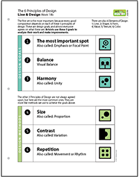
6 Principles of Design
Poster or notebook page for students to keep. Print enough for each student to have one.
 1 Page – Opens in new window
2.2 teach
- Emphasis – We call it The most important spot
- Balance
- Harmony (unity)
- Variation (contrast)
- Repetition/Movement
- Size/proportion
But don’t start your art with these principles. You should just jump in and begin your art. Artists do not sit down and think about using 6 principles of anything before they begin. Instead, we make decisions based on what looks good, and what we think we will like. When we’re finished, sometimes we do like it, and sometimes we don’t. These become our Keepers, and our Learners. Why is one painting good and another one not? Examining our work after we’ve begun, is when understanding the principles can help us. When we figure out which things are strong or weak, it helps us discover why we don’t like the Learners. Then we know how to make better artwork!”
2.3 Discuss
Skip these if you need to move forward.
1. What are some ways to create contrast in artwork? (value, or light vs. dark; texture, or rough vs. smooth; color, or red vs. green)
2. There are two main ways to use balance. What are they? (symmetrical and asymmetrical)
3. If I painted 6 circles in a row, each getting a little bigger than the one before, and they are all cool colors except for one red one, what design principles am I using? (Harmony and repetition by using all circles; harmony by using analagous or alike colors; contrast and emphasis with the red circle; size and harmony with the progression of the circles.)

LEARNING TARGETS
Students know how to create a composition for their artwork.
M A T E R I A L S
- 8.5″ x 11″ copy paper to make framers
- Scissors
- Ruler or straight edge
- Tape
- Drawing from Step 1
3.1 cut
The framers should be about 4″ long on each side so you can make 3″ or so square “windows”.
3.2 display
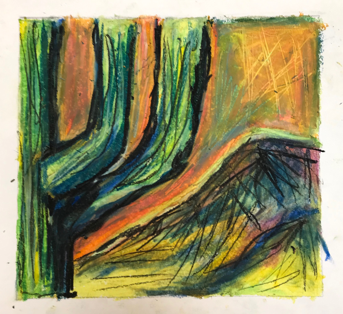
Bold Line Drawing
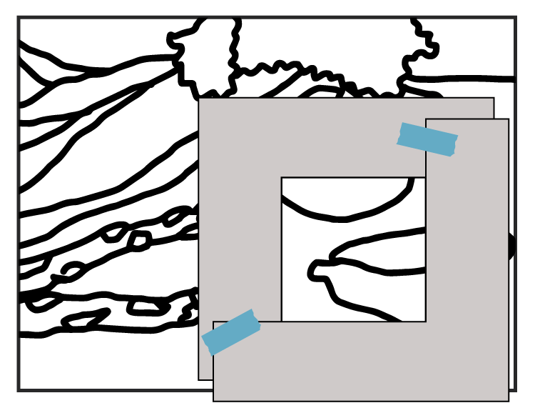
Using the framer
Use the frame pieces to find small square areas that look good to you.
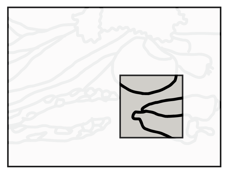
First cropped design
Here is one design
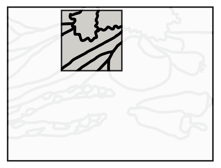
2nd idea
Move the frame around to see different compositions.
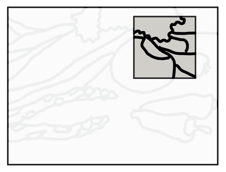
3rd idea
Moving to a new area will create a very different design, but then small movements can really make it look better or worse. Keep working with it until you find something that looks great to you.
3.3 design
Some may balk at this, thinking it is not very creative or fun. Challenge students to see if they can find: 1. something they would never think of; 2. some kind of hidden picture, like when looking at clouds; or 3. to find two completely different-looking designs.
3.4 draw
Young students don’t like to redraw, so you can let them choose one design and only make one thumbnail sketch.
Have everyone draw another version or two of their design as a quick little thumbnail sketch to try and create a better composition. Thumbnail sketches are about 1″ to 1.5″ square. This makes it easy to draw them quickly, and make design decisions instead of art decisions.
Have your artists then choose one of these drawings for their final work today. It may be their first drawing or one of the variations they made. Either way, it should be their favorite version.
LEARNING TARGETS
Students know how to blend with oil pastels
M A T E R I A L S
- 14″ x 17″ Sketch Paper
- Oil Pastels
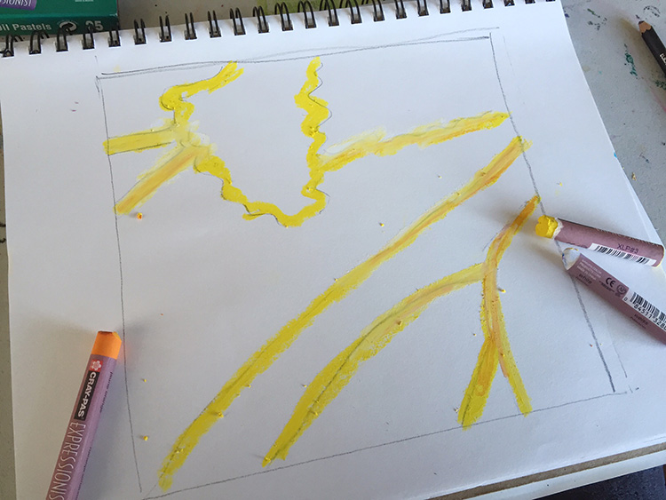
4.1 practice
Draw lines slowly, like you’re walking along a trail. This will create lines with more wiggle, or Character, which can look very nice. Then try these other ways to create different types of line:
- Turning your tool (pastel) slowly as you move it.
- Getting another color and having them combine in unexpected ways.
- Make sure you use thick bold lines, which will mean filling in and blending just like in larger areas.
- Some lines can be thicker than others.
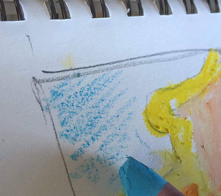
- Use the pastel on it’s side to create a lighter area with texture – layer other colors on top – blend together
- White blends colors very nicely
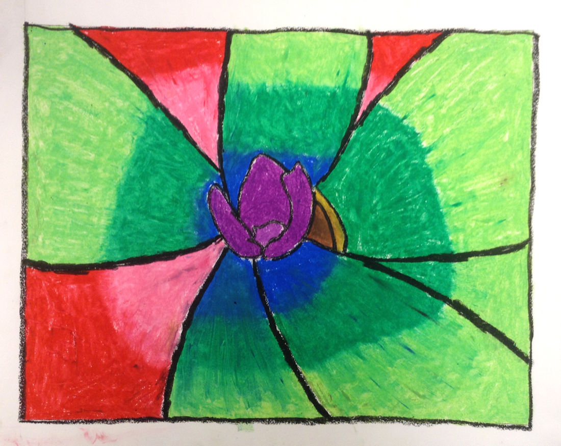
Display the slideshow below and read the captions once they get going.
1
Create thick bold and bright outlines first. You can use a pencil for guide lines, but be very light.
2
Fill in the areas with colors you like. Blending and gradations will make it look more like paint than crayons.
3
To make lighter colors and new colors, use the side of the pastel to make a bit of texture in one color
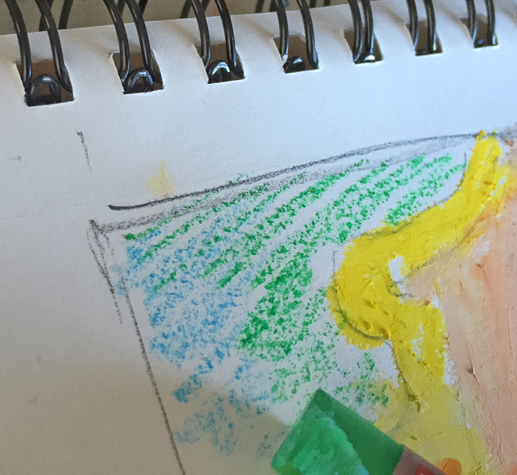
4
Then make another layer in a second color, also lightly.
5
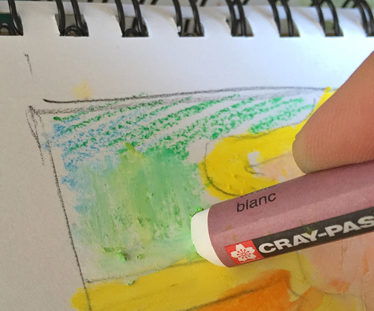
Finish by blending with white and/or a blending stick (stump)
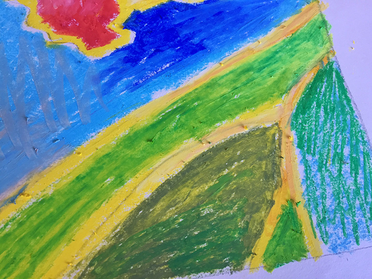
6
areas lightly filled in
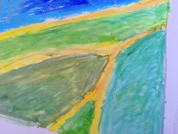
7
White goes over the whole thing to create a creamy lighter effect.
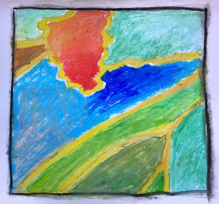
8
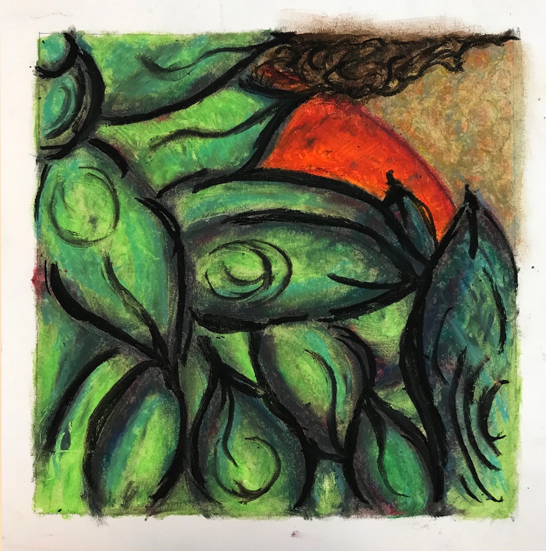
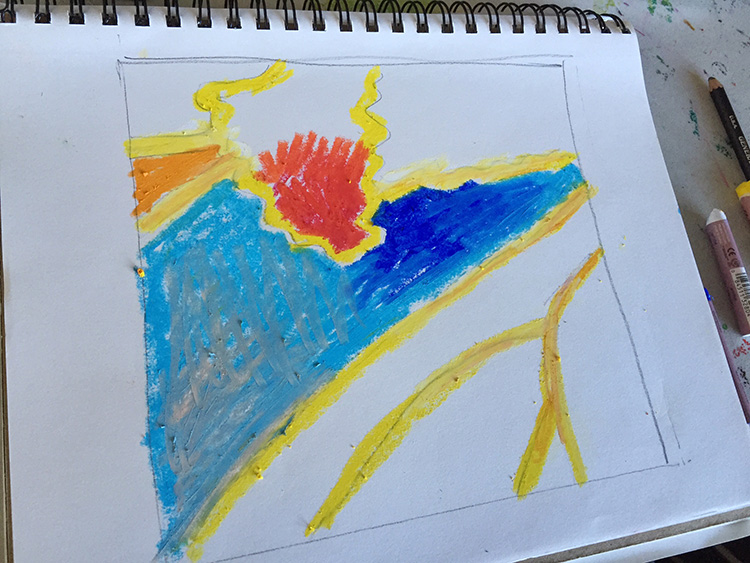
The finished work. Can you find the Most Important Spot? Is there Balance and Harmony? Why do you think that is?
4.2 teach
Here are the reasons the Principles are working in this slideshow design:
- Most important spot – Brightest colors and wiggly line all in same place, plus the only red and the only dark blue.
- Balance – The Red leaf is on the left side, while there are lots of lines all pulling towards the right.
- Harmony – All of the lines are the same yellow color, which keep the red area harmonious even though it is very different.
LEARNING TARGETS
Students know how to design their final drawing
M A T E R I A L S
- 11″ x 15″ Watercolor Paper
- 2B Pencil
- Eraser
5.1 draw
Make this larger than we have been working with. It should be 8 1/2 or 9 inches square, so they can use a sheet of copy paper as a template, or a notebook or pad.
This will be the same design they’ve been working on in the previous steps. The only difference is that it must be enlarged to fit the larger square. This is the final artwork, so it should be the best version they have done so far, but we will refine it one more time.
Use a pencil and make guide lines to create line drawings inside the new, larger square frame on the watercolor paper. Make sure that students do not press hard, because this is not a real drawing, but a guide line drawing, and we may want to change it around a bit in the next step.
Guide lines can only be made by drawing them light in the first place. Making your heavy lines light by erasing them doesn’t create real guide lines, because they will always show a little bit. It’s ok if you struggle with making light guidelines. Just keep practicing.”
LEARNING TARGETS
Students know how to express themselves through line and color
M A T E R I A L S
- Oil Pastels
- Blender sticks (stumps)
- Sandpaper block
- Paper towels
6.1 color
Here is an important point for today’s lesson:
If you decide to change your mind, and make a different line drawing than your thumbnails, you might get something you like, but it’s much more likely that you won’t. You would be taking a shot in the dark with no idea how it will look or how the principles of design are applied. Don’t do this today. While experimentation is sometimes the right thing to do, today we are using our plans so we don’t miss the good design we want to see.
After you make your lines, fill in all the areas between the lines with pastels, blending and creating different colors. Use all the color you want. It’s your artwork! You can also use browns, grays, and white for neutral areas. Make sure you blend your pastel colors together so that it looks like a painting instead of a crayon drawing. Blenders can be used to do this too.
Make sure that you always use the dark colors last (unless you’re blending them with lighter ones on top), and black is the very last pastel that you use. This is the Sunset technique.
Have fun and make it the way you want.”
LEARNING TARGETS
Students know how to create a glowing light effect
M A T E R I A L S
- Oil Pastels
- Light Sword Printout
7.1 Print
template
Light Swords
Print on COVER STOCK.
Cut apart in half or thirds so each student can get 2 or 3 sword outlines.
Make sure everyone gets at least 2 swords to color.
If you have time, let each student have a whole page of their own.
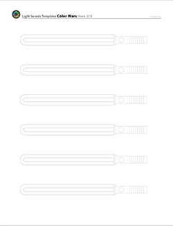
1 Page – Opens in new window
7.2 display
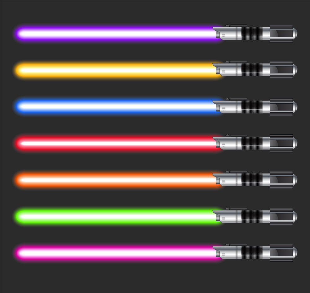
7.3 color
Each student should get at least 2 outlines to fill in.
Point out how it is lightest in the center of the “blade”. Then you can switch your display to the slideshow below, or you can demo the process for them yourself. Everyone will begin with the light sword “blade” and wait until that’s finished to make the handle.
- Choose a cool color for the first lightsaber and pick out a pastel for it. blue, green, or purple.
- Fill the very center part of the “blade” with a thick layer of white pastel all along the length.
- Use the colored pastel to fill the outer area all around the edges, and surrounding the middle white part. Be careful not to get color on the white center.
- Now use the white pastel to make it glow: go over the color part, blending the white gently into it.
- Small children will already have done this next part simply by being a little sloppy, but if you have older kids and they are being very neat: Let a little of the color and white get outside the edges and fade away so it glows. Just a tiny bit of glow looks best.
- Color the handle of the light saber any way you want, to finish the sword.
- Choose a warm color for another light saber. Follow the same steps in the same order.
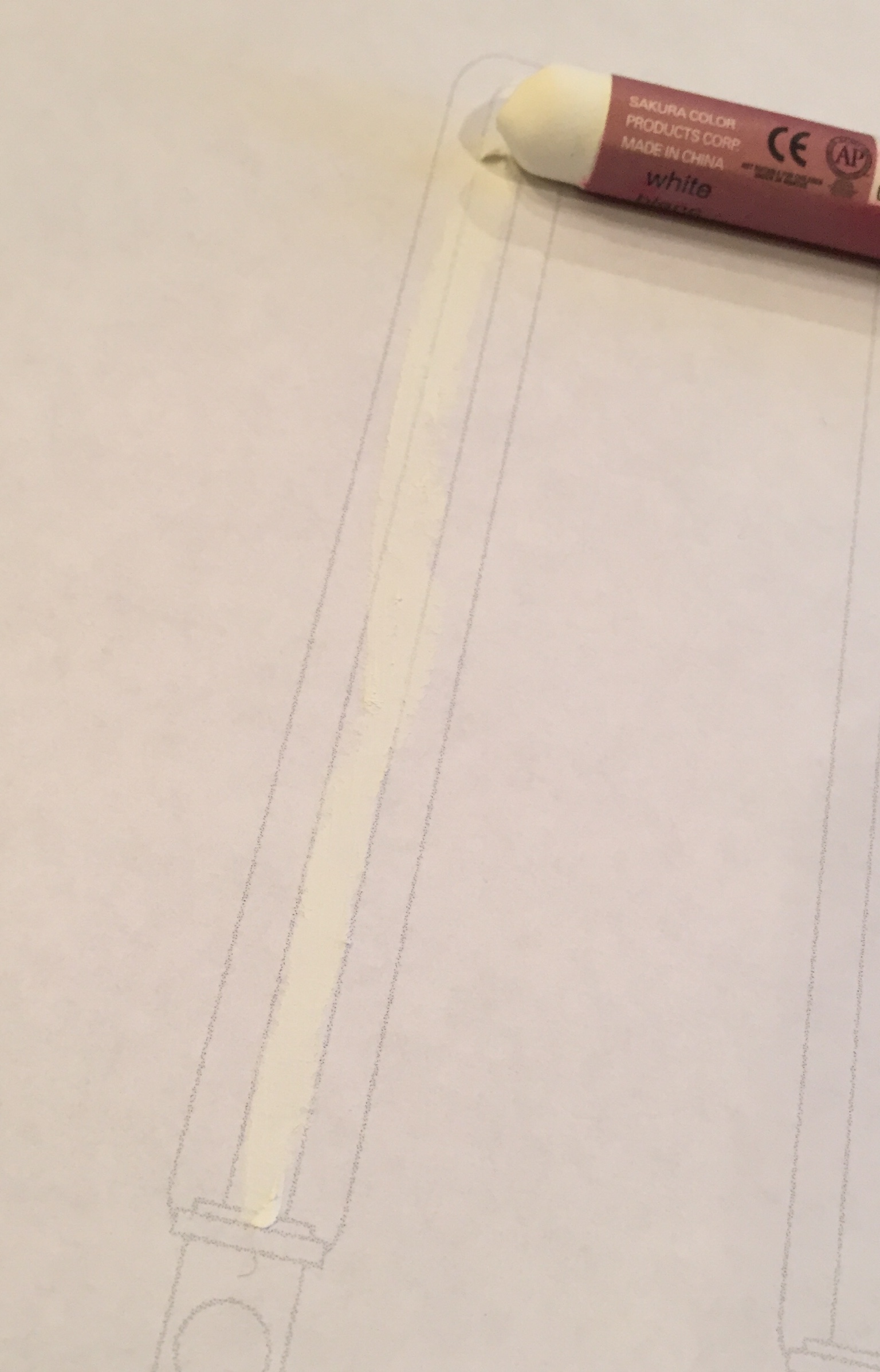
1
fill the thin area that’s the center of the light sword “blade” with pure white oil pastel.
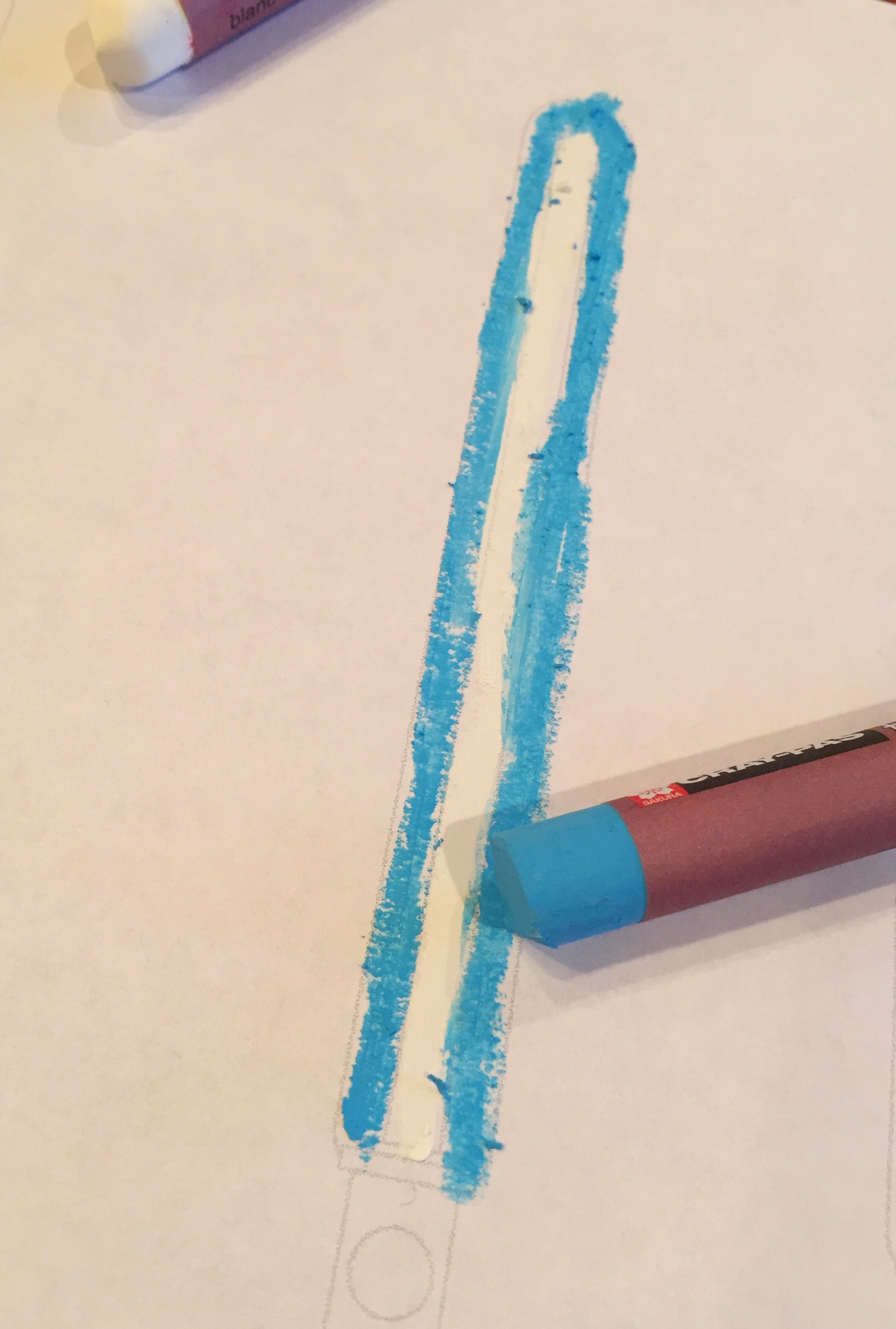
2
Fill the surrounding area with a bright color pastel.
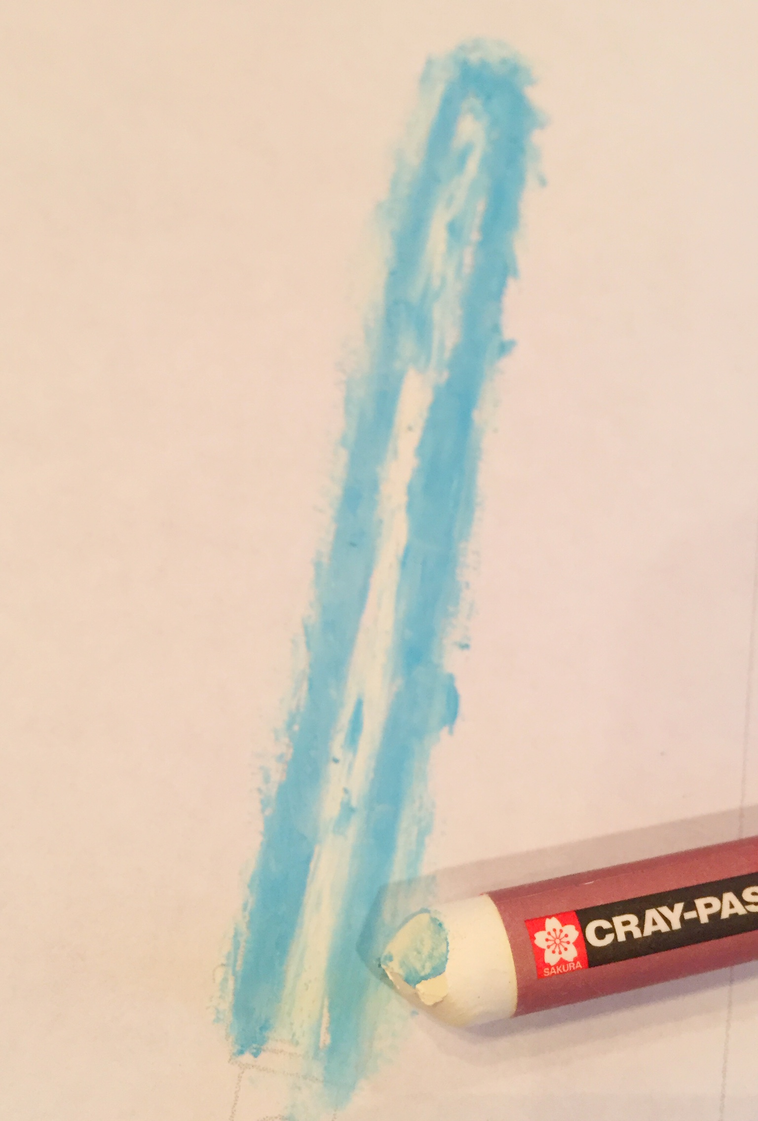
3
Use the white oil pastel and go over all of the color, letting some of it get outside the outer edge, and also a little bit in the center white area too. Keep the center bright white though. Think about how lights glow as you work.
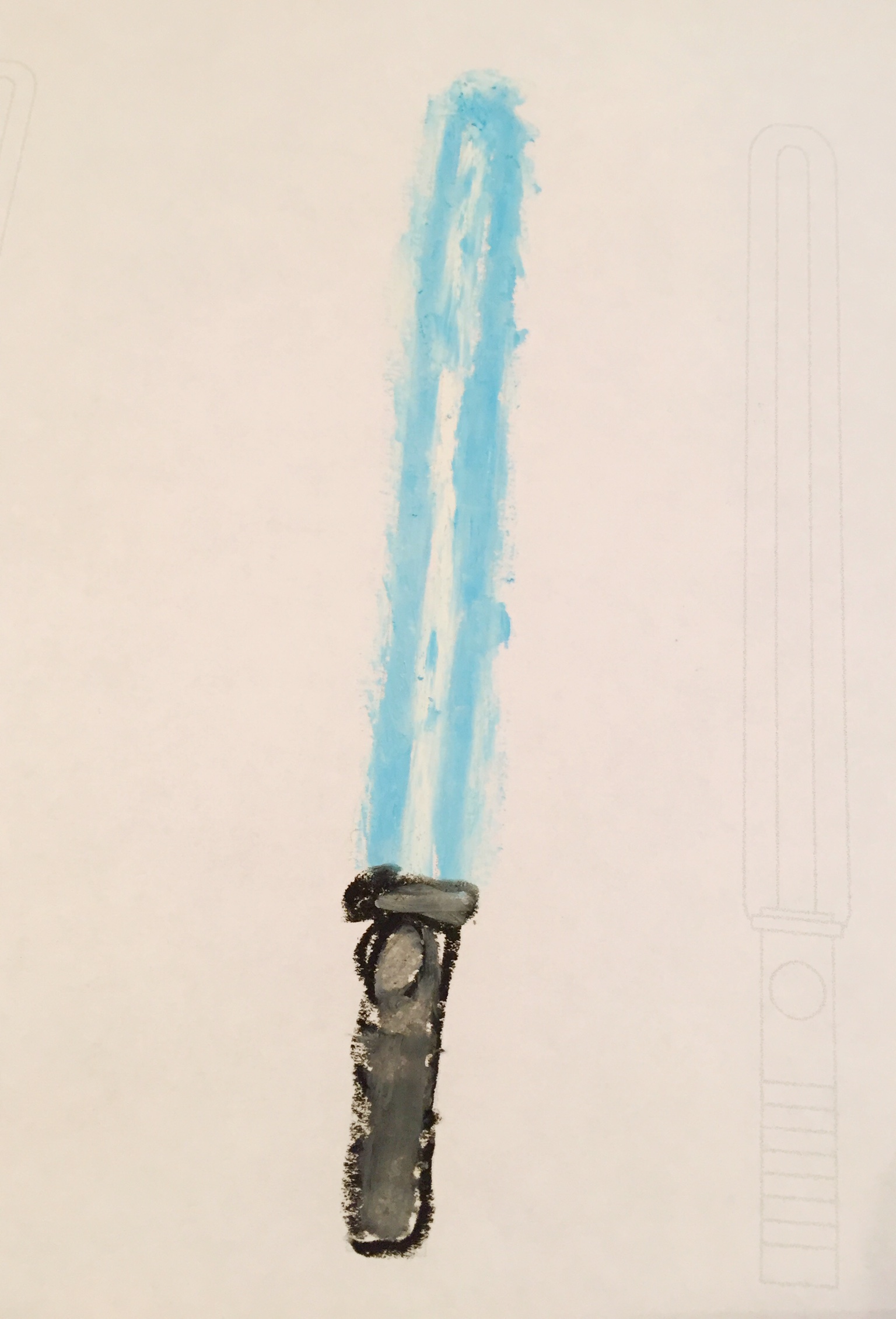
4
Draw a handle for your sword to finish.
LEARNING TARGETS
Students know the importance of cleaning up.
M A T E R I A L S
- Paper Towels
- Cleaning wipes
- Sink
- Waste baskets
- Well-lit spot for photos
- Camera or phone-camera
8.1 clean
- Wash hands
- Put art supplies away
- Wipe tables & toss trash
- Remove any smocks (last)
- Check for items on floors and tables
8.2 photo
8.3 connect
OBJECTIVES
- Practice and improvement using line, balance, harmony, & emphasis
- Understanding how design principles are actually useful
- Accomplishment in rearranging an artwork design to make it more pleasing
- Fulfillment by creating a well-designed colorful work
TROUBLESPOTS
Overwhelmed artists – Taking shapes one at a time is essential. Finding the shapes and lines by looking at a photo, and feeling confident enough to draw them can be intimidating. The photo references have clear shapes and are just complex enough to move the frame around and have more than one design to find. Even so a student may become overwhelmed because they look at the whole thing and not able to focus on one shape first. Show them a single large shape to draw and help them ignore all the others until it’s done. This is weird! – If an artist really does not want to use the bright color for lines, it’s more important for them to be comfortable than to do our project a certain way. Allow artists to use black if they need to, but in that case, the black MUST be put on the artwork LAST. Disbelief in practice work – Young artists in 3rd and 4th grade often get tired of working on one design. In their mind, once you’ve drawn something once, you are done, even if you don’t like it. They still have the idea that ALL DRAWINGS ARE FINAL ART. So it is finished and now it’s time to make a new piece of art. “Why are you asking us to do the same art again?” Instead of fighting with them, explain first, that older artists, like teens and adults, redraw because they know it’s good to practice a few times before making the final art. If that is still not sinking in, tell them it’s a new and different drawing of the same object, and let them move the frame around more so it looks different. You can also say, “have you ever erased a line and redrawn it? Well, that’s what we’re doing, but we aren’t erasing, we’re redrawing in a new place so it looks cleaner.” You mainly want to avoid stress, because that kills creativity. A student will understand when they’re ready, but not if you push too hard, so just let them draw something entirely new if they’re unhappy. You should always work to dispel 2 false ideas that plague so many artists. One is a mistaken belief that everything they produce should be good, or final artwork, and the other is that all of their works, whether a learner or a keeper, are an indication of their value as an artist. These ideas are so ingrained and so huge, that it takes a lot of training to change. An 8 year old has just made a developmental change that allows them to view their work self-critically for the first time in their life. It’s very important to reassure them constantly, and help them understand that they can create a learner, and that every other artist creates them too.
ART WORDS
Composition – Often referred to as design, this is the arrangement of all the things that we use to create art, such as line, shape, color, etc. Composition is what we do with these things. We have different sizes of them, contrasting colors, balance, a most important spot, etc. The combination of all art things and what we do with them in a work, is called composition.
Principles of Design – There are usually 6 principles but no one in the art world fully agrees on what these are. The Principles refers to the arrangement and goals for artwork, or what we do with art elements (line, shape, etc. are elements). Most people agree on the first 3 principles which are goals. The last 3 of the 6 principles are the troublemakers, and vary from model to model. They usually refer to: 4. Size or Proportion; 5. Contrast or Variation; & 6. Repetition or Rhythm Note from Dennas to teachers: if you enjoy analyzing things, you may notice that the first 3 principles are more like goals that every artwork needs. The last 3 are more like methods used to achieve those goals. My theory is that the disagreements center on the last 3 because they are more like methods, but can also be looked at as goals and sometimes even elements, like color. Color can also be used as a method to acheive emphasis and balance, so it resembles a design principle. It’s confusing enough that no one can figure it out definitively! That’s totally ok though. In the real world, the first 3 are the ones that are the most useful for modifying our work.
Technique – The movement an artist makes, and the way that things are held, create different techniques of applying materials to surfaces.
Guide Line – A term for making very lightly drawn guidelines that do not become part of a final artwork. The pencil barely touches, or tickles the paper or canvas.
CLASSROOM
PREP
Print all of your PDFs from the lesson plan and cut any references apart as needed.
What your room needs
Here are your printable lists and room prep instructions.
Opens in new window
CLASSROOM
MATERIALS
- Reference Images
- Printouts
- Scissors
- Ruler or straight edge
- Sandpaper
STUDENT’S
MATERIALS
- 14″ x 17″ Sketch Paper
- 11″ 15″ Watercolor Paper
- Eraser
- Ebony Pencil
- Kneaded eraser
- Oil pastels
- Tape
- 2B Pencil
- Blender Sticks
PREVIEW
Week 19: Color Star
We have replaced the color wheel with a color star, which is more accurate in many ways and helps to understand how the basic pigments work when applied to a color wheel model. This will be kept in a binder or folder, and become one of the most useful tools an artist can have.
Week 20: Crazy Fun
Students have a chance to visit the crazy part of their creativity and think outside of the box. Surprising and unexpected art is encouraged, but not required today. Examples are shown, and artists are walked through the process of thinking more creatively than they normally would.