
Style
Each lesson Plan focuses primarily on one of the 4 Cornerstones of Art:
Drawing | Painting | Color | Style
OVERVIEW
Students will see how balance affects composition by using a drawn object and moving location and sizes. They will finish a color practice composition using acrylic paint over a drawing on paper. There will be a preview of next week’s cylinder lesson, and we will tap into students’ recent experience in creating magazine covers as well.Grades 3 – 5
Week of January 6 – 10
1 Hour & 45 Minutes
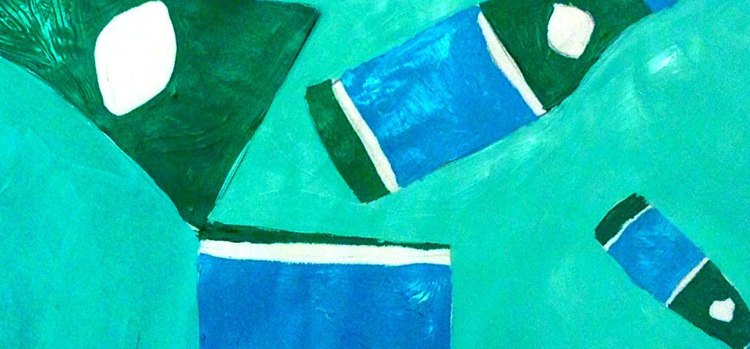
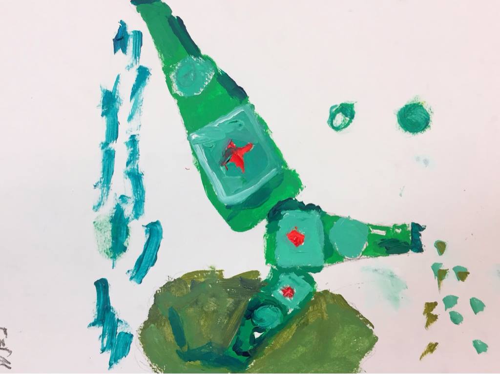
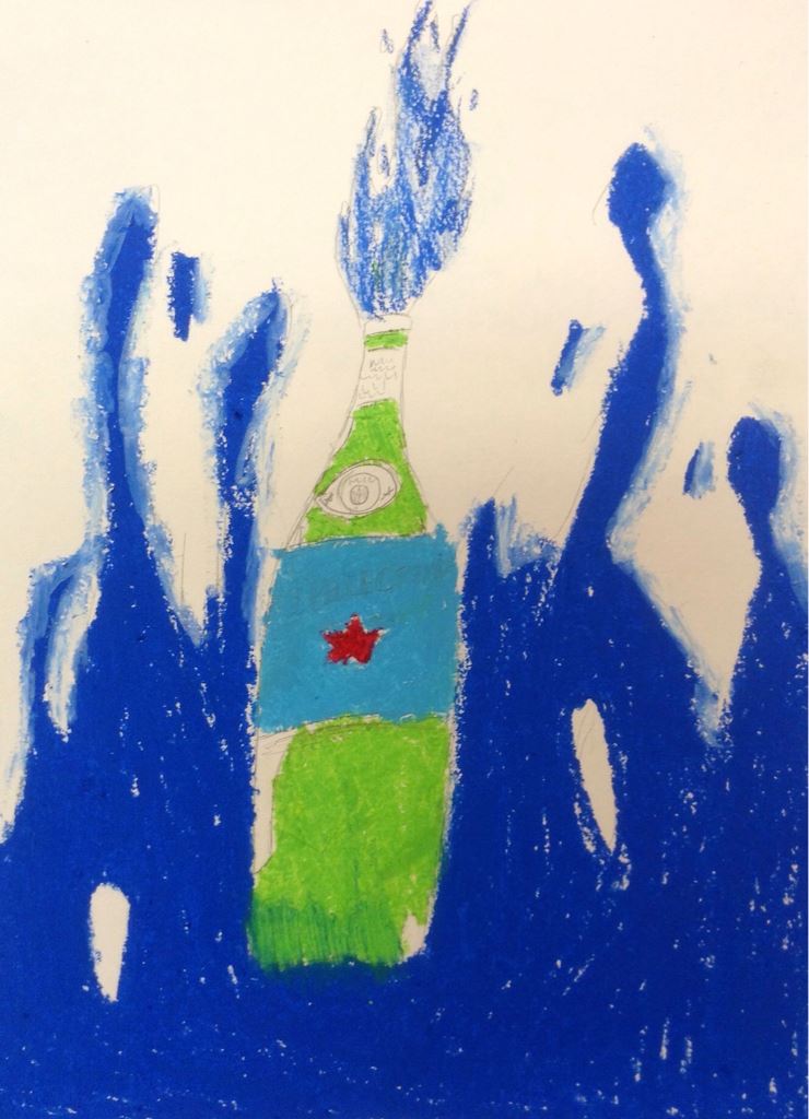
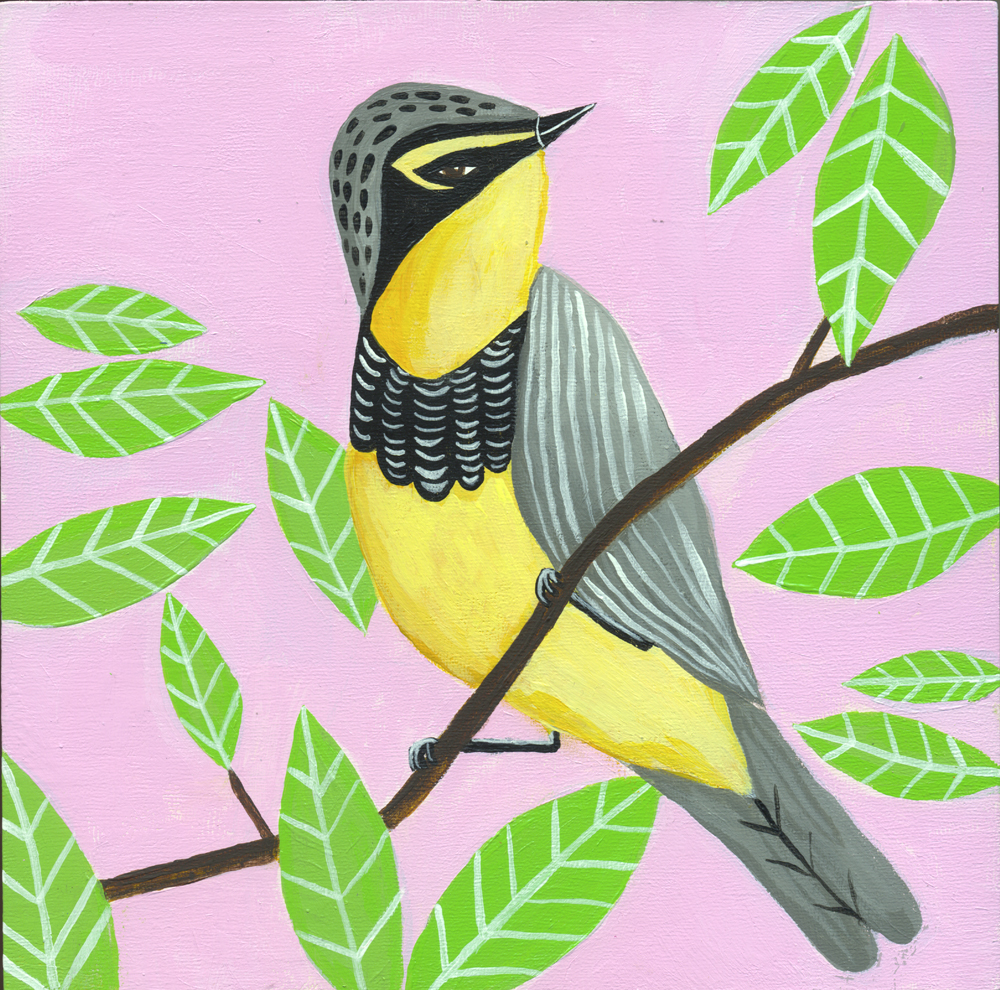
Student Work
Lesson At A Glance
Here’s a brief overview of the complete lesson. It’s also on your prep page in the Ready, Set, Go! section (below the lesson).
Colored buttons jump to each section in the full lesson plan below.
15 Minutes – Draw reference using simple lines
5 Min – Students cut out the drawings
10 min – Composition and Balance slideshow
No step 4 any more
12 min – Students experiment with different compositions & choose one
5 min – Set up for acrylic painting
10 min – Artists draw final composition guidelines
45 min – Students paint composition
2 Min – Everyone helps
Use this button to jump down to the preparation section.
SCROLL & TEACH
LESSONPLAN
Each section is a different color. Read over once and then you can SCROLL & TEACH using any device you like. It’s designed to work well with your phone.
LEARNING TARGETS

Students know how to draw using a reference
M A T E R I A L S
- 14″ x 17″ sketch pad
- 4B pencil
- White and kneaded erasers
- Cheasel reference stand & clip
- Items reference PDF (below)
All materials are suggestions and may be modified as you see fit. We have tried many items, and these seem to allow the most versatility for the cost.
1.1 Print
Reference
Choose References
Allow students to choose one subject, and take all the reference sheets for that one subject.
You can choose to present one, two, or all three subjects for reference, depending on what you think is best for your students.
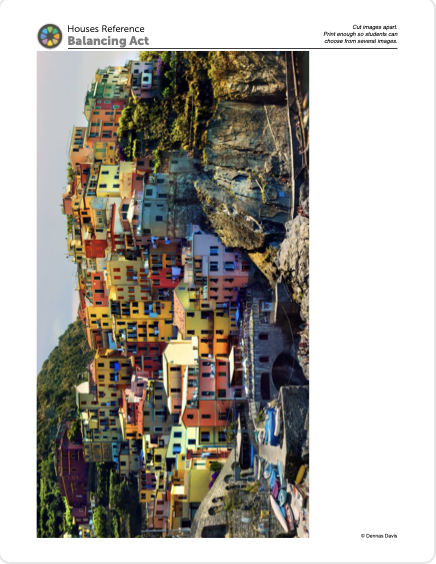
HOUSES
Opens in new window
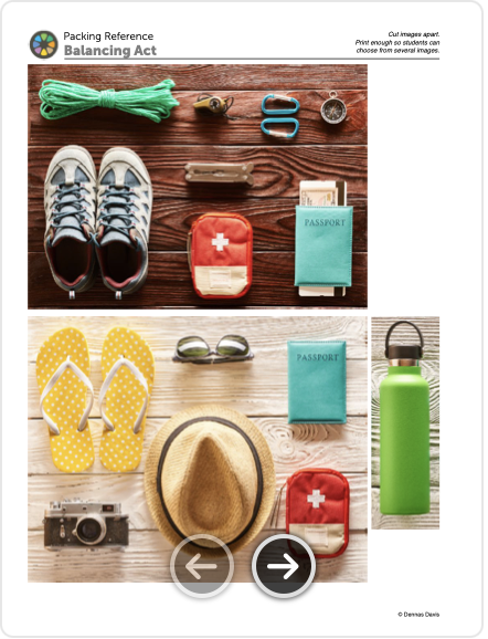
PACKING ITEMS
Opens in new window
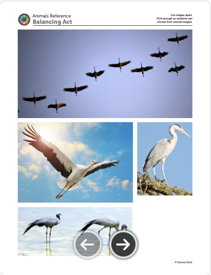
ANIMALS
Opens in new window
1.2 Teach
You can read this or paraphrase:
“Today’s project is all about composition, sometimes referred to as design. There are several design principles that almost all artists use to create a pleasant looking work. We’ll be learning about these basic principles as we work with the reference images.
Go ahead and begin drawing one object from your references, or a group of objects if that works better. Just choose something you like, and start a study sketch. Make your sketch a comfortable size, because we’re going to cut it out in a moment. Take about 5 minutes and don’t worry about shading. Just do outlines and shapes. If it looks off to you, just start another one. the more quick sketches you do, the faster you learn a subject.
Then do a few more sketches of different objects. Try to get at least 3 pretty ok drawings of 3 or more different things from your references.
You are going to make a simple stylized work of art today, using acrylic paints – on watercolor paper instead of canvas. One of the things we want to do today, is to let the work be flat color, without shading, or just minimal shading if you want and have time. You may have seen posters done in a flat color style, and I’ll show you some examples in a minute.
1.3 draw
Remind students that they should warm up with line drawings with no shading or color. Create about 3 to 5 drawings that are a good size to go together, and not too big.
It’s ok to start over. Remind students to look at the Big Shapes first, instead of all the details. Then fill in details after the big shape(s) are accurate.
As they work, display the graphic below, and read the teacher talk to explain.
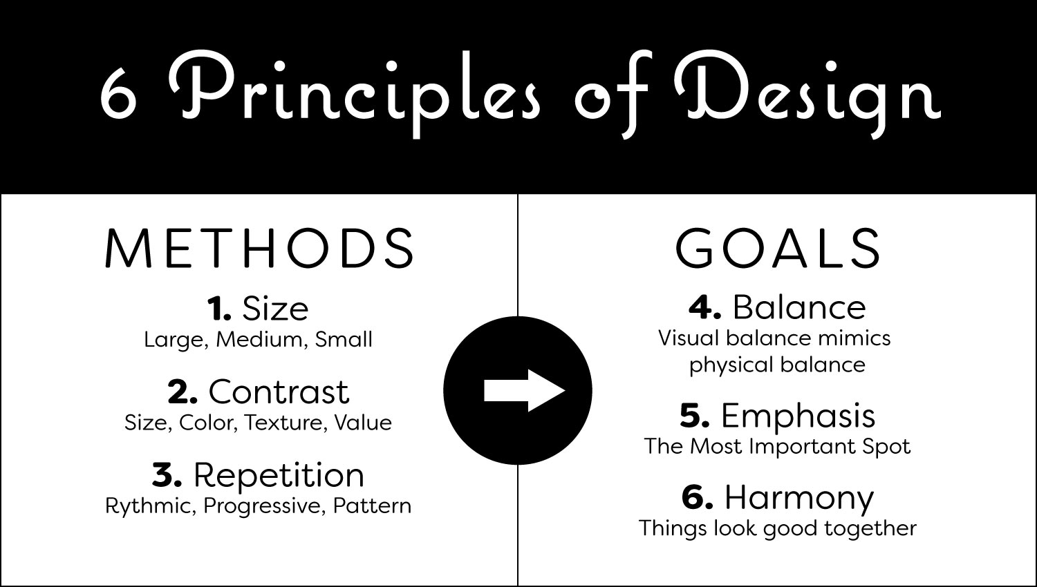
“There are 6 principles of design. We can divide these into 3 GOALS for your art, and 3 METHODS that artists use to reach these goals.
One of the 3 goals for your art is balance. This is important, because we don’t like to see things that aren’t balanced. They look like they are about to fall over. Things that are wobbly make people nervous and uncomfortable. If your art looks like it would not be stable, then people are uncomfortable when they view it.
By itself, a simple bottle has symmetrical balance. You could fold it down to middle and it’s almost a mirror image of itself on each side. Symmetry is always balanced. You can use symmetry, or you can make your work asymettrical. We just want to be balanced.
We’re going to use size, contrast, and repetition today, in order to achieve balance in our compositions, along with harmony, and emphasis.”
Advanced Student Lesson
CREATIONS - tap here to open
Our Creations lessons are for students who have completed the two years of Foundations and are ready to begin using all that they have learned to create new work. These more challenging versions of the same concepts and techniques are easily taught along-side students in the Foundations course. This allows for excellent review, and is encouraging for students to see progress from each viewpoint.
Use the Student Instructions printout below to distribute to your Creations students. Tap the image to open the PDF in a new window.
Balanced Still Life or do the same project as Foundations
Overview: Advanced students will use thumbnails to work out a balanced composition for a still life. They can choose to work in pencil, oil pastels, watercolor, or acrylics on paper.
Optionally, students can create a graphic-like poster painting using their own subject or from the provided reference photos. Ideas should not take more than 20-30 minutes.
Other elements such a simple poster text may also be added.
Step 1. (10 minutes) Set up objects for a still life, keeping the objects simple. At least 3 objects must be used. Select medium – and surface: either drawing paper or watercolor paper.
NOTE: Your work can be: 1) graphic-style poster with the objects isolated and arranged in any way you like, 2) surrealistic, or 3) realistic.
Step 2. (15 min) Thumbnails – Draw 3 or 4 horizontal Frames and 3 or 4 vertical ones. These should be 1 and 1/2 inches or so. Then create 6 to 8 compositions using only Big Shapes, and taking only one minute to do each idea. Take your best idea and create 1 or 2 variations of it. Choose your favorite.
Step 3. (5) Set up workspace and materials.
Step 4. Guide Lines – draw very light simplified shapes to help your accuracy and to copy the thumbnail sketch. Look at the Frame edges to make sure you’re getting the shapes the same sizes and proportions.
Step 5. Create your artwork.
Tap images to open Creations Student Instructions and Reference Materials in new windows


Use this button to jump down to the preparation section.
LEARNING TARGETS
Students know how to make preparations for creative work
M A T E R I A L S
- Sketches from Step 1
- 4B pencil
- Scissors
All materials are suggestions and may be modified as you see fit. We have tried many items, and these seem to allow the most versatility for the cost.
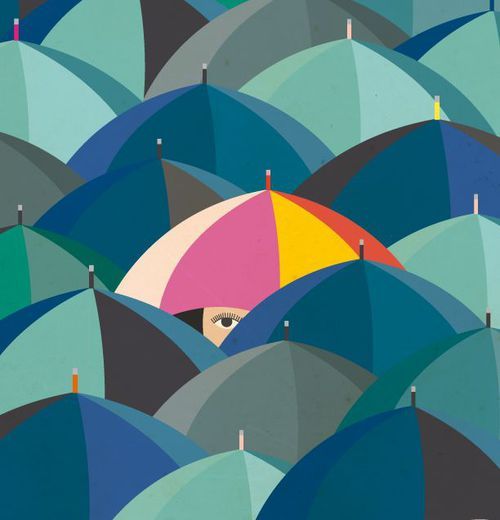
Flat color graphic artwork (tap any image to open viewer)

Use this button to jump down to the preparation section.
LEARNING TARGETS
Students know how to analyze and modify a composition
M A T E R I A L S
- TV or Ipad to show slideshow
The captions may not display while you show these. Use another device to view the captions so you can read them aloud as you go throught the images.
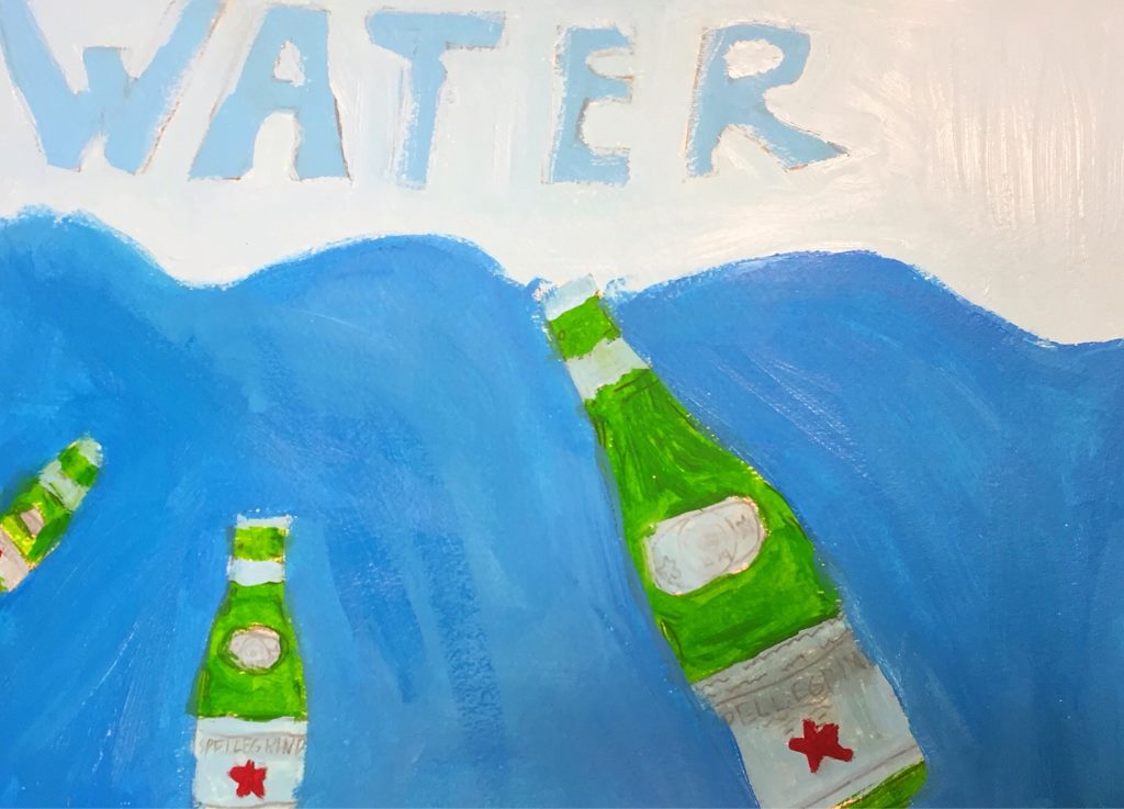
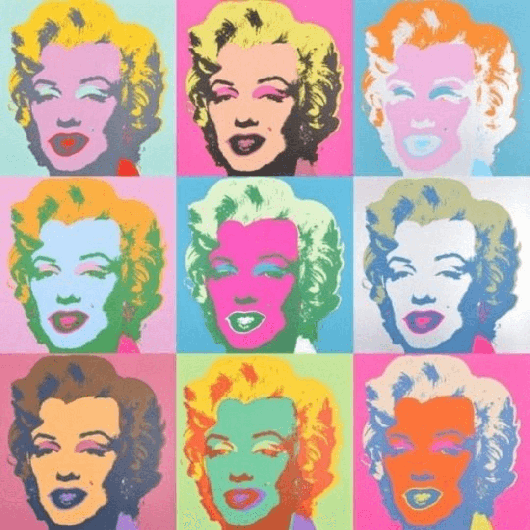
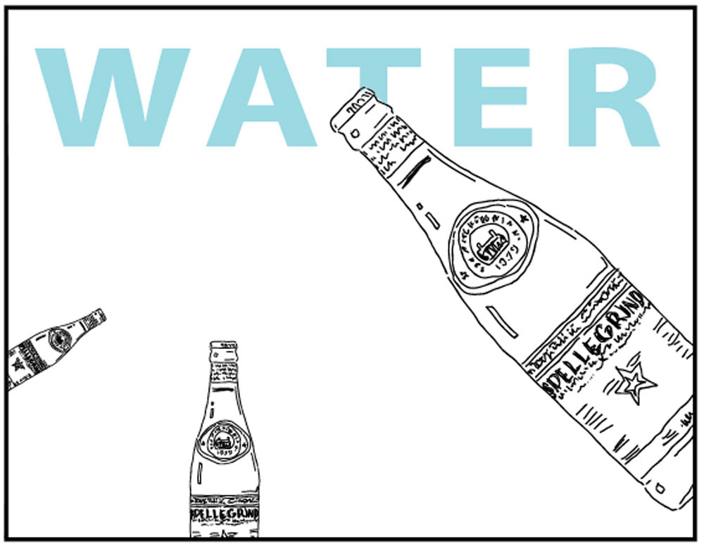
Composition and Balance (tap any image to open viewer)
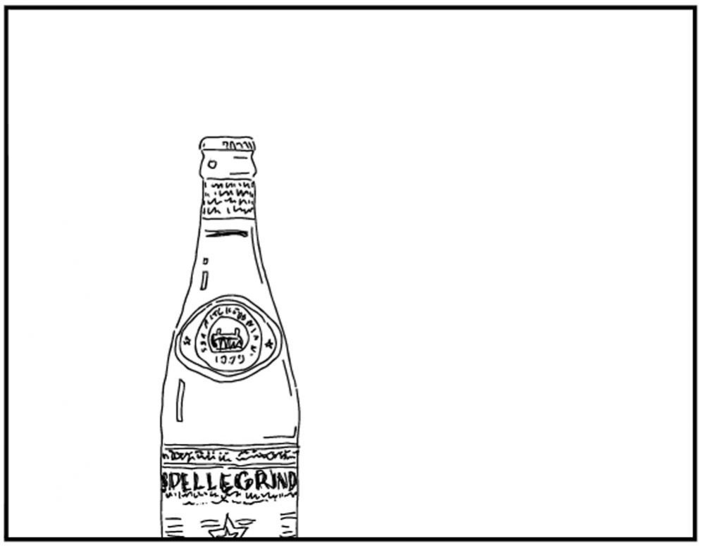
With one subject off-center, the composition leaves a large empty space. It looks a little off-balanced.
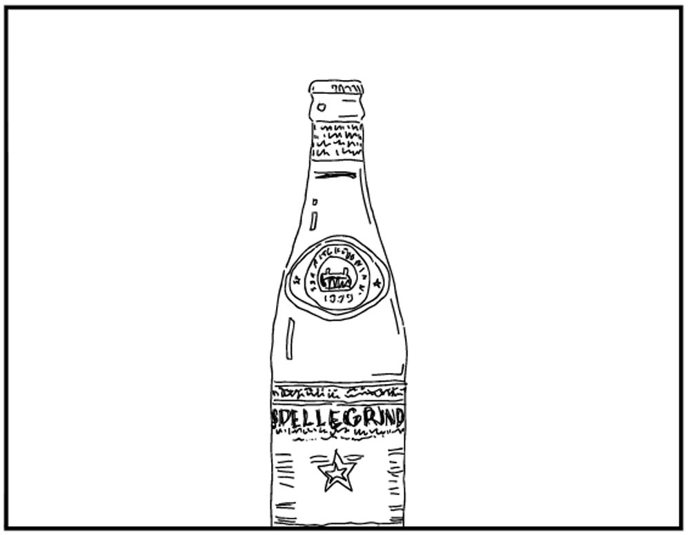
Centering the bottle makes it balanced, but is it very interesting?
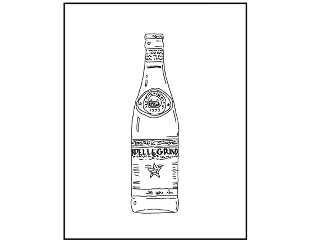
Changing the orientation makes the centered design perfect – and predictable. There just aren’t many choices with a single item.
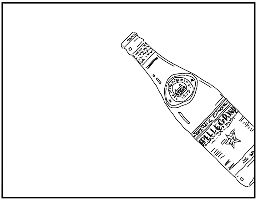
An angle makes it interesting, but it is off-balance again.

By adding more elements, the design can be balanced and interesting too.
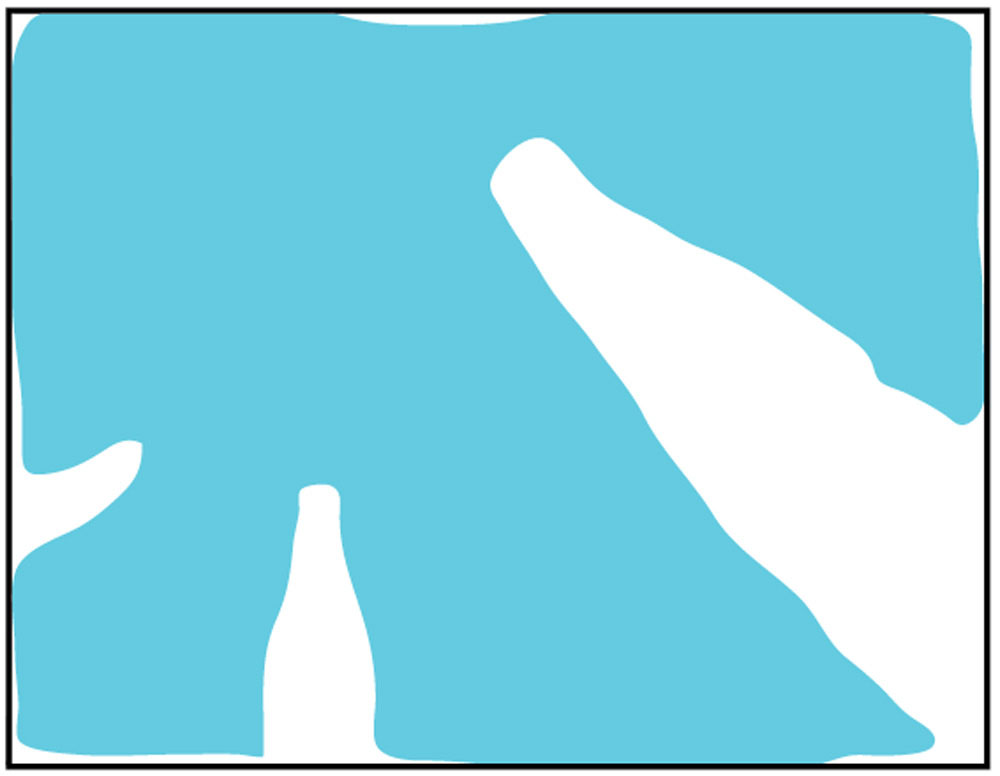
The air, or negative space, around the items looks balanced too. Visualizing it helps with accuracy and to see what else might be needed.
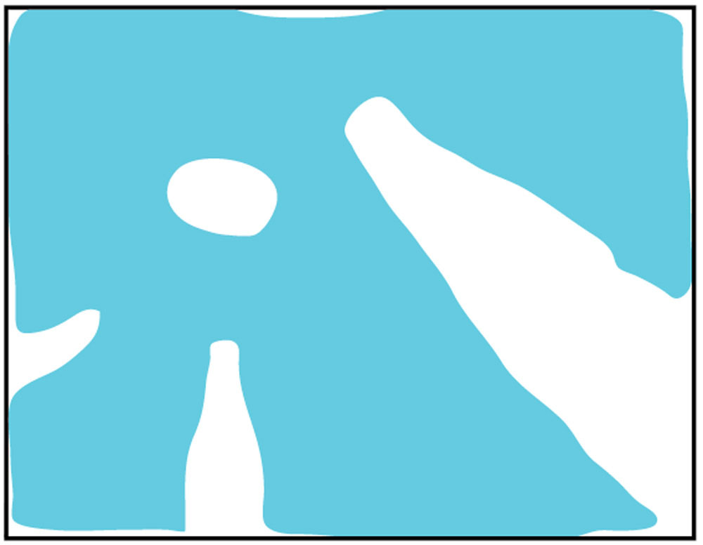
Since the negative space looks flower-like, a center spot is a nice compositional addition.
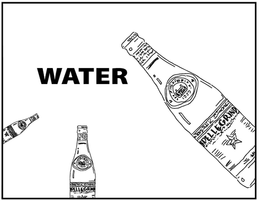
If we were making a WATER poster then this is a good spot for lettering, but it seems unbalanced again with this heavy black font.
Softening the visual weight of the lettering helps the composition a lot. We could be finished now! However, new ideas can also be explored and it’s a good idea to have choices.
Moving the lettering and making it large is a nice change. We have lost the center spot idea, but let’s work on that with a new idea.
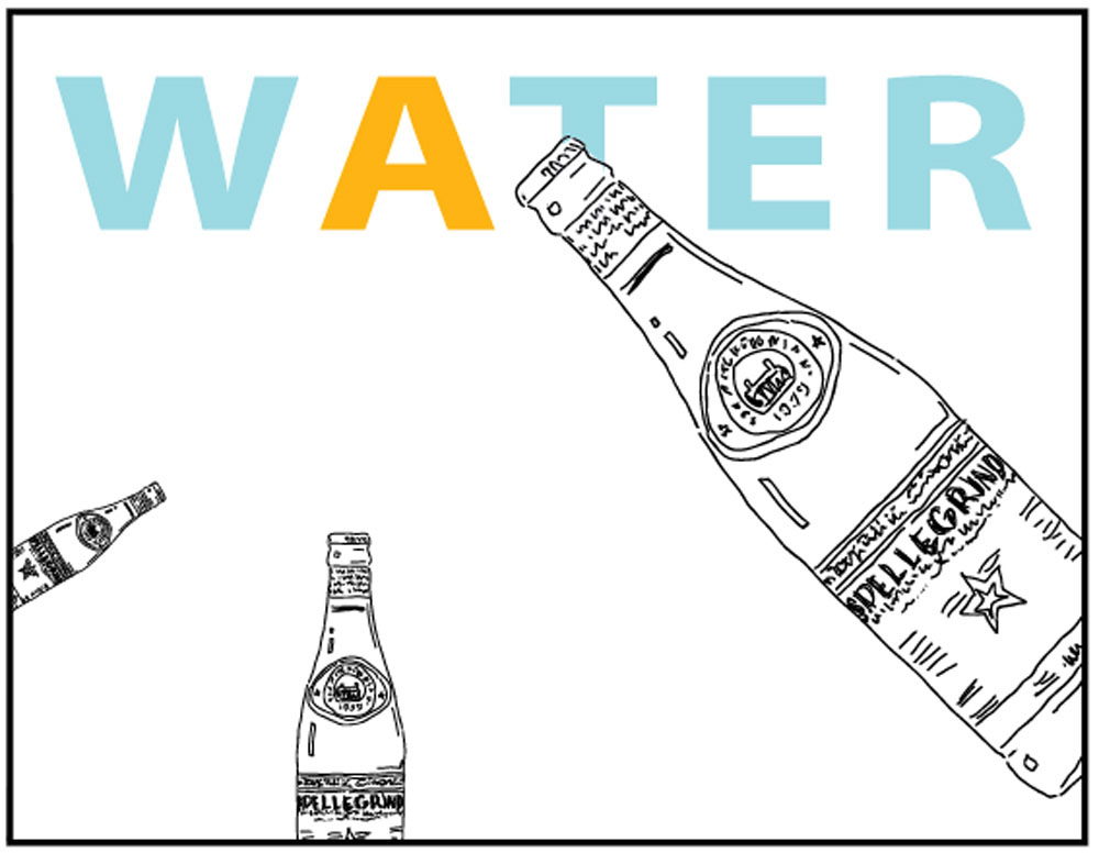
Noticing that the A is near our spot, and is being pointed at by all 3 bottles, makes this idea work well. Now there’s balance AND emphasis (the most important spot).
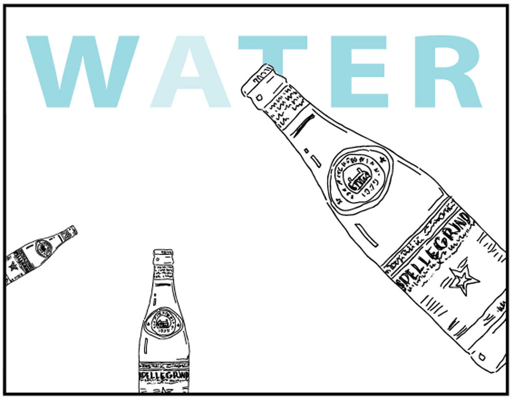
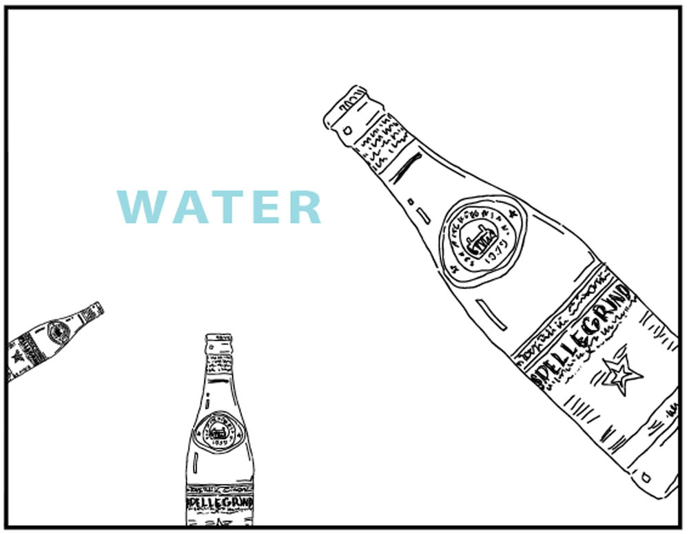
The yellow was too strong, so changing the letter to a lighter blue creates a similar effect, but calmer & more like water.
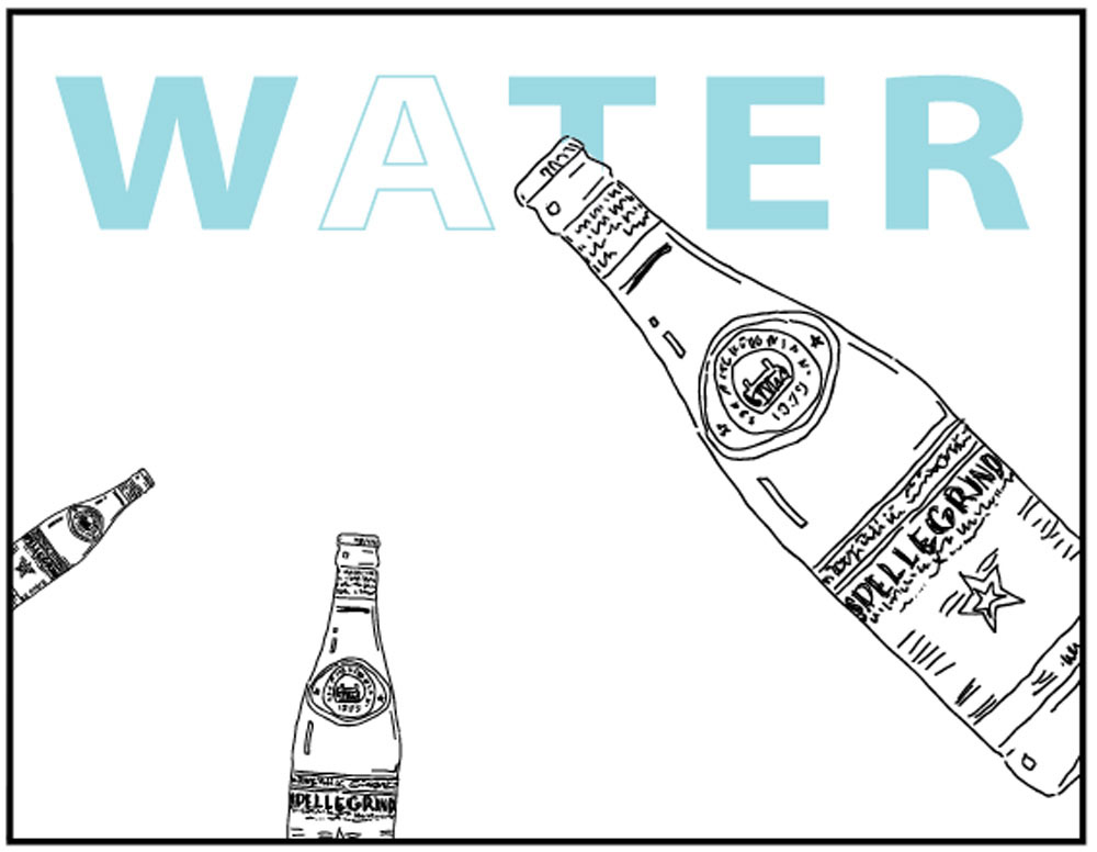
Outlined type is even better! The bottles have also been slightly angled, to point more directly at the letter A.
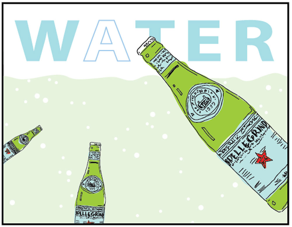
Finishing the design we can make several more ideas and adjustments, but the strong design is maintained, since it has good balance and emphasis.
Use this button to jump down to the preparation section.
No Step 4. Sorry about that.
Turns out, it's really hard to just delete a step.STEP 5. Composition Experiments
Students will try different layouts and choose the one they like best. 12 MinutesLEARNING TARGETS
Students know how to make composition variations and adjustments
M A T E R I A L S
- 11 x 15 Watercolor paper with smoothest side up
- 3 to 5 cut out sketches of objects
- 14 x 17 sketch pad
- 2B pencil
- Kneaded eraser
This section helps students understand the importance of trying different ideas for one work of art. This is the core concept for drawing thumbnail design sketches, which are required in higher education art schools.
5.1 Set up
Explain that we’re going to experiment now. We’ll use the cut outs to arrange the 3 to 5 objects or animals on a rectangle. The rectangle is the edge of the artwork, or what we call the Frame.
What’s important, is to realize that the practice frame is a smaller, test version of the final artwork. We will do the final on a half-sheet of watercolor paper.
Have students set the cut outs on a clean page in their sketch pad. These are most likely much smaller than needed for the final art. Or they might be pretty close to what the final size will be.
Students must figure the size of the practice Frame out, but imagining their cutouts in a rectangle. You can try different sizes to see how they work.
Decide how big the FRAME of the art needs to be for your first experiment. Draw an empty rectangle either vertical or horizontal.
Now draw 3 more rectangles. They can be all the same, or each one can be a little different.
5.2 Explain
We’re going to try and find the winner of the game. You can move your pieces of paper around and make an arrangement. If there was time, we could make a hundred different designs, but we just need 3 or 4. Then we choose a winner!
Make sure everyone is ready for the next step, so you can walk them through it together.
The cutouts are the playing pieces. You can arrange them in just a few seconds. Then you can rearrange them again and again.
Start by putting all your drawings on one rectangle frame. Move them around until you like the way they look. [allow students to work]
To remember this arrangement, make a tiny little memory sketch of it next to the larger one. The tiny quick sketch is just so you remember where each piece goes.
Now do another arrangement in the same box, but make big changes. You can make an object go partly outside of the frame, so you won’t see the whole thing in the final artwork. You can overlap objects. You can even change an objects size by drawing a quick memory sketch on the paper.
How creative can you be?
Once you have your second design, trace around the objects so you can place them there again.
Then make at least 2 or 3 more designs in the other blank frames. Trace each one.
You can also add other elements to your design, like a large circle, or a horizon and clouds. The objects or animals should be the focus though, so don’t overwhelm them with a lot of detail or small elements around them.”
“What if you could look at your finished work and see what it looks like. Most artists look at final work and see some things they wish they had done differently. If only you could travel into the future to see it first, and then go back and tell yourself what changes to make before you do all the work.
This method of making fast little versions of several designs, allows you to test several ideas, as if you did all of them, and then traveled back to now to tell yourself which one is the winner.
Designers need to see different versions so they can choose the best one. Sometimes your first idea is pretty good. Often though, later ideas are better. That’s why visualizing is such an important tool.
You can visualize with only your imagination, which is ok, but not as dependable. You can visualize better with a simple version of your big shapes when we move cutouts around. There are other, even faster ways to visualize, such as making quick thumbnail sketches.”
5.5 Imagine
Have everyone look at their designs and imagine other things in their picture. What do they want to try for colors, background elements, and more. Anything simple enough to be easily drawn and painted. Explain that they will only use 5 or 6 flat colors total, for the subjects and the background, so it must be simple, like a poster.
If you are finishing up the first half of a two-session lesson, have students tape their composition in place with painter’s tape, not pressing to much, or drawing around the paper cutouts with a pencil very, very lightly. They can also draw other light elements or make notes.
Use this button to jump down to the preparation section.
LEARNING TARGETS
Students know how to set up their work area for painting with acrylics.
M A T E R I A L S
- Watercolor paper with composition
- Reference pictures on stand
- Water tub
- Brushes – medium and small, pointy synthetic rounds
- Palette or plate
- Acrylic paints
- Smocks
- Paper towels
Brushes should be nylon for springiness and durability. Round brushes are the most versatile.
Paint pigment list:
- Napthol or Pyrrol Red
- Hansa or Light Yellow
- Pthalo Green (blue shade)
- Cyan or Cerulean Blue
- Ultramarine Blue
- Dioxazine Purple
- Magenta
- Burnt Umber
- Raw Sienna
- Titanium White (professional grade only)
6.1 setup
Set up for acrylic painting.

Use this button to jump down to the preparation section.
LEARNING TARGETS
Students know how to draw light, erasable lines to help them keep the integrity of their design while painting
M A T E R I A L S
- Watercolor paper
- practice design sketch
- 2B pencil
- Kneaded eraser
7.1 draw
Draw a final composition in light lines (guidelines only) with no shading, on the sheet of watercolor paper. Remind your students to focus on the big shapes of the design and any background graphics. Then add a few details as needed, but not too many. Lots of small lines will distract from the graphic look of the work, and are not usually necessary.
“You will paint your design in 4 or 5 solid flat colors for a graphic poster style look. Even though it’s watercolor paper, we’re not using the paint like watercolor today.
Remember, guidelines are not artwork, they’re only a guide for helping you know where things go, and you’ll completely paint over them.”
7.2 Show
Show some examples of artwork.
A quick search on the web will bring up several old poster artworks, some well-known. Show these to talk about flat color style.
Go to the Walter Anderson Museum website to show some of his stylized animal artwork. Here is Dennas’ review of the museum with his photos:
https://goo.gl/maps/dEA7ZyZJzn8UE7U69
Use this button to jump down to the preparation section.
STEP 8. Paint
Students will paint the composition onto paper, using a limited number of colors. 35 MinutesLEARNING TARGETS
Students know how to mix and apply paint to paper
M A T E R I A L S
- Watercolor paper with guidelines
- Reference photo on stand
- Acrylic paint setup
8.1 paint
Everyone will paint the composition on paper in acrylics, using 4 or 5 flat colors adding white to each one for opacity. An extra color can be used as an accent.
Mix up the first color in just a small amount, trying diffent mixes until it looks good. Once anyone has a color they like, they can begin painting.
Place this color on your poster where you want it, painting with enough paint to cover well, and to get good edges. To paint an edge, the tip of the brush should be against the guidline. The brush or the paper should be turned so that the guideline is not underneath the bristles or the handle.
TIP
Rough edges happen when you are running out of paint! Get more paint – don’t just dilute with water.
9.2 Continue
Use this button to jump down to the preparation section.
LEARNING TARGETS
Students know the importance of cleaning up.
M A T E R I A L S
- Paper Towels
- Cleaning wipes
- Sink
- Waste baskets
- Well-lit spot for photos
- Camera or phone-camera
9.1 CLEAN
Students set up their work area.
- Wash hands
- Super-wash brushes if used
- Put art supplies away
- Wipe tables & toss trash
- Remove any smocks (last)
- Check for items on floors and tables
9.2 PHOTO
Try to get photos of your student’s artwork. Find a good spot for quick lighting without highlights or shadows from your hands and device. Ideally in-between two strong lights on each side.
OBJECTIVES
- Practice and improvement in visualization, composition, and color-mixing
- Understanding how visual balance plays a part in composition
- Accomplishment by working on and finishing a graphic arts piece
- Fulfillment from choosing and working with composition and color
TROUBLESPOTS
Details! This project is a simple flat design, and small details will slow down the work and make it too difficult for the time and the desired effect.
ART WORDS
Composition – The arrangement of elements in a drawing or painting that make it look more agreeable, or enjoyable, to viewers. Also called, design.
Balance – Visual balance is like real balance. People are more comfortable when things look similar to real-world objects that won’t easily fall over. Some things command more visual weight than others, like color, faces, and words.
Visualize – Using your imagination to predict how something will look after it’s drawn and/or painted.
CLASSROOM
PREP
Print all of your PDFs from the lesson plan and cut any references apart as needed.
What your room needs
Here are your printable lists and room prep instructions.
Opens in new window
CLASSROOM
MATERIALS
- Cheasel reference stand & clip
- Scissors
- Water tub
- Smocks
- Paper towels
- Waste baskets
STUDENT’S
MATERIALS
- 11” x 15” Watercolor paper
- Sketch Pad
- 4B Pencil
- White and kneaded erasers
- Brushes
- Palette or plate
- Acrylic paints
PREVIEW
Week 21: The Secret Plate
Students will learn how to draw one of the most fundamental forms, a cylinder, much more accurately, by learning how to think about it differently. There is a fun way to teach and remember this important concept. Then they’ll apply the information to a still life; creating a line-drawing of bottles and striped fabric.
Week 22: Two-Week Still Life
Using recent lesson insights will be helpful when drawing a detailed still life of bottles, bowls, fruit, and striped fabric. The drawing will continue for two weeks instead of our usual one.